مرحبًا بك في قسم أعلى الخطوط — حيث تلتقي الشعبية بالجودة. هذه هي الخطوط الأكثر تنزيلًا واستخدامًا هذا العام من قبل مجتمعنا. إذا كنت بحاجة إلى اختيار موثوق للشعارات أو الويب أو وسائل التواصل، فابدأ من هنا.
يتميز كل خط رائج بتوازن جيد وقابلية قراءة وتعدد استخدامات. ستجد سان سيريف حديثة، وسكريبتات أنيقة، وسيريف كلاسيكية، وخطوط عرض minimal مختارة بعناية.
-
( Fonts by Neogrey Creative - Ivan Filipov - Personal-use only. For commercial use please contact owner. )
A futuristic, geometric font with rounded edges and uniform strokes.
 تنزيل 142 التنزيلات@WebFont
 -
( Fonts by Manfred Klein. Free for private and charity use. Free for commercial with donation to organizations )
Comic panel-inspired, illustrative display font.
![PabloInTownB تنزيل الخطوط]() تنزيل 142 التنزيلات@WebFont
تنزيل 142 التنزيلات@WebFont -
( Fonts by www.gliphmaker.com. Personal-use only. For commercial use please contact owner. )
An ornate and decorative font with intricate double-line detailing.
![Goudy Decor InitialC تنزيل الخطوط]() تنزيل 142 التنزيلات@WebFont
تنزيل 142 التنزيلات@WebFont -
( Fonts by Vunira Design )
A playful, bold, and handwritten-style font with a friendly appearance.
![CarissaFREE تنزيل الخطوط]() تنزيل 142 التنزيلات@WebFont
تنزيل 142 التنزيلات@WebFont -
( Fonts by Darcy Baldwin - darcybaldwin.com. Free for personal use only )
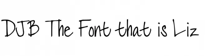
A playful, casual handwritten font with a natural, creative flair.
![DJB The Font that is Liz تنزيل الخطوط]() تنزيل 142 التنزيلات@WebFont
تنزيل 142 التنزيلات@WebFont -
-
( Fonts by Daniel Zadorozny - www.iconian.com - Free for personal use )
A bold, geometric font with a distressed, industrial style.
![XPED Distressed تنزيل الخطوط]() تنزيل 142 التنزيلات@WebFont
تنزيل 142 التنزيلات@WebFont -
( Typodermic Fonts - Ray Larabie - www.typodermicfonts.com/ )
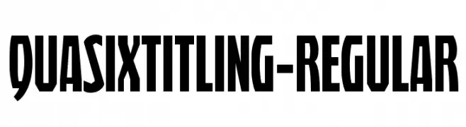
A bold, narrow font with high contrast and tight spacing, perfect for impactful headlines.
![QuasixTitling-Regular تنزيل الخطوط]() تنزيل 142 التنزيلات@WebFont
تنزيل 142 التنزيلات@WebFont -
( Fonts by a Max Infeld - XEROGRAPHER FONTS - xerographer.blogspot.com . Personal-use only. For commercial use please contact owner. )
A playful, hand-drawn crayon-style font with textured, uneven strokes.
![LargeCrayon تنزيل الخطوط]() تنزيل 142 التنزيلات@WebFont
تنزيل 142 التنزيلات@WebFont -
![Conlon تنزيل الخطوط]() تنزيل 142 التنزيلات@WebFont
تنزيل 142 التنزيلات@WebFont -
( Sharkshock - Dennis Ludlow - www.sharkshock.net )
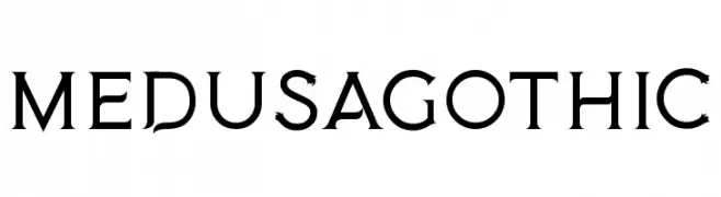
A bold, gothic-inspired font with sharp serifs and a modern twist.
![MedusaGothic تنزيل الخطوط]() تنزيل 142 التنزيلات@WebFont
تنزيل 142 التنزيلات@WebFont


ما هي أبرز الخطوط الآن؟
تحظى Syntha Nova Regular, PabloInTownB, Goudy Decor InitialC, CarissaFREE and DJB The Font that is Liz بشعبية لخطوطها النظيفة وتطبيقاتها الواسعة — من الهوية البصرية إلى الصفحات المقصودة والملصقات.
أي الخطوط تُستخدم كثيرًا في الشعارات؟
تُعد السان سيريف الهندسية (مثل Poppins وعائلات على نمط Gotham) خيارًا شائعًا لعلامات نظيفة قابلة للتوسع. ولإضفاء طابع ودي، تبقى السكريبت واليدوية خيارًا كلاسيكيًا. اجمع عنوانًا بارزًا مع خط نصي محايد لتحقيق التوازن والتميّز.
كم مرة يتم تحديث قائمة أعلى الخطوط؟
نحدّثها بانتظام استنادًا إلى التنزيلات والنشاط الفعلي. عُد إليها كثيرًا لاكتشاف النجوم الصاعدة مبكرًا.
💡 نصيحة: أضف هذه الصفحة إلى العلامات — تتغير الاتجاهات بسرعة وقد تُلهم خطوط اليوم الرائجة إعادة العلامة غدًا.