مرحبًا بك في قسم أعلى الخطوط — حيث تلتقي الشعبية بالجودة. هذه هي الخطوط الأكثر تنزيلًا واستخدامًا هذا العام من قبل مجتمعنا. إذا كنت بحاجة إلى اختيار موثوق للشعارات أو الويب أو وسائل التواصل، فابدأ من هنا.
يتميز كل خط رائج بتوازن جيد وقابلية قراءة وتعدد استخدامات. ستجد سان سيريف حديثة، وسكريبتات أنيقة، وسيريف كلاسيكية، وخطوط عرض minimal مختارة بعناية.
-
( Fonts by Fontry - M.G. Adkins - Personal-use only. For commercial use please contact owner. )
A bold, rounded font with a playful, retro vibe.
 تنزيل 142 التنزيلات@WebFont
 -
( Nght's Place - www.crosswinds.net/~nghtmvs/font/fonts1.html )
A bold, decorative font with rose illustrations on each character.
![101! A Rose fer U تنزيل الخطوط]() تنزيل 142 التنزيلات@WebFont
تنزيل 142 التنزيلات@WebFont -
( Fonts by Daniel Zadorozny - www.iconian.com - Free for personal use )
A bold, angular font with a futuristic and dynamic style.
![Montroc Leftalic تنزيل الخطوط]() تنزيل 142 التنزيلات@WebFont
تنزيل 142 التنزيلات@WebFont -
![Frantic Italic تنزيل الخطوط]() تنزيل 142 التنزيلات@WebFont
تنزيل 142 التنزيلات@WebFont -
( Fonts by Dieter Steffmann )
A bold, decorative font with a shadow effect, combining modern and retro styles.
![Epoque Shadow تنزيل الخطوط]() تنزيل 142 التنزيلات@WebFont
تنزيل 142 التنزيلات@WebFont -
-
( Noto is a trademark of Google Inc. Noto fonts are open source. All Noto fonts are published under the SIL Open Font License, Version 1.1 )
A classic serif typeface with elegant serifs and versatile character support.
![Noto Serif Telugu تنزيل الخطوط]() تنزيل 142 التنزيلات@WebFont
تنزيل 142 التنزيلات@WebFont -
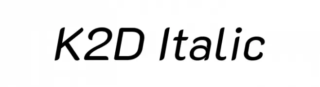
( Copyright 2018 The K2D Project Authors (https://github.com/cadsondemak/K2D) )
A modern sans-serif italic font with a sleek and dynamic style.
![K2D Italic تنزيل الخطوط]() تنزيل 142 التنزيلات@WebFont
تنزيل 142 التنزيلات@WebFont -
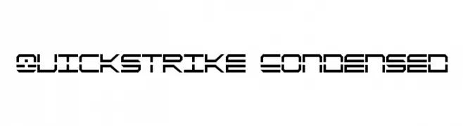
( Fonts by Daniel Zadorozny - www.iconian.com )
A futuristic, geometric font with a condensed and angular design.
![QuickStrike Condensed تنزيل الخطوط]() تنزيل 142 التنزيلات@WebFont
تنزيل 142 التنزيلات@WebFont -
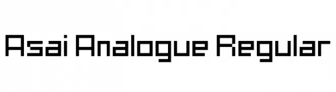
( Andre Asai - www.andreasai.com )
A geometric, pixelated font with a retro digital aesthetic.
![Asai Analogue Regular تنزيل الخطوط]() تنزيل 142 التنزيلات@WebFont
تنزيل 142 التنزيلات@WebFont -
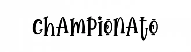
( Fonts by Supersemar Letter )
A playful and whimsical font with quirky letterforms and dynamic strokes.
![Championato تنزيل الخطوط]() تنزيل 142 التنزيلات@WebFont
تنزيل 142 التنزيلات@WebFont


ما هي أبرز الخطوط الآن؟
تحظى Garishing Worse, 101! A Rose fer U, Montroc Leftalic, Frantic Italic and Epoque Shadow بشعبية لخطوطها النظيفة وتطبيقاتها الواسعة — من الهوية البصرية إلى الصفحات المقصودة والملصقات.
أي الخطوط تُستخدم كثيرًا في الشعارات؟
تُعد السان سيريف الهندسية (مثل Poppins وعائلات على نمط Gotham) خيارًا شائعًا لعلامات نظيفة قابلة للتوسع. ولإضفاء طابع ودي، تبقى السكريبت واليدوية خيارًا كلاسيكيًا. اجمع عنوانًا بارزًا مع خط نصي محايد لتحقيق التوازن والتميّز.
كم مرة يتم تحديث قائمة أعلى الخطوط؟
نحدّثها بانتظام استنادًا إلى التنزيلات والنشاط الفعلي. عُد إليها كثيرًا لاكتشاف النجوم الصاعدة مبكرًا.
💡 نصيحة: أضف هذه الصفحة إلى العلامات — تتغير الاتجاهات بسرعة وقد تُلهم خطوط اليوم الرائجة إعادة العلامة غدًا.