مرحبًا بك في قسم أعلى الخطوط — حيث تلتقي الشعبية بالجودة. هذه هي الخطوط الأكثر تنزيلًا واستخدامًا هذا العام من قبل مجتمعنا. إذا كنت بحاجة إلى اختيار موثوق للشعارات أو الويب أو وسائل التواصل، فابدأ من هنا.
يتميز كل خط رائج بتوازن جيد وقابلية قراءة وتعدد استخدامات. ستجد سان سيريف حديثة، وسكريبتات أنيقة، وسيريف كلاسيكية، وخطوط عرض minimal مختارة بعناية.
-
 تنزيل 156 التنزيلات@WebFont
 -
( Fonts by Daniel Zadorozny - www.iconian.com - Free for personal use )
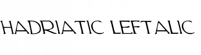
A dynamic, left-leaning italic font with artistic flair and unique character design.
![Hadriatic Leftalic تنزيل الخطوط]() تنزيل 156 التنزيلات@WebFont
تنزيل 156 التنزيلات@WebFont -
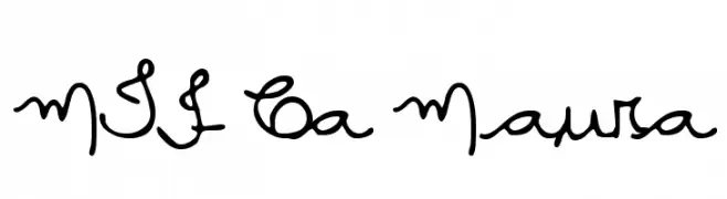
( Fonts by Miss Tiina at www.misstiina.com (please check the website before use) )
A playful, whimsical script font with a handwritten feel.
![MTF Ca Maura تنزيل الخطوط]() تنزيل 156 التنزيلات@WebFont
تنزيل 156 التنزيلات@WebFont -
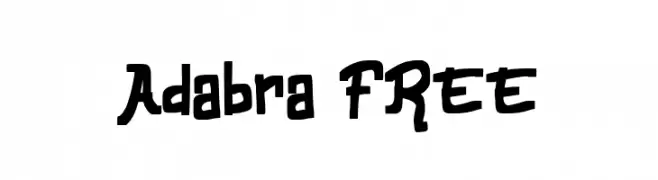
( Fonts by Vunira Design )
A playful, hand-drawn font with bold, irregular strokes and a whimsical style.
![Adabra FREE تنزيل الخطوط]() تنزيل 156 التنزيلات@WebFont
تنزيل 156 التنزيلات@WebFont -
( Fonts by Iconian Fonts )
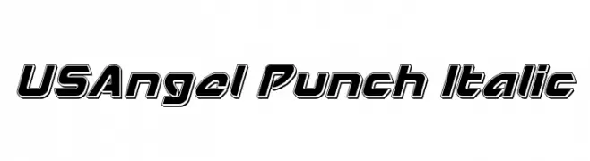
A bold, italic font with thick outlines and a modern, dynamic style.
![USAngel Punch Italic تنزيل الخطوط]() تنزيل 156 التنزيلات@WebFont
تنزيل 156 التنزيلات@WebFont -
-
( Fonts by www.paintblackeditions.org - Free for personal use only )
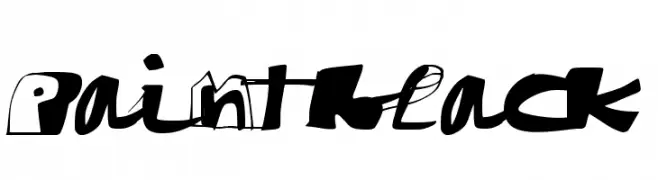
A bold, graffiti-inspired font with dynamic, irregular shapes.
![paintblack تنزيل الخطوط]() تنزيل 156 التنزيلات@WebFont
تنزيل 156 التنزيلات@WebFont -
( Font by Jonathan Harris - www.tattoowoo.com )
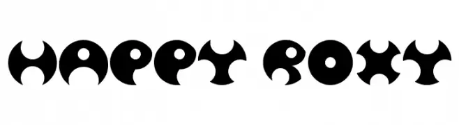
A bold, geometric decorative font with crescent-like cutouts.
![Happy Roxy تنزيل الخطوط]() تنزيل 156 التنزيلات@WebFont
تنزيل 156 التنزيلات@WebFont -
( Fonts by a Anonymous foundry. Personal-use only. For commercial use please contact owner. )
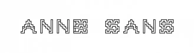
A maze-like, pixelated font with a retro digital aesthetic.
![Anne sans تنزيل الخطوط]() تنزيل 156 التنزيلات@WebFont
تنزيل 156 التنزيلات@WebFont -
![IFoundMyValentineHearted تنزيل الخطوط]() تنزيل 156 التنزيلات@WebFont
تنزيل 156 التنزيلات@WebFont -
( jbensch.deviantart.com )
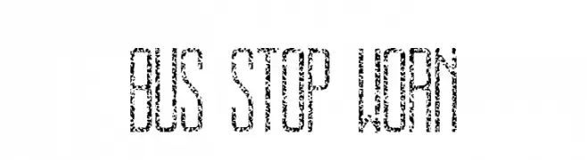
A distressed, vintage-style font with a worn, gritty texture.
![BUS STOP WORN تنزيل الخطوط]() تنزيل 156 التنزيلات@WebFont
تنزيل 156 التنزيلات@WebFont

ما هي أبرز الخطوط الآن؟
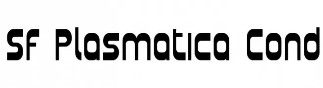
تحظى SF Plasmatica Cond, Hadriatic Leftalic, MTF Ca Maura, Adabra FREE and USAngel Punch Italic بشعبية لخطوطها النظيفة وتطبيقاتها الواسعة — من الهوية البصرية إلى الصفحات المقصودة والملصقات.
أي الخطوط تُستخدم كثيرًا في الشعارات؟
تُعد السان سيريف الهندسية (مثل Poppins وعائلات على نمط Gotham) خيارًا شائعًا لعلامات نظيفة قابلة للتوسع. ولإضفاء طابع ودي، تبقى السكريبت واليدوية خيارًا كلاسيكيًا. اجمع عنوانًا بارزًا مع خط نصي محايد لتحقيق التوازن والتميّز.
كم مرة يتم تحديث قائمة أعلى الخطوط؟
نحدّثها بانتظام استنادًا إلى التنزيلات والنشاط الفعلي. عُد إليها كثيرًا لاكتشاف النجوم الصاعدة مبكرًا.
💡 نصيحة: أضف هذه الصفحة إلى العلامات — تتغير الاتجاهات بسرعة وقد تُلهم خطوط اليوم الرائجة إعادة العلامة غدًا.