مرحبًا بك في قسم أعلى الخطوط — حيث تلتقي الشعبية بالجودة. هذه هي الخطوط الأكثر تنزيلًا واستخدامًا هذا العام من قبل مجتمعنا. إذا كنت بحاجة إلى اختيار موثوق للشعارات أو الويب أو وسائل التواصل، فابدأ من هنا.
يتميز كل خط رائج بتوازن جيد وقابلية قراءة وتعدد استخدامات. ستجد سان سيريف حديثة، وسكريبتات أنيقة، وسيريف كلاسيكية، وخطوط عرض minimal مختارة بعناية.
-
( Fonts by Galdino Otten Fonts )
A playful, rounded font with a whimsical and informal style.
 تنزيل 156 التنزيلات@WebFont
 -
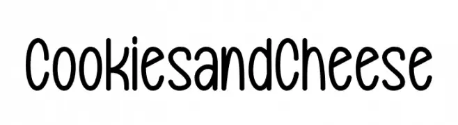
( Fonts by bringtypestudio.co )
Playful handwritten font with rounded edges.
![Cookies and Cheese تنزيل الخطوط]() تنزيل 156 التنزيلات@WebFont
تنزيل 156 التنزيلات@WebFont -
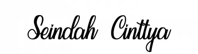
( Fonts by StringLabs - stringlabscreative.com - Personal-use only. For commercial use please contact owner. )
An elegant, flowing script font with calligraphic influences and ornate details.
![Seindah Cinttya تنزيل الخطوط]() تنزيل 156 التنزيلات@WebFont
تنزيل 156 التنزيلات@WebFont -
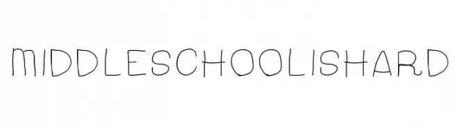
![MiddleSchoolIsHard تنزيل الخطوط]() تنزيل 156 التنزيلات@WebFont
تنزيل 156 التنزيلات@WebFont -
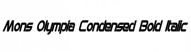
( Fonts by a Neale Davidson - www.pixelsagas.com. Personal-use only. For commercial use please contact owner. )
A bold, italic, and condensed font with a modern and dynamic style.
![Mons Olympia Condensed Bold Italic تنزيل الخطوط]() تنزيل 156 التنزيلات@WebFont
تنزيل 156 التنزيلات@WebFont -
-
![logotix تنزيل الخطوط]() تنزيل 156 التنزيلات@WebFont
تنزيل 156 التنزيلات@WebFont -
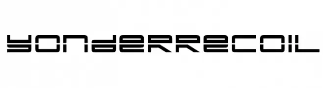
![YonderRecoil تنزيل الخطوط]() تنزيل 156 التنزيلات@WebFont
تنزيل 156 التنزيلات@WebFont -
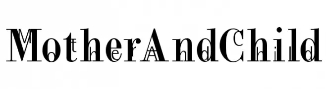
( Fonts by Manfred Klein. Free for private and charity use. Free for commercial with donation to organizations )
A bold serif font with high contrast and elegant serifs, perfect for impactful headlines.
![MotherAndChild تنزيل الخطوط]() تنزيل 156 التنزيلات@WebFont
تنزيل 156 التنزيلات@WebFont -
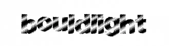
( Fonts by a Max Infeld - XEROGRAPHER FONTS - xerographer.blogspot.com . Personal-use only. For commercial use please contact owner. )
A bold, textured font with a brush-like appearance, perfect for impactful designs.
![BouldLight تنزيل الخطوط]() تنزيل 156 التنزيلات@WebFont
تنزيل 156 التنزيلات@WebFont -
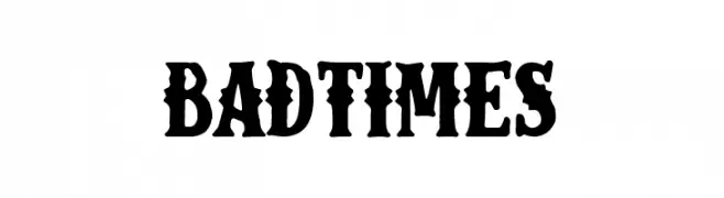
( Fonts by Woodcutter Manero - http://www.woodcutter.es - Personal-use only. For commercial use please contact owner. )
A bold, vintage-style font with ornamental serifs and a rugged, old-western appearance.
![Bad Times تنزيل الخطوط]() تنزيل 156 التنزيلات@WebFont
تنزيل 156 التنزيلات@WebFont

ما هي أبرز الخطوط الآن؟
تحظى Comic Balloon New Regular, Cookies and Cheese, Seindah Cinttya, MiddleSchoolIsHard and Mons Olympia Condensed Bold Italic بشعبية لخطوطها النظيفة وتطبيقاتها الواسعة — من الهوية البصرية إلى الصفحات المقصودة والملصقات.
أي الخطوط تُستخدم كثيرًا في الشعارات؟
تُعد السان سيريف الهندسية (مثل Poppins وعائلات على نمط Gotham) خيارًا شائعًا لعلامات نظيفة قابلة للتوسع. ولإضفاء طابع ودي، تبقى السكريبت واليدوية خيارًا كلاسيكيًا. اجمع عنوانًا بارزًا مع خط نصي محايد لتحقيق التوازن والتميّز.
كم مرة يتم تحديث قائمة أعلى الخطوط؟
نحدّثها بانتظام استنادًا إلى التنزيلات والنشاط الفعلي. عُد إليها كثيرًا لاكتشاف النجوم الصاعدة مبكرًا.
💡 نصيحة: أضف هذه الصفحة إلى العلامات — تتغير الاتجاهات بسرعة وقد تُلهم خطوط اليوم الرائجة إعادة العلامة غدًا.