مرحبًا بك في قسم أعلى الخطوط — حيث تلتقي الشعبية بالجودة. هذه هي الخطوط الأكثر تنزيلًا واستخدامًا هذا العام من قبل مجتمعنا. إذا كنت بحاجة إلى اختيار موثوق للشعارات أو الويب أو وسائل التواصل، فابدأ من هنا.
يتميز كل خط رائج بتوازن جيد وقابلية قراءة وتعدد استخدامات. ستجد سان سيريف حديثة، وسكريبتات أنيقة، وسيريف كلاسيكية، وخطوط عرض minimal مختارة بعناية.
-
 تنزيل 163 التنزيلات@WebFont
 -
( Fonts by Daniel Zadorozny - www.iconian.com )
Bold, italicized font with a distressed, grunge texture and expanded width.
![Body Swipers Expanded Italic تنزيل الخطوط]() تنزيل 163 التنزيلات@WebFont
تنزيل 163 التنزيلات@WebFont -
( Fonts by Docallisme HAS - Ryal - docallisme.blogspot.com - Personal-use only. For commercial use please contact owner. )
A clean, modern sans-serif font with uniform stroke width and balanced spacing.
![Party-Chocolate-and-Soda تنزيل الخطوط]() تنزيل 163 التنزيلات@WebFont
تنزيل 163 التنزيلات@WebFont -
( Fonts by www.blambot.com )
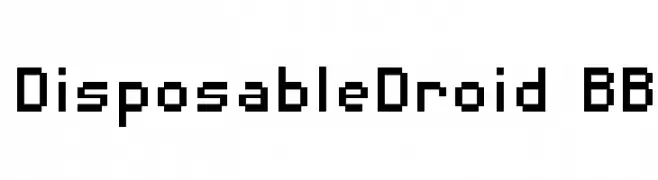
A pixelated, retro-style font with a geometric, digital appearance.
![DisposableDroid BB تنزيل الخطوط]() تنزيل 163 التنزيلات@WebFont
تنزيل 163 التنزيلات@WebFont -
( Fonts by weknow - Wino S Kadir )
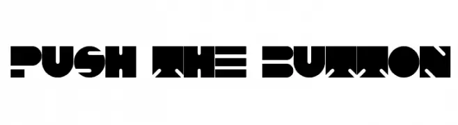
A bold, geometric font with a futuristic and industrial style.
![PUSH THE BUTTON تنزيل الخطوط]() تنزيل 163 التنزيلات@WebFont
تنزيل 163 التنزيلات@WebFont -
-
( Fonts by a Alberto Villanueva - www.av.nixiweb.com. Personal-use only. For commercial use please contact owner. )
A bold, modern font with vintage flair and high contrast strokes.
![Cintia تنزيل الخطوط]() تنزيل 163 التنزيلات@WebFont
تنزيل 163 التنزيلات@WebFont -
( Fonts by Fontherapy - Siti Anisa - Personal-use only. For commercial use please contact owner. )
A bold, playful handwritten font with thick, rounded strokes.
![Rosemate Sans تنزيل الخطوط]() تنزيل 163 التنزيلات@WebFont
تنزيل 163 التنزيلات@WebFont -
![special product تنزيل الخطوط]() تنزيل 163 التنزيلات@WebFont
تنزيل 163 التنزيلات@WebFont -
( Fonts by Edric Studio www.creativefabrica.com/designer/edricstudio/ - Personal-use only. For commercial use please contact owner. )
A bold slab serif font with strong, block-like serifs and a cohesive design.
![NORTHCLIFF تنزيل الخطوط]() تنزيل 163 التنزيلات@WebFont
تنزيل 163 التنزيلات@WebFont -
( Fonts by Iconian Fonts )
A bold, textured, and condensed font with a rugged, grunge style.
![Wolf Brothers Condensed تنزيل الخطوط]() تنزيل 163 التنزيلات@WebFont
تنزيل 163 التنزيلات@WebFont


ما هي أبرز الخطوط الآن؟
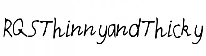
تحظى RQSThinnyandThicky, Body Swipers Expanded Italic, Party-Chocolate-and-Soda, DisposableDroid BB and PUSH THE BUTTON بشعبية لخطوطها النظيفة وتطبيقاتها الواسعة — من الهوية البصرية إلى الصفحات المقصودة والملصقات.
أي الخطوط تُستخدم كثيرًا في الشعارات؟
تُعد السان سيريف الهندسية (مثل Poppins وعائلات على نمط Gotham) خيارًا شائعًا لعلامات نظيفة قابلة للتوسع. ولإضفاء طابع ودي، تبقى السكريبت واليدوية خيارًا كلاسيكيًا. اجمع عنوانًا بارزًا مع خط نصي محايد لتحقيق التوازن والتميّز.
كم مرة يتم تحديث قائمة أعلى الخطوط؟
نحدّثها بانتظام استنادًا إلى التنزيلات والنشاط الفعلي. عُد إليها كثيرًا لاكتشاف النجوم الصاعدة مبكرًا.
💡 نصيحة: أضف هذه الصفحة إلى العلامات — تتغير الاتجاهات بسرعة وقد تُلهم خطوط اليوم الرائجة إعادة العلامة غدًا.