مرحبًا بك في قسم أعلى الخطوط — حيث تلتقي الشعبية بالجودة. هذه هي الخطوط الأكثر تنزيلًا واستخدامًا هذا العام من قبل مجتمعنا. إذا كنت بحاجة إلى اختيار موثوق للشعارات أو الويب أو وسائل التواصل، فابدأ من هنا.
يتميز كل خط رائج بتوازن جيد وقابلية قراءة وتعدد استخدامات. ستجد سان سيريف حديثة، وسكريبتات أنيقة، وسيريف كلاسيكية، وخطوط عرض minimal مختارة بعناية.
-
( Fonts by Iconian Fonts )
A bold, textured, and condensed font with a rugged, grunge style.
 تنزيل 163 التنزيلات@WebFont
 -
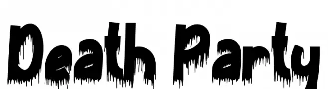
( Fonts by Yoga Letter )
A bold, dripping font ideal for horror and Halloween themes.
![Death Party تنزيل الخطوط]() تنزيل 163 التنزيلات@WebFont
تنزيل 163 التنزيلات@WebFont -
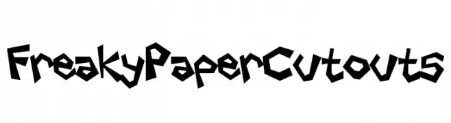
( Fonts by Darrell Flood )
A playful, edgy font with a paper cutout style and jagged edges.
![Freaky Paper Cutouts تنزيل الخطوط]() تنزيل 163 التنزيلات@WebFont
تنزيل 163 التنزيلات@WebFont -
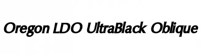
( Fonts by Luke Owens - Personal-use only. For commercial use please contact owner. )
A bold, ultra-black oblique font with strong, dynamic strokes.
![Oregon LDO UltraBlack Oblique تنزيل الخطوط]() تنزيل 163 التنزيلات@WebFont
تنزيل 163 التنزيلات@WebFont -
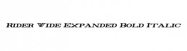
( Fonts by Mans Greback - www.mawns.com )
Bold, italic, and expanded font with high contrast and dynamic style.
![Rider Wide Expanded Bold Italic تنزيل الخطوط]() تنزيل 163 التنزيلات@WebFont
تنزيل 163 التنزيلات@WebFont -
-
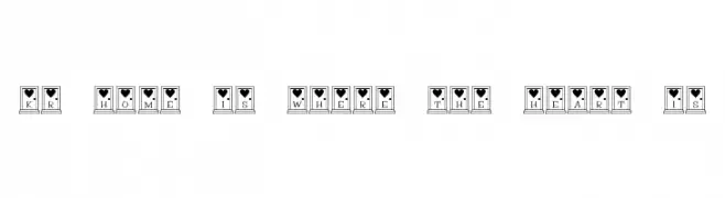
( Fonts by Kat`s Fun Fonts - Personal-use only. For commercial use please contact owner. )
A decorative font with letters framed by windows and topped with heart symbols.
![KR Home Is Where The Heart Is تنزيل الخطوط]() تنزيل 163 التنزيلات@WebFont
تنزيل 163 التنزيلات@WebFont -
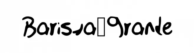
![Barista_Grande تنزيل الخطوط]() تنزيل 163 التنزيلات@WebFont
تنزيل 163 التنزيلات@WebFont -
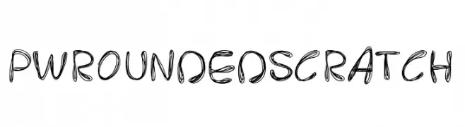
( Fonts by Peax Webdesign - www.peax-webdesign.com. Personal-use only. For commercial use please contact owner. )
A playful, hand-drawn font with rounded edges and a scratchy texture.
![PWRoundedScratch تنزيل الخطوط]() تنزيل 163 التنزيلات@WebFont
تنزيل 163 التنزيلات@WebFont -
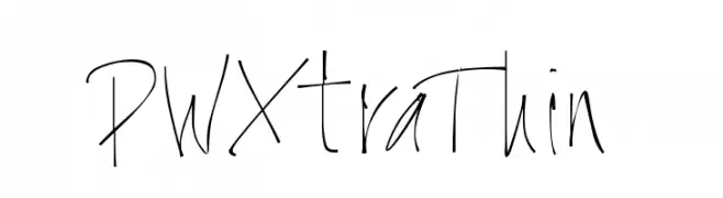
![PWXtraThin تنزيل الخطوط]() تنزيل 163 التنزيلات@WebFont
تنزيل 163 التنزيلات@WebFont -
( Fonts by Vultype - Candra Hamdani - Personal-use only. For commercial use please contact owner. )
A modern, elegant handwritten font with fluid, cursive letterforms.
![Austin تنزيل الخطوط]() تنزيل 163 التنزيلات@WebFont
تنزيل 163 التنزيلات@WebFont

ما هي أبرز الخطوط الآن؟
تحظى Wolf Brothers Condensed, Death Party, Freaky Paper Cutouts, Oregon LDO UltraBlack Oblique and Rider Wide Expanded Bold Italic بشعبية لخطوطها النظيفة وتطبيقاتها الواسعة — من الهوية البصرية إلى الصفحات المقصودة والملصقات.
أي الخطوط تُستخدم كثيرًا في الشعارات؟
تُعد السان سيريف الهندسية (مثل Poppins وعائلات على نمط Gotham) خيارًا شائعًا لعلامات نظيفة قابلة للتوسع. ولإضفاء طابع ودي، تبقى السكريبت واليدوية خيارًا كلاسيكيًا. اجمع عنوانًا بارزًا مع خط نصي محايد لتحقيق التوازن والتميّز.
كم مرة يتم تحديث قائمة أعلى الخطوط؟
نحدّثها بانتظام استنادًا إلى التنزيلات والنشاط الفعلي. عُد إليها كثيرًا لاكتشاف النجوم الصاعدة مبكرًا.
💡 نصيحة: أضف هذه الصفحة إلى العلامات — تتغير الاتجاهات بسرعة وقد تُلهم خطوط اليوم الرائجة إعادة العلامة غدًا.