مرحبًا بك في قسم أعلى الخطوط — حيث تلتقي الشعبية بالجودة. هذه هي الخطوط الأكثر تنزيلًا واستخدامًا هذا العام من قبل مجتمعنا. إذا كنت بحاجة إلى اختيار موثوق للشعارات أو الويب أو وسائل التواصل، فابدأ من هنا.
يتميز كل خط رائج بتوازن جيد وقابلية قراءة وتعدد استخدامات. ستجد سان سيريف حديثة، وسكريبتات أنيقة، وسيريف كلاسيكية، وخطوط عرض minimal مختارة بعناية.
-
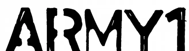
( Andrus Peegel )
A bold, stencil-style font with a rugged, distressed texture.
 تنزيل 171 التنزيلات@WebFont
 -
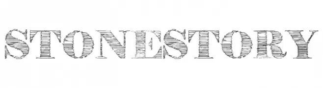
( Fonts by Eva Barabasne Olasz )
A textured, stone-like serif font with a rugged, carved appearance.
![StoneStory تنزيل الخطوط]() تنزيل 171 التنزيلات@WebFont
تنزيل 171 التنزيلات@WebFont -
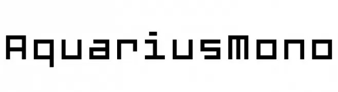
( Fonts by www.floodfonts.com )
A monospaced font with a digital, retro aesthetic and geometric design.
![AquariusMono تنزيل الخطوط]() تنزيل 171 التنزيلات@WebFont
تنزيل 171 التنزيلات@WebFont -
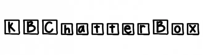
( Fonts by Khrys Bosland )
A playful, hand-drawn font with characters enclosed in irregular outlines.
![KBChatterBox تنزيل الخطوط]() تنزيل 171 التنزيلات@WebFont
تنزيل 171 التنزيلات@WebFont -
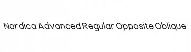
خط بواسطة CannotIntoSpaceFonts. For commercial use please contact the owner.
![Nordica Advanced Regular Opposite Oblique تنزيل الخطوط]() تنزيل 171 التنزيلات@WebFont
تنزيل 171 التنزيلات@WebFont -
-
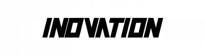
( Fonts by Wino S Kadir - weknow - www.revolge.com/shop/weknow/ - Personal-use only. For commercial use please contact owner. )
A bold, angular font with a futuristic and dynamic style.
![INOVATION تنزيل الخطوط]() تنزيل 171 التنزيلات@WebFont
تنزيل 171 التنزيلات@WebFont -
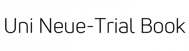
( Fonts by Fontfabric - Svetoslav Simov - Personal-use only. For commercial use please contact owner. )
A modern, geometric sans-serif font with clean lines and uniform stroke widths.
![Uni Neue-Trial Book تنزيل الخطوط]() تنزيل 171 التنزيلات@WebFont
تنزيل 171 التنزيلات@WebFont -
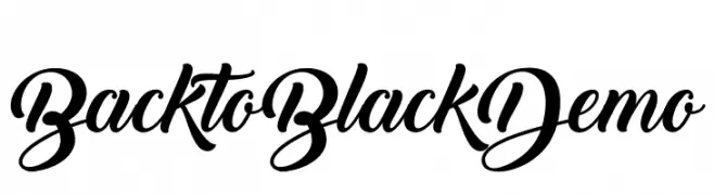
( Fonts by Misti's Fonts - Personal-use only. For commercial use please contact owner. )
A bold, elegant script font with flowing curves and high contrast.
![Back to Black Demo تنزيل الخطوط]() تنزيل 171 التنزيلات@WebFont
تنزيل 171 التنزيلات@WebFont -
( Fonts by Octotype - www.foundmyfont.com - Personal-use only. For commercial use please contact owner. )
A decorative script font with elegant, flowing characters and ornate swashes.
![Walking in Sunlight تنزيل الخطوط]() تنزيل 171 التنزيلات@WebFont
تنزيل 171 التنزيلات@WebFont -
( Fonts by Balpirick Studio - Personal-use only. For commercial use please contact owner. )
An elegant, handwritten font with flowing, graceful characters.
![Royals Boutique تنزيل الخطوط]() تنزيل 171 التنزيلات@WebFont
تنزيل 171 التنزيلات@WebFont

ما هي أبرز الخطوط الآن؟
تحظى army1, StoneStory, AquariusMono, KBChatterBox and Nordica Advanced Regular Opposite Oblique بشعبية لخطوطها النظيفة وتطبيقاتها الواسعة — من الهوية البصرية إلى الصفحات المقصودة والملصقات.
أي الخطوط تُستخدم كثيرًا في الشعارات؟
تُعد السان سيريف الهندسية (مثل Poppins وعائلات على نمط Gotham) خيارًا شائعًا لعلامات نظيفة قابلة للتوسع. ولإضفاء طابع ودي، تبقى السكريبت واليدوية خيارًا كلاسيكيًا. اجمع عنوانًا بارزًا مع خط نصي محايد لتحقيق التوازن والتميّز.
كم مرة يتم تحديث قائمة أعلى الخطوط؟
نحدّثها بانتظام استنادًا إلى التنزيلات والنشاط الفعلي. عُد إليها كثيرًا لاكتشاف النجوم الصاعدة مبكرًا.
💡 نصيحة: أضف هذه الصفحة إلى العلامات — تتغير الاتجاهات بسرعة وقد تُلهم خطوط اليوم الرائجة إعادة العلامة غدًا.