مرحبًا بك في قسم أعلى الخطوط — حيث تلتقي الشعبية بالجودة. هذه هي الخطوط الأكثر تنزيلًا واستخدامًا هذا العام من قبل مجتمعنا. إذا كنت بحاجة إلى اختيار موثوق للشعارات أو الويب أو وسائل التواصل، فابدأ من هنا.
يتميز كل خط رائج بتوازن جيد وقابلية قراءة وتعدد استخدامات. ستجد سان سيريف حديثة، وسكريبتات أنيقة، وسيريف كلاسيكية، وخطوط عرض minimal مختارة بعناية.
-
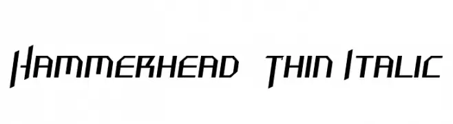
( Fonts by Dieter Schumacher )
A sharp, angular font with a futuristic and dynamic style.
 تنزيل 170 التنزيلات@WebFont
 -
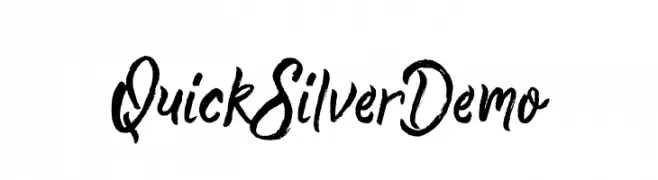
( Fonts by Putra Khan )
A dynamic brush script font with expressive, hand-painted strokes.
![Quick Silver Demo تنزيل الخطوط]() تنزيل 170 التنزيلات@WebFont
تنزيل 170 التنزيلات@WebFont -
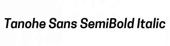
( Fonts by Village Type and Design LLC & Cristiano Sobral - Personal-use only. For commercial use please contact owner. )
A modern, semi-bold italic sans-serif font with a clean and dynamic style.
![Tanohe Sans SemiBold Italic تنزيل الخطوط]() تنزيل 170 التنزيلات@WebFont
تنزيل 170 التنزيلات@WebFont -
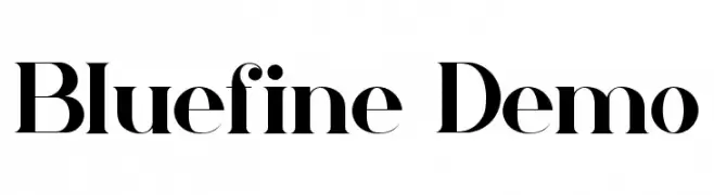
( Fonts by CalligraphyFonts - Personal-use only. For commercial use please contact owner. )
A bold, high-contrast serif font with a classic yet modern style.
![Bluefine Demo تنزيل الخطوط]() تنزيل 170 التنزيلات@WebFont
تنزيل 170 التنزيلات@WebFont -
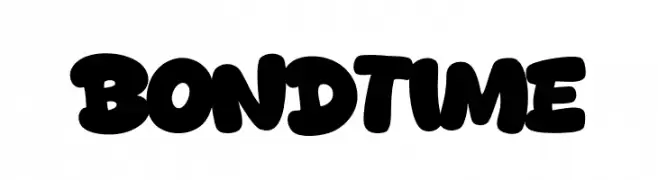
( Fonts by Khurasan™ )
A bold, playful font with rounded, thick strokes and a bubbly appearance.
![Bond Time تنزيل الخطوط]() تنزيل 170 التنزيلات@WebFont
تنزيل 170 التنزيلات@WebFont -
-
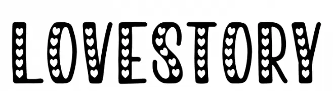
( Fonts by NJ Studio - Personal-use only. For commercial use please contact owner. )
A playful, heart-filled font perfect for romantic and whimsical designs.
![love story تنزيل الخطوط]() تنزيل 170 التنزيلات@WebFont
تنزيل 170 التنزيلات@WebFont -
![FLW Demo تنزيل الخطوط]() تنزيل 170 التنزيلات
تنزيل 170 التنزيلات -
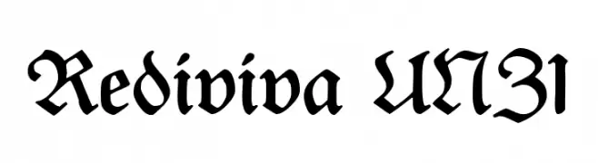
( Fonts by Peter Wiegel - www.peter-wiegel.de - Personal-use only. For commercial use please contact owner. )
A bold, blackletter font with intricate, angular designs and high contrast.
![Rediviva UNZ1 تنزيل الخطوط]() تنزيل 170 التنزيلات@WebFont
تنزيل 170 التنزيلات@WebFont -
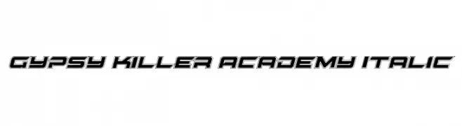
( Fonts by Daniel Zadorozny - www.iconian.com - Free for personal use )
A bold, italic font with a futuristic, three-dimensional style.
![Gypsy Killer Academy Italic تنزيل الخطوط]() تنزيل 170 التنزيلات@WebFont
تنزيل 170 التنزيلات@WebFont -
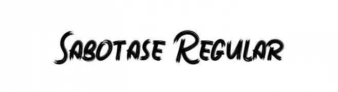
خط بواسطة typotopia. For commercial use please contact the owner.
( Fonts bt Typotopia - Typotopia.co - Personal Use Only, for Commercial Use, please contact Us )
A bold, brush-style font with a dynamic and textured appearance.
![Sabotase Regular تنزيل الخطوط]() تنزيل 170 التنزيلات@WebFont
تنزيل 170 التنزيلات@WebFont
ما هي أبرز الخطوط الآن؟
تحظى Hammerhead Thin Italic, Quick Silver Demo, Tanohe Sans SemiBold Italic, Bluefine Demo and Bond Time بشعبية لخطوطها النظيفة وتطبيقاتها الواسعة — من الهوية البصرية إلى الصفحات المقصودة والملصقات.
أي الخطوط تُستخدم كثيرًا في الشعارات؟
تُعد السان سيريف الهندسية (مثل Poppins وعائلات على نمط Gotham) خيارًا شائعًا لعلامات نظيفة قابلة للتوسع. ولإضفاء طابع ودي، تبقى السكريبت واليدوية خيارًا كلاسيكيًا. اجمع عنوانًا بارزًا مع خط نصي محايد لتحقيق التوازن والتميّز.
كم مرة يتم تحديث قائمة أعلى الخطوط؟
نحدّثها بانتظام استنادًا إلى التنزيلات والنشاط الفعلي. عُد إليها كثيرًا لاكتشاف النجوم الصاعدة مبكرًا.
💡 نصيحة: أضف هذه الصفحة إلى العلامات — تتغير الاتجاهات بسرعة وقد تُلهم خطوط اليوم الرائجة إعادة العلامة غدًا.