مرحبًا بك في قسم أعلى الخطوط — حيث تلتقي الشعبية بالجودة. هذه هي الخطوط الأكثر تنزيلًا واستخدامًا هذا العام من قبل مجتمعنا. إذا كنت بحاجة إلى اختيار موثوق للشعارات أو الويب أو وسائل التواصل، فابدأ من هنا.
يتميز كل خط رائج بتوازن جيد وقابلية قراءة وتعدد استخدامات. ستجد سان سيريف حديثة، وسكريبتات أنيقة، وسيريف كلاسيكية، وخطوط عرض minimal مختارة بعناية.
-
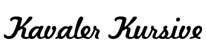
( Fonts by DeNada Industries - Mike Allard )
A flowing, cursive font with smooth, rounded edges and a dynamic slant.
 تنزيل 3394 التنزيلات@WebFont
 -
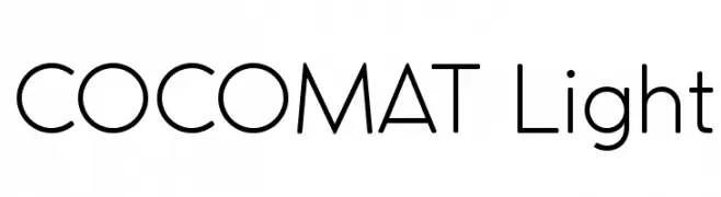
( Fonts by a kmzero font foundry - www.zetafonts.com. Personal-use only. For commercial use please contact owner. )
A clean, geometric sans-serif font with a modern and minimalist style.
![COCOMAT Light تنزيل الخطوط]() تنزيل 3393 التنزيلات@WebFont
تنزيل 3393 التنزيلات@WebFont -
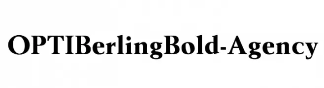
( Fonts by Castcraft Software - opti.netii.net - check the website before use )
A bold, classic serif font with strong strokes and sharp serifs.
![OPTIBerlingBold-Agency تنزيل الخطوط]() تنزيل 3393 التنزيلات@WebFont
تنزيل 3393 التنزيلات@WebFont -
![WilhelmKlingsporGotisch تنزيل الخطوط]() تنزيل 3393 التنزيلات@WebFont
تنزيل 3393 التنزيلات@WebFont -
( Fonts by Manfred Klein - manfred-klein.ina-mar.com )
A modern sans-serif font with geometric shapes and uniform stroke width.
![Folks-Normal تنزيل الخطوط]() تنزيل 3391 التنزيلات@WebFont
تنزيل 3391 التنزيلات@WebFont -
-
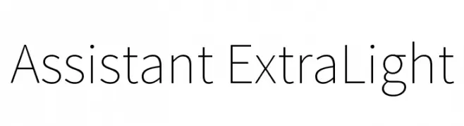
( Copyright 2010 The Assistant Project Authors, with Reserved Font Name 'Source'. Source is a trademark of Adobe Systems Incorporated in the United States and/or other countries. )
A clean, modern typeface with consistent stroke width and excellent readability.
![Assistant ExtraLight تنزيل الخطوط]() تنزيل 3390 التنزيلات@WebFont
تنزيل 3390 التنزيلات@WebFont -
( Copyright (c) 2014, Indian Type Foundry (info@indiantypefoundry.com). )
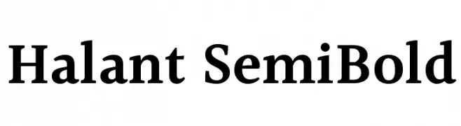
A semi-bold serif font with balanced contrast and elegant serifs.
![Halant SemiBold تنزيل الخطوط]() تنزيل 3390 التنزيلات@WebFont
تنزيل 3390 التنزيلات@WebFont -
( www.hypefonts.com )
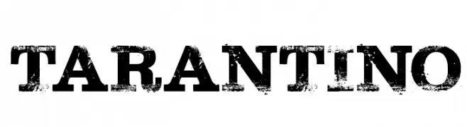
A bold, distressed font with a vintage, rugged appearance.
![Tarantino تنزيل الخطوط]() تنزيل 3390 التنزيلات@WebFont
تنزيل 3390 التنزيلات@WebFont -
( Copyright (c) 2011 by Ralph du Carrois, with Reserved Font Name 'Carrois' )
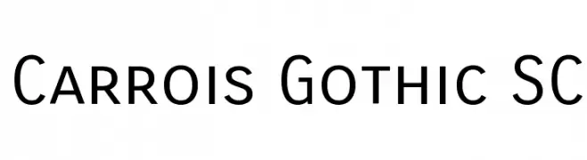
A clean, modern sans-serif font with uniform stroke widths and high legibility.
![Carrois Gothic SC تنزيل الخطوط]() تنزيل 3389 التنزيلات@WebFont
تنزيل 3389 التنزيلات@WebFont -
( Copyright (c) 2011, TypeTogether (www.type-together.com) )
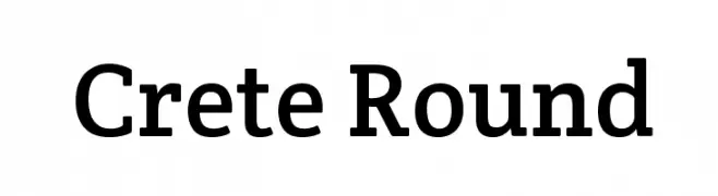
A classic serif font with rounded edges, blending traditional and modern styles.
![Crete Round تنزيل الخطوط]() تنزيل 3389 التنزيلات@WebFont
تنزيل 3389 التنزيلات@WebFont


ما هي أبرز الخطوط الآن؟
تحظى Kavaler Kursive, COCOMAT Light, OPTIBerlingBold-Agency, WilhelmKlingsporGotisch and Folks-Normal بشعبية لخطوطها النظيفة وتطبيقاتها الواسعة — من الهوية البصرية إلى الصفحات المقصودة والملصقات.
أي الخطوط تُستخدم كثيرًا في الشعارات؟
تُعد السان سيريف الهندسية (مثل Poppins وعائلات على نمط Gotham) خيارًا شائعًا لعلامات نظيفة قابلة للتوسع. ولإضفاء طابع ودي، تبقى السكريبت واليدوية خيارًا كلاسيكيًا. اجمع عنوانًا بارزًا مع خط نصي محايد لتحقيق التوازن والتميّز.
كم مرة يتم تحديث قائمة أعلى الخطوط؟
نحدّثها بانتظام استنادًا إلى التنزيلات والنشاط الفعلي. عُد إليها كثيرًا لاكتشاف النجوم الصاعدة مبكرًا.
💡 نصيحة: أضف هذه الصفحة إلى العلامات — تتغير الاتجاهات بسرعة وقد تُلهم خطوط اليوم الرائجة إعادة العلامة غدًا.