مرحبًا بك في قسم أعلى الخطوط — حيث تلتقي الشعبية بالجودة. هذه هي الخطوط الأكثر تنزيلًا واستخدامًا هذا العام من قبل مجتمعنا. إذا كنت بحاجة إلى اختيار موثوق للشعارات أو الويب أو وسائل التواصل، فابدأ من هنا.
يتميز كل خط رائج بتوازن جيد وقابلية قراءة وتعدد استخدامات. ستجد سان سيريف حديثة، وسكريبتات أنيقة، وسيريف كلاسيكية، وخطوط عرض minimal مختارة بعناية.
-
 تنزيل 952 التنزيلات@WebFont
 -
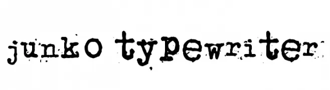
( Fonts by www.junkohanhero.com )
A vintage, distressed typewriter-style font with a textured, stamped appearance.
![junko typewriter تنزيل الخطوط]() تنزيل 952 التنزيلات@WebFont
تنزيل 952 التنزيلات@WebFont -
![Cosmic Age تنزيل الخطوط]() تنزيل 952 التنزيلات@WebFont
تنزيل 952 التنزيلات@WebFont -
( Fonts by Blue Vinyl - Jess Latham - www.bvfonts.com )
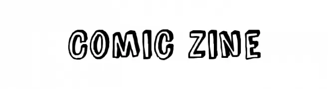
A bold, hand-drawn comic-style font with thick outlines and playful character.
![Comic Zine تنزيل الخطوط]() تنزيل 952 التنزيلات@WebFont
تنزيل 952 التنزيلات@WebFont -
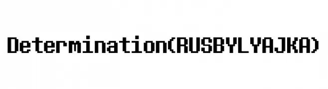
( Fonts by FONTS BY LYAJKA - Personal-use only. For commercial use please contact owner. )
A bold, pixelated font with a retro, digital aesthetic.
![Determination (RUS BY LYAJKA) تنزيل الخطوط]() تنزيل 951 التنزيلات@WebFont
تنزيل 951 التنزيلات@WebFont -
( Fonts by Syaf Rizal - Khurasan - Personal-use only. For commercial use please contact owner. )
A bold, brush-style font with dynamic, expressive strokes.
![Oh Now! تنزيل الخطوط]() تنزيل 951 التنزيلات@WebFont
تنزيل 951 التنزيلات@WebFont -
( Fonts by CannotIntoSpaceFonts - KineticPlasma Fonts - Personal-use only. For commercial use please contact owner. )
A bold, oblique, and super extended font with a modern, dynamic style.
![Warsaw Gothic SuperExtended Oblique تنزيل الخطوط]() تنزيل 951 التنزيلات@WebFont
تنزيل 951 التنزيلات@WebFont -
( Fonts by prescottdesignshop.com - Personal-use only. For commercial use please contact owner. )
A modern, light sans-serif font with clean lines and elegant proportions.
![PassionSansPDac-Light تنزيل الخطوط]() تنزيل 951 التنزيلات@WebFont
تنزيل 951 التنزيلات@WebFont -
( Fonts by Situjuh Nazara - 7ntypes.com - Personal-use only. For commercial use please contact owner. )
A bold, italic font with a dynamic and modern style.
![Gobold Italic تنزيل الخطوط]() تنزيل 951 التنزيلات@WebFont
تنزيل 951 التنزيلات@WebFont -
( Fonts by a Neale Davidson - www.pixelsagas.com. Personal-use only. For commercial use please contact owner. )
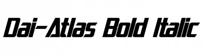
A bold, italicized font with a modern, dynamic style and tight character spacing.
![Dai-Atlas Bold Italic تنزيل الخطوط]() تنزيل 951 التنزيلات@WebFont
تنزيل 951 التنزيلات@WebFont -
( Fonts by www.kimberlygeswein.com - Kimberly Geswein )
A casual, handwritten font with a friendly and approachable style.
![KG Shadows Into Light تنزيل الخطوط]() تنزيل 951 التنزيلات@WebFont
تنزيل 951 التنزيلات@WebFont -
( Fonts by Galdino Otten - galdinootten.com )
A tall, narrow, and modern font with a sleek, minimalist design.
![Thin Design تنزيل الخطوط]() تنزيل 951 التنزيلات@WebFont
تنزيل 951 التنزيلات@WebFont -
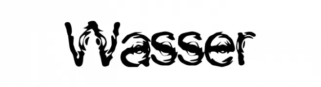
![Wasser تنزيل الخطوط]() تنزيل 951 التنزيلات@WebFont
تنزيل 951 التنزيلات@WebFont -
![rough Bold تنزيل الخطوط]() تنزيل 951 التنزيلات@WebFont
تنزيل 951 التنزيلات@WebFont -
( Fonts by Dieter Steffmann )
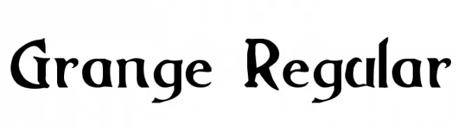
A bold, medieval-inspired serif font with sharp, angular features.
![Grange Regular تنزيل الخطوط]() تنزيل 951 التنزيلات@WebFont
تنزيل 951 التنزيلات@WebFont -
( Fonts by Dreadful Productions - http://usersites.horrorfind.com/home/horror/dreadful/ )
A bold, rugged font with a hand-drawn, distressed appearance.
![Last Man on Earth تنزيل الخطوط]() تنزيل 951 التنزيلات@WebFont
تنزيل 951 التنزيلات@WebFont -
( Fonts by Billy Argel - www.billyargel.com - Personal-use only. For commercial use please contact owner. )
A bold, playful font with a retro flair and decorative flourishes.
![Satisfaction تنزيل الخطوط]() تنزيل 951 التنزيلات@WebFont
تنزيل 951 التنزيلات@WebFont -
( Fonts by http://perso.calixo.net/~uzim/ )
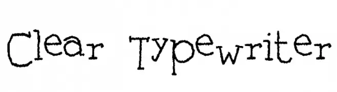
A vintage, typewriter-style font with a hand-drawn, monospaced design.
![Clear Typewriter تنزيل الخطوط]() تنزيل 951 التنزيلات@WebFont
تنزيل 951 التنزيلات@WebFont -
( Fonts by Jacob Fisher - www.pizzadude.dk )
A playful, handwritten font with a casual and friendly vibe.
![Schoolbully تنزيل الخطوط]() تنزيل 951 التنزيلات@WebFont
تنزيل 951 التنزيلات@WebFont -
( Fonts by dustBUST - Andreas Nylin )
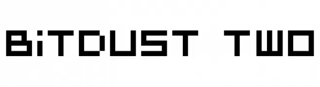
A bold, pixelated font with a geometric, digital aesthetic.
![BitDust Two تنزيل الخطوط]() تنزيل 951 التنزيلات@WebFont
تنزيل 951 التنزيلات@WebFont -
( Fonts by Zetafonts - Personal-use only. For commercial use please contact owner. )
A bold, italicized font with strong, dynamic strokes and a cohesive design.
![HeadingNow Trial 46 Bold Italic تنزيل الخطوط]() تنزيل 950 التنزيلات@WebFont
تنزيل 950 التنزيلات@WebFont -
( Fonts by Eko Bimantara - Personal-use only. For commercial use please contact owner. )
A bold, modern sans-serif font with clean lines and strong presence.
![HandoTrial-Bold تنزيل الخطوط]() تنزيل 950 التنزيلات@WebFont
تنزيل 950 التنزيلات@WebFont -
( Fonts by Vladimir Nikolic )
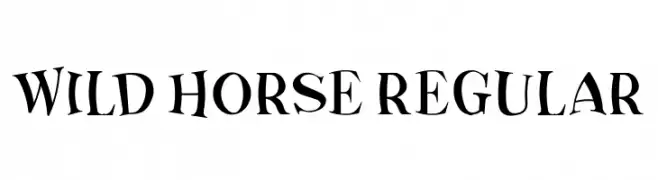
A dynamic and playful font with varying stroke widths and a whimsical style.
![Wild Horse Regular تنزيل الخطوط]() تنزيل 950 التنزيلات@WebFont
تنزيل 950 التنزيلات@WebFont -
( Fonts by Village Type and Design LLC & Cristiano Sobral - Personal-use only. For commercial use please contact owner. )
A bold, italicized sans-serif font with a modern and dynamic appearance.
![Tanohe Sans ExtraBold Italic تنزيل الخطوط]() تنزيل 950 التنزيلات@WebFont
تنزيل 950 التنزيلات@WebFont -
( Fonts by Windestrian- https://creativemarket.com/windestrian - Personal-use only. For commercial use please contact owner. )
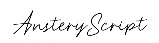
Elegant, flowing script font with connected characters.
![Anstery Script تنزيل الخطوط]() تنزيل 950 التنزيلات@WebFont
تنزيل 950 التنزيلات@WebFont -
![Son Of A Glitch Italic تنزيل الخطوط]() تنزيل 950 التنزيلات@WebFont
تنزيل 950 التنزيلات@WebFont -
( Fonts by Google - Personal-use only. For commercial use please contact owner. )
Bold, italic, and condensed typeface with a modern and dynamic style.
![Noto Sans Condensed Black Italic تنزيل الخطوط]() تنزيل 950 التنزيلات@WebFont
تنزيل 950 التنزيلات@WebFont -
![Germinabunt Regular Rough [DEMO] تنزيل الخطوط]() تنزيل 950 التنزيلات@WebFont
تنزيل 950 التنزيلات@WebFont -
( Dag@bert - binbei.jimdo.com/ )
A modern, geometric font with clean lines and rounded edges.
![Plagiata تنزيل الخطوط]() تنزيل 950 التنزيلات@WebFont
تنزيل 950 التنزيلات@WebFont -
( 7NTypes - Situjuh Nazara - 7ntypes.com )
A bold, rounded font with a playful and friendly style.
![Clambake October Six Bold تنزيل الخطوط]() تنزيل 950 التنزيلات@WebFont
تنزيل 950 التنزيلات@WebFont -
( Copyright (c) 2012-2015, The Mozilla Foundation and Telefonica S.A. )
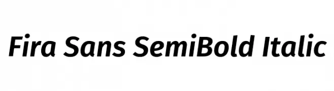
A modern, semi-bold italic sans-serif font with a dynamic and clean appearance.
![Fira Sans SemiBold Italic تنزيل الخطوط]() تنزيل 950 التنزيلات@WebFont
تنزيل 950 التنزيلات@WebFont -
( Fonts by Raquel Tavares )
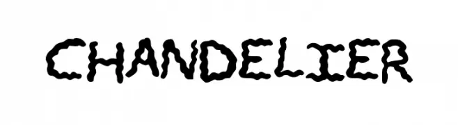
A bold, wavy, hand-drawn style font with an organic, playful appearance.
![CHANDELIER تنزيل الخطوط]() تنزيل 950 التنزيلات@WebFont
تنزيل 950 التنزيلات@WebFont -
![Chicken Hut تنزيل الخطوط]() تنزيل 950 التنزيلات@WebFont
تنزيل 950 التنزيلات@WebFont -
( Fonts by Castcraft Software - OPTI Fonts Archive - opti.netii.net - Personal-use only. For commercial use please contact owner. )
A playful, handwritten-style font with smooth curves and a casual vibe.
![OPTIRipple-Regular تنزيل الخطوط]() تنزيل 950 التنزيلات@WebFont
تنزيل 950 التنزيلات@WebFont -
( Fonts by Chris Vile - fontmonger.com - Personal-use only. For commercial use please contact owner. )
A bold, distressed font with rough, brush-like strokes for an edgy look.
![why so serious تنزيل الخطوط]() تنزيل 950 التنزيلات@WebFont
تنزيل 950 التنزيلات@WebFont


![Germinabunt Regular Rough [DEMO] تنزيل الخطوط](https://d144mzi0q5mijx.cloudfront.net/img/G/E/Germinabunt-Regular-Rough-DEMO.webp)


ما هي أبرز الخطوط الآن؟
تحظى Dotchaos, junko typewriter, Cosmic Age, Comic Zine and Determination (RUS BY LYAJKA) بشعبية لخطوطها النظيفة وتطبيقاتها الواسعة — من الهوية البصرية إلى الصفحات المقصودة والملصقات.
أي الخطوط تُستخدم كثيرًا في الشعارات؟
تُعد السان سيريف الهندسية (مثل Poppins وعائلات على نمط Gotham) خيارًا شائعًا لعلامات نظيفة قابلة للتوسع. ولإضفاء طابع ودي، تبقى السكريبت واليدوية خيارًا كلاسيكيًا. اجمع عنوانًا بارزًا مع خط نصي محايد لتحقيق التوازن والتميّز.
كم مرة يتم تحديث قائمة أعلى الخطوط؟
نحدّثها بانتظام استنادًا إلى التنزيلات والنشاط الفعلي. عُد إليها كثيرًا لاكتشاف النجوم الصاعدة مبكرًا.
💡 نصيحة: أضف هذه الصفحة إلى العلامات — تتغير الاتجاهات بسرعة وقد تُلهم خطوط اليوم الرائجة إعادة العلامة غدًا.