مرحبًا بك في قسم أعلى الخطوط — حيث تلتقي الشعبية بالجودة. هذه هي الخطوط الأكثر تنزيلًا واستخدامًا هذا العام من قبل مجتمعنا. إذا كنت بحاجة إلى اختيار موثوق للشعارات أو الويب أو وسائل التواصل، فابدأ من هنا.
يتميز كل خط رائج بتوازن جيد وقابلية قراءة وتعدد استخدامات. ستجد سان سيريف حديثة، وسكريبتات أنيقة، وسيريف كلاسيكية، وخطوط عرض minimal مختارة بعناية.
-
( Fonts by Ahmad Syarif Afandi - https://delapan.studio - Personal-use only. For commercial use please contact owner. )
A playful handwritten font with smooth, rounded letterforms.
 تنزيل 488 التنزيلات@WebFont
 -
![JungleLeaves تنزيل الخطوط]() تنزيل 488 التنزيلات@WebFont
تنزيل 488 التنزيلات@WebFont -
( Fonts by James Barnardo - Personal-use only. For commercial use please contact owner. )
A bold, modern font with rounded edges and a geometric structure.
![Coyote تنزيل الخطوط]() تنزيل 488 التنزيلات@WebFont
تنزيل 488 التنزيلات@WebFont -
( Fonts by Graham Meade - GemFonts )
A bold, outlined font with a modern, industrial feel and three-dimensional appearance.
![Impressed Metal تنزيل الخطوط]() تنزيل 488 التنزيلات@WebFont
تنزيل 488 التنزيلات@WebFont -
( Please check www.otlab.ru before you use this font! )
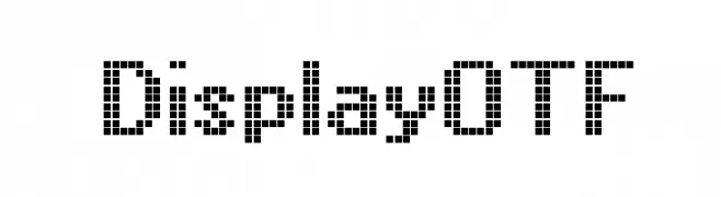
A pixelated, retro-style font with a blocky, geometric design.
![DisplayOTF تنزيل الخطوط]() تنزيل 488 التنزيلات@WebFont
تنزيل 488 التنزيلات@WebFont -
( Fonts by B85 - Personal-use only. For commercial use please contact owner. )
A sharp, graffiti-inspired font with elongated, edgy characters.
![Ozone Original تنزيل الخطوط]() تنزيل 488 التنزيلات@WebFont
تنزيل 488 التنزيلات@WebFont -
( Fonts by a Neale Davidson - www.pixelsagas.com. Personal-use only. For commercial use please contact owner. )
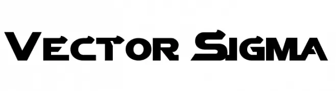
A bold, geometric font with a futuristic and industrial style.
![Vector Sigma تنزيل الخطوط]() تنزيل 488 التنزيلات@WebFont
تنزيل 488 التنزيلات@WebFont -
( Fonts by blue studio09 - Personal-use only. For commercial use please contact owner. )
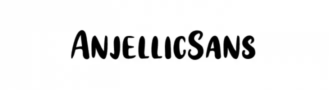
A bold, playful handwritten font with rounded, slightly irregular letterforms.
![Anjellic Sans تنزيل الخطوط]() تنزيل 488 التنزيلات@WebFont
تنزيل 488 التنزيلات@WebFont -
![ST Ember تنزيل الخطوط]() تنزيل 488 التنزيلات@WebFont
تنزيل 488 التنزيلات@WebFont -
( Copyright (c) 2014 Claus Eggers Sørensen (es@forthehearts.net) )
A classic serif typeface with sharp serifs and high contrast, exuding elegance and tradition.
![Inknut Antiqua تنزيل الخطوط]() تنزيل 488 التنزيلات@WebFont
تنزيل 488 التنزيلات@WebFont


ما هي أبرز الخطوط الآن؟
تحظى NinaninutRegular, JungleLeaves, Coyote, Impressed Metal and DisplayOTF بشعبية لخطوطها النظيفة وتطبيقاتها الواسعة — من الهوية البصرية إلى الصفحات المقصودة والملصقات.
أي الخطوط تُستخدم كثيرًا في الشعارات؟
تُعد السان سيريف الهندسية (مثل Poppins وعائلات على نمط Gotham) خيارًا شائعًا لعلامات نظيفة قابلة للتوسع. ولإضفاء طابع ودي، تبقى السكريبت واليدوية خيارًا كلاسيكيًا. اجمع عنوانًا بارزًا مع خط نصي محايد لتحقيق التوازن والتميّز.
كم مرة يتم تحديث قائمة أعلى الخطوط؟
نحدّثها بانتظام استنادًا إلى التنزيلات والنشاط الفعلي. عُد إليها كثيرًا لاكتشاف النجوم الصاعدة مبكرًا.
💡 نصيحة: أضف هذه الصفحة إلى العلامات — تتغير الاتجاهات بسرعة وقد تُلهم خطوط اليوم الرائجة إعادة العلامة غدًا.