مرحبًا بك في قسم أعلى الخطوط — حيث تلتقي الشعبية بالجودة. هذه هي الخطوط الأكثر تنزيلًا واستخدامًا هذا العام من قبل مجتمعنا. إذا كنت بحاجة إلى اختيار موثوق للشعارات أو الويب أو وسائل التواصل، فابدأ من هنا.
يتميز كل خط رائج بتوازن جيد وقابلية قراءة وتعدد استخدامات. ستجد سان سيريف حديثة، وسكريبتات أنيقة، وسيريف كلاسيكية، وخطوط عرض minimal مختارة بعناية.
-
( Fonts by www.peter-wiegel.de. Personal-use only. For commercial use please contact owner. )
An elegant script font with flowing, connected letterforms and classic calligraphic style.
 تنزيل 489 التنزيلات@WebFont
 -
( Noto is a trademark of Google Inc. Noto fonts are open source. All Noto fonts are published under the SIL Open Font License, Version 1.1 )
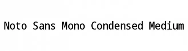
A clean, modern monospaced font with a condensed, medium-weight design.
![Noto Sans Mono Condensed Medium تنزيل الخطوط]() تنزيل 489 التنزيلات@WebFont
تنزيل 489 التنزيلات@WebFont -
( Fonts by www.fontalicious.com )
A bold, rugged font with thick, irregular strokes and a distressed appearance.
![Rusty تنزيل الخطوط]() تنزيل 489 التنزيلات@WebFont
تنزيل 489 التنزيلات@WebFont -
( Fonts by Castcraft Software - opti.netii.net - check the website before use )
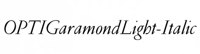
A classic serif typeface with an elegant italic style and light strokes.
![OPTIGaramondLight-Italic تنزيل الخطوط]() تنزيل 489 التنزيلات@WebFont
تنزيل 489 التنزيلات@WebFont -
( Fonts by Daniel Zadorozny - www.iconian.com - Free for personal use )
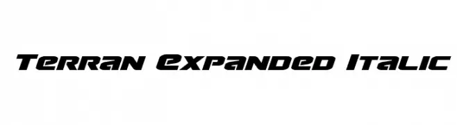
A bold, italicized, and expanded font with a futuristic and dynamic style.
![Terran Expanded Italic تنزيل الخطوط]() تنزيل 489 التنزيلات@WebFont
تنزيل 489 التنزيلات@WebFont -
-
( Copyright (c) 2015 Ek Type (www.ektype.in) )
A bold, rounded font with smooth curves and a friendly appearance.
![Baloo Tamma 2 Bold تنزيل الخطوط]() تنزيل 489 التنزيلات@WebFont
تنزيل 489 التنزيلات@WebFont -
( These fonts are free to use in any private, recreational manner.For commercial go to www.flopdesign.com/fordesign/font.html )
A playful, modern font with rounded, bold characters.
![SAKURAalp تنزيل الخطوط]() تنزيل 489 التنزيلات@WebFont
تنزيل 489 التنزيلات@WebFont -
![F'Earth تنزيل الخطوط]() تنزيل 489 التنزيلات@WebFont
تنزيل 489 التنزيلات@WebFont -
( Fonts by Andrew Hart - dirt2.com )
A modern, geometric font with clean lines and rounded edges.
![Ganix Apec تنزيل الخطوط]() تنزيل 489 التنزيلات@WebFont
تنزيل 489 التنزيلات@WebFont -
( Fonts by www.DigitalDreamDesign.net )
A bold, oblique font with a futuristic and dynamic style.
![D3 Cosmism Katakana Oblique تنزيل الخطوط]() تنزيل 489 التنزيلات@WebFont
تنزيل 489 التنزيلات@WebFont


ما هي أبرز الخطوط الآن؟
تحظى Feronia, Noto Sans Mono Condensed Medium, Rusty, OPTIGaramondLight-Italic and Terran Expanded Italic بشعبية لخطوطها النظيفة وتطبيقاتها الواسعة — من الهوية البصرية إلى الصفحات المقصودة والملصقات.
أي الخطوط تُستخدم كثيرًا في الشعارات؟
تُعد السان سيريف الهندسية (مثل Poppins وعائلات على نمط Gotham) خيارًا شائعًا لعلامات نظيفة قابلة للتوسع. ولإضفاء طابع ودي، تبقى السكريبت واليدوية خيارًا كلاسيكيًا. اجمع عنوانًا بارزًا مع خط نصي محايد لتحقيق التوازن والتميّز.
كم مرة يتم تحديث قائمة أعلى الخطوط؟
نحدّثها بانتظام استنادًا إلى التنزيلات والنشاط الفعلي. عُد إليها كثيرًا لاكتشاف النجوم الصاعدة مبكرًا.
💡 نصيحة: أضف هذه الصفحة إلى العلامات — تتغير الاتجاهات بسرعة وقد تُلهم خطوط اليوم الرائجة إعادة العلامة غدًا.