مرحبًا بك في قسم أعلى الخطوط — حيث تلتقي الشعبية بالجودة. هذه هي الخطوط الأكثر تنزيلًا واستخدامًا هذا العام من قبل مجتمعنا. إذا كنت بحاجة إلى اختيار موثوق للشعارات أو الويب أو وسائل التواصل، فابدأ من هنا.
يتميز كل خط رائج بتوازن جيد وقابلية قراءة وتعدد استخدامات. ستجد سان سيريف حديثة، وسكريبتات أنيقة، وسيريف كلاسيكية، وخطوط عرض minimal مختارة بعناية.
-
( Michael D. Adams - www.triskele.com/roadgeek-fonts/ )
A modern, geometric sans-serif font with uniform strokes and high readability.
 تنزيل 657 التنزيلات@WebFont
 -
( Typodermic Fonts - Ray Larabie - www.typodermicfonts.com/ )
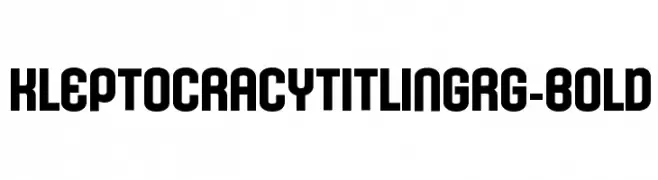
A bold, geometric font with high contrast and a modern aesthetic.
![KleptocracyTitlingRg-Bold تنزيل الخطوط]() تنزيل 657 التنزيلات@WebFont
تنزيل 657 التنزيلات@WebFont -
( Fonts by www.woodcutter.es - woodcutter Manero - Personal-use only. For commercial use please contact owner. )
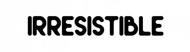
A bold, playful font with rounded edges and a modern style.
![Irresistible تنزيل الخطوط]() تنزيل 657 التنزيلات@WebFont
تنزيل 657 التنزيلات@WebFont -
( Fonts by A. M. )
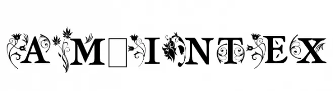
An ornate, decorative font with floral embellishments on uppercase letters.
![am_intex تنزيل الخطوط]() تنزيل 657 التنزيلات@WebFont
تنزيل 657 التنزيلات@WebFont -
( Copyright (c) 2015 Indian Type Foundry (info@indiantypefoundry.com) )
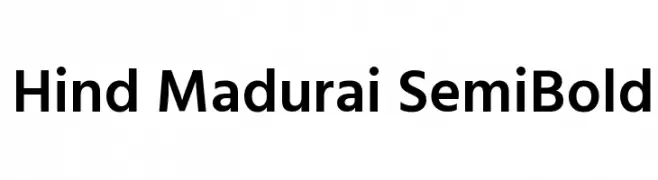
A clean, modern sans-serif font with a semi-bold weight and geometric structure.
![Hind Madurai SemiBold تنزيل الخطوط]() تنزيل 657 التنزيلات@WebFont
تنزيل 657 التنزيلات@WebFont -
-
![Topeka تنزيل الخطوط]() تنزيل 657 التنزيلات@WebFont
تنزيل 657 التنزيلات@WebFont -
( dccanim.deviantart.com )
A playful, handwritten font with rounded, consistent strokes and a casual feel.
![DCC-AnatoliaClasic تنزيل الخطوط]() تنزيل 657 التنزيلات@WebFont
تنزيل 657 التنزيلات@WebFont -
( Fonts by Arkandis Digital Foundry )
A bold, oblique font with a dynamic and impactful style.
![VenturisSansADFHeavy-Oblique تنزيل الخطوط]() تنزيل 657 التنزيلات@WebFont
تنزيل 657 التنزيلات@WebFont -
( Fonts by billyargel.blogspot.com - Billy Argel )
A bold, modern geometric font with a sleek and professional appearance.
![NORMAL تنزيل الخطوط]() تنزيل 657 التنزيلات@WebFont
تنزيل 657 التنزيلات@WebFont -
( Copyright (c) 2011 by LatinoType Limitada (luciano@latinotype.com) )
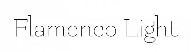
A thin, elegant font with a modern and sophisticated style.
![Flamenco Light تنزيل الخطوط]() تنزيل 657 التنزيلات@WebFont
تنزيل 657 التنزيلات@WebFont
ما هي أبرز الخطوط الآن؟
تحظى Roadgeek 2005 Series D, KleptocracyTitlingRg-Bold, Irresistible, am_intex and Hind Madurai SemiBold بشعبية لخطوطها النظيفة وتطبيقاتها الواسعة — من الهوية البصرية إلى الصفحات المقصودة والملصقات.
أي الخطوط تُستخدم كثيرًا في الشعارات؟
تُعد السان سيريف الهندسية (مثل Poppins وعائلات على نمط Gotham) خيارًا شائعًا لعلامات نظيفة قابلة للتوسع. ولإضفاء طابع ودي، تبقى السكريبت واليدوية خيارًا كلاسيكيًا. اجمع عنوانًا بارزًا مع خط نصي محايد لتحقيق التوازن والتميّز.
كم مرة يتم تحديث قائمة أعلى الخطوط؟
نحدّثها بانتظام استنادًا إلى التنزيلات والنشاط الفعلي. عُد إليها كثيرًا لاكتشاف النجوم الصاعدة مبكرًا.
💡 نصيحة: أضف هذه الصفحة إلى العلامات — تتغير الاتجاهات بسرعة وقد تُلهم خطوط اليوم الرائجة إعادة العلامة غدًا.