مرحبًا بك في قسم أعلى الخطوط — حيث تلتقي الشعبية بالجودة. هذه هي الخطوط الأكثر تنزيلًا واستخدامًا هذا العام من قبل مجتمعنا. إذا كنت بحاجة إلى اختيار موثوق للشعارات أو الويب أو وسائل التواصل، فابدأ من هنا.
يتميز كل خط رائج بتوازن جيد وقابلية قراءة وتعدد استخدامات. ستجد سان سيريف حديثة، وسكريبتات أنيقة، وسيريف كلاسيكية، وخطوط عرض minimal مختارة بعناية.
-
( Fonts by imagex )
A playful, collage-style font with a hand-drawn, chalk-like texture.
 تنزيل 124 التنزيلات@WebFont
 -
( Fonts by Woodcutter Manero - www.woodcutter.es - Personal-use only. For commercial use please contact owner. )
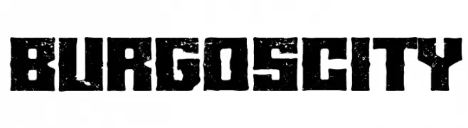
A bold, distressed font with a rugged, vintage appearance.
![Burgos city تنزيل الخطوط]() تنزيل 124 التنزيلات@WebFont
تنزيل 124 التنزيلات@WebFont -
( Fonts by a Des Gomez. Personal-use only. For commercial use please contact owner. )
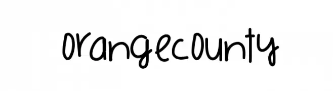
A playful, handwritten font with a casual and friendly vibe.
![OrangeCounty تنزيل الخطوط]() تنزيل 124 التنزيلات@WebFont
تنزيل 124 التنزيلات@WebFont -
( Fonts by www.junkohanhero.com - Personal-use only. For commercial use please contact owner. )
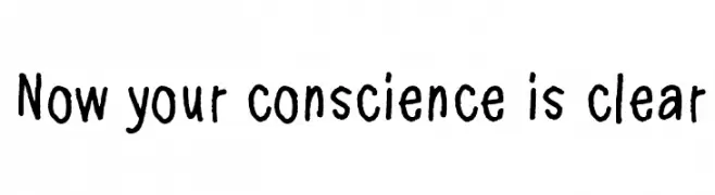
A playful, handwritten font with a casual and friendly style.
![Now your conscience is clear تنزيل الخطوط]() تنزيل 124 التنزيلات@WebFont
تنزيل 124 التنزيلات@WebFont -
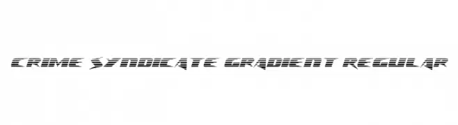
( Fonts by Daniel Zadorozny - www.iconian.com - Free for personal use )
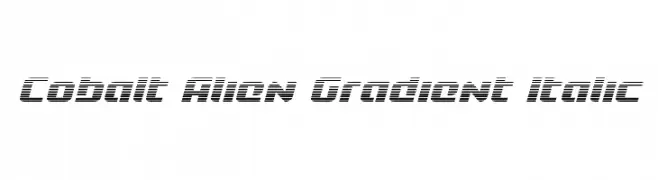
A bold, futuristic font with a gradient effect and angular, geometric shapes.
![Crime Syndicate Gradient Regular تنزيل الخطوط]() تنزيل 124 التنزيلات@WebFont
تنزيل 124 التنزيلات@WebFont -
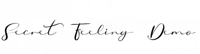
( Fonts by Edric Studio - Personal-use only. For commercial use please contact owner. )
A cursive, handwritten font with elegant, flowing strokes and dynamic contrast.
![Secret Feeling Demo تنزيل الخطوط]() تنزيل 124 التنزيلات@WebFont
تنزيل 124 التنزيلات@WebFont -
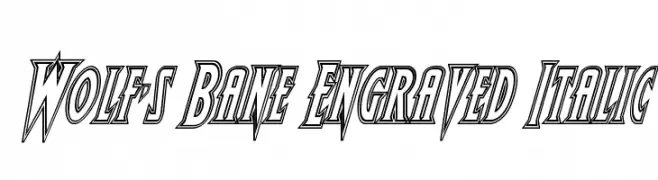
( Fonts by Daniel Zadorozny - www.iconian.com - Free for personal use )
A bold, italic font with sharp, engraved lines and a dynamic, three-dimensional style.
![Wolf's Bane Engraved Italic تنزيل الخطوط]() تنزيل 124 التنزيلات@WebFont
تنزيل 124 التنزيلات@WebFont -
( Fonts by PressGang Studios )
A dynamic, hand-drawn font with a rough, edgy style.
![Outrage PG تنزيل الخطوط]() تنزيل 124 التنزيلات@WebFont
تنزيل 124 التنزيلات@WebFont -
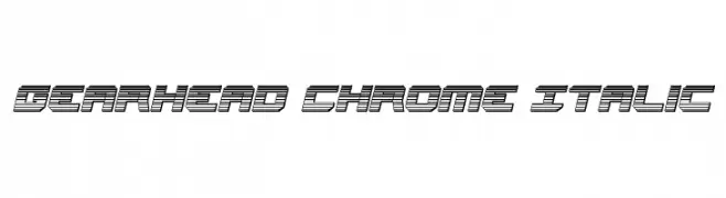
( Fonts by Daniel Zadorozny - www.iconian.com - Free for personal use )
A bold, futuristic font with a chrome-like, layered design and italicized slant.
![Gearhead Chrome Italic تنزيل الخطوط]() تنزيل 124 التنزيلات@WebFont
تنزيل 124 التنزيلات@WebFont -
( Fonts by Geronimo Fonts - Personal-use only. For commercial use please contact owner. )
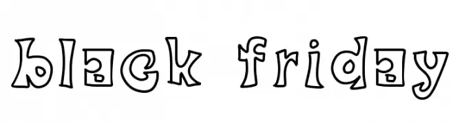
A playful, hand-drawn font with bold outlines and a whimsical style.
![black friday تنزيل الخطوط]() تنزيل 124 التنزيلات@WebFont
تنزيل 124 التنزيلات@WebFont -
( Fonts by Daniel Zadorozny - www.iconian.com )
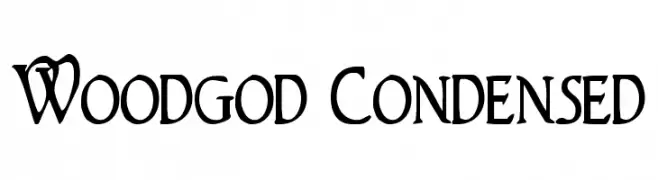
A decorative, condensed serif font with artistic and whimsical elements.
![Woodgod Condensed تنزيل الخطوط]() تنزيل 124 التنزيلات@WebFont
تنزيل 124 التنزيلات@WebFont -
( Fonts by Din Studio - Donis Miftahudin - Personal-use only. For commercial use please contact owner. )
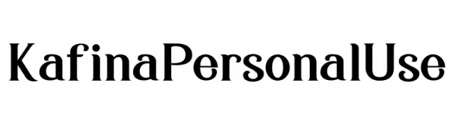
A bold and elegant serif font with strong strokes and slightly curved serifs.
![Kafina Personal Use تنزيل الخطوط]() تنزيل 124 التنزيلات@WebFont
تنزيل 124 التنزيلات@WebFont -
( Fonts by Maulana Creative )
A lively, handwritten cursive font with fluid, connected strokes.
![Hooney Vibes Free Regular تنزيل الخطوط]() تنزيل 124 التنزيلات@WebFont
تنزيل 124 التنزيلات@WebFont -
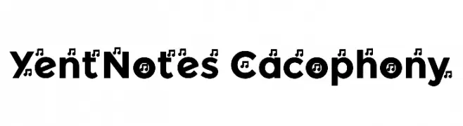
![YentNotes Cacophony تنزيل الخطوط]() تنزيل 124 التنزيلات@WebFont
تنزيل 124 التنزيلات@WebFont -
( Fonts by wep - Wahyu Eka Prasetya - Personal-use only. For commercial use please contact owner. )
A bold, cursive font with dynamic flow and interconnected letters.
![Asalkan_ تنزيل الخطوط]() تنزيل 124 التنزيلات@WebFont
تنزيل 124 التنزيلات@WebFont -
( Fonts by Denny Subagja )
A playful, hand-drawn font with whimsical, decorative elements.
![Arsyi تنزيل الخطوط]() تنزيل 124 التنزيلات@WebFont
تنزيل 124 التنزيلات@WebFont -
( Fonts by Daniel Zadorozny - www.iconian.com - Free for personal use )
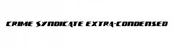
A bold, extra-condensed font with sharp, angular edges and a futuristic style.
![Crime Syndicate Extra-condensed تنزيل الخطوط]() تنزيل 124 التنزيلات@WebFont
تنزيل 124 التنزيلات@WebFont -
( Fonts by Woodcutter )
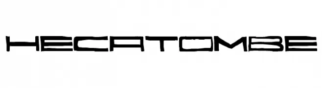
A bold, futuristic font with geometric and angular design elements.
![Hecatombe تنزيل الخطوط]() تنزيل 124 التنزيلات@WebFont
تنزيل 124 التنزيلات@WebFont -
( Fonts by Televo - Personal-use only. For commercial use please contact owner. )
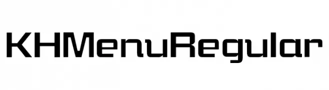
A modern, geometric font with bold, clean lines and a slightly condensed style.
![KHMenu Regular تنزيل الخطوط]() تنزيل 124 التنزيلات@WebFont
تنزيل 124 التنزيلات@WebFont -
( Hugo Beyts )
A bold, blocky font with rounded edges and a vintage western flair.
![John Wayne Ford تنزيل الخطوط]() تنزيل 124 التنزيلات@WebFont
تنزيل 124 التنزيلات@WebFont -
( Zess Type - zesstype.com/ )
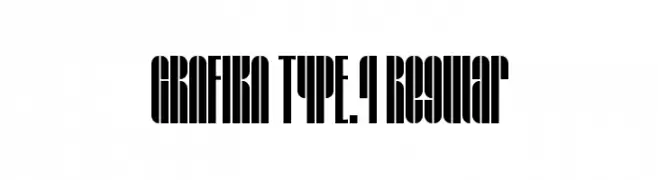
A bold, geometric font with a condensed and modern style.
![GRAFIKA TYPE.4 Regular تنزيل الخطوط]() تنزيل 124 التنزيلات@WebFont
تنزيل 124 التنزيلات@WebFont -
( Fonts by AlifRyanZulfikar - Personal-use only. For commercial use please contact owner. )
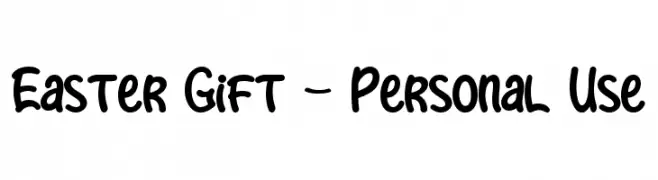
A playful, bold, and rounded hand-drawn font with a whimsical style.
![Easter Gift - Personal Use تنزيل الخطوط]() تنزيل 124 التنزيلات@WebFont
تنزيل 124 التنزيلات@WebFont -
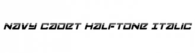
![Navy Cadet Halftone Italic تنزيل الخطوط]() تنزيل 124 التنزيلات@WebFont
تنزيل 124 التنزيلات@WebFont -
( Fonts by www.woodcutter.es - woodcutter Manero - Personal-use only. For commercial use please contact owner. )
A bold, dripping font perfect for horror-themed designs.
![VENGANZA تنزيل الخطوط]() تنزيل 124 التنزيلات@WebFont
تنزيل 124 التنزيلات@WebFont -
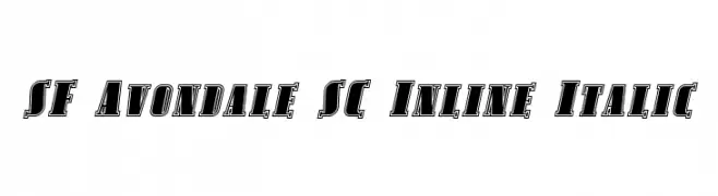
![SF Avondale SC Inline Italic تنزيل الخطوط]() تنزيل 124 التنزيلات@WebFont
تنزيل 124 التنزيلات@WebFont -
( Fonts by YOFonts - Yasuhiro Yamaoka - yoworks.com - Personal-use only. For commercial use please contact owner. )
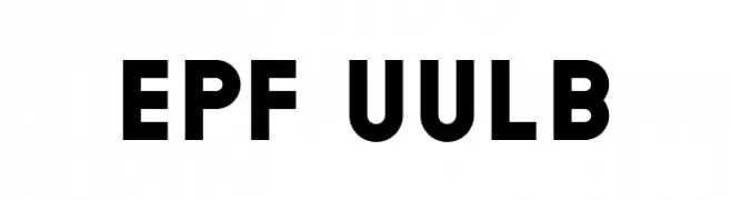
A bold, geometric sans-serif font with strong, modern letterforms.
![EPF UULB تنزيل الخطوط]() تنزيل 124 التنزيلات@WebFont
تنزيل 124 التنزيلات@WebFont -
( Fonts by Daniel Zadorozny - www.iconian.com - Personal-use only. For commercial use please contact owner. )
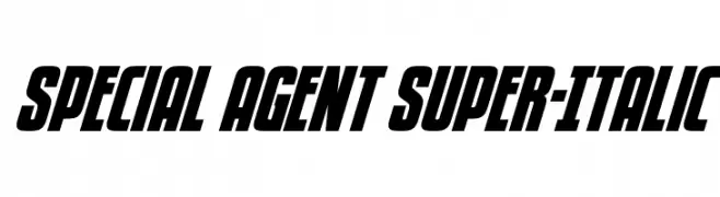
A bold, italic font with high contrast and tight spacing, ideal for impactful designs.
![Special Agent Super-Italic تنزيل الخطوط]() تنزيل 124 التنزيلات@WebFont
تنزيل 124 التنزيلات@WebFont -
( Fonts by www.woodcutter.es - woodcutter Manero - Personal-use only. For commercial use please contact owner. )
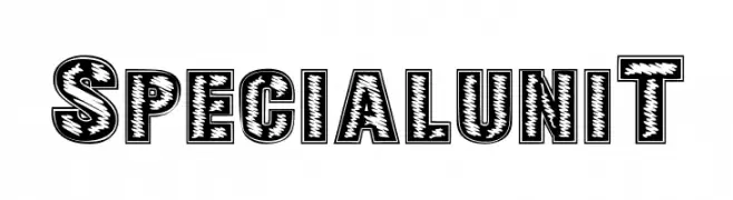
A bold, decorative font with a textured, engraved appearance.
![SPECIAL UNIT تنزيل الخطوط]() تنزيل 124 التنزيلات@WebFont
تنزيل 124 التنزيلات@WebFont -
( Fonts by Manjali Studio - Personal-use only. For commercial use please contact owner. )
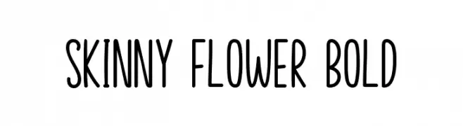
A tall, slender, and playful font with consistent strokes and a modern style.
![Skinny Flower Bold تنزيل الخطوط]() تنزيل 124 التنزيلات@WebFont
تنزيل 124 التنزيلات@WebFont -
( Fonts by Prioritype )
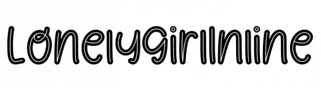
A playful, hand-drawn inline font with rounded, whimsical characters.
![Lonely Girl Inline تنزيل الخطوط]() تنزيل 124 التنزيلات@WebFont
تنزيل 124 التنزيلات@WebFont -
( Fonts by Manuel Ramos - www.infinitismo.com - Personal-use only. For commercial use please contact owner. )
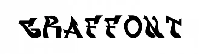
A bold, graffiti-inspired font with sharp, angular edges and dynamic styling.
![graffont تنزيل الخطوط]() تنزيل 124 التنزيلات@WebFont
تنزيل 124 التنزيلات@WebFont -
![DLDesignsFour تنزيل الخطوط]() تنزيل 124 التنزيلات@WebFont
تنزيل 124 التنزيلات@WebFont -
( Fonts by Motokiwo - Anton Cahyono - Personal-use only. For commercial use please contact owner. )
A modern, handwritten font with elegant, fluid strokes and dynamic character design.
![Storytelling تنزيل الخطوط]() تنزيل 124 التنزيلات@WebFont
تنزيل 124 التنزيلات@WebFont -
![Cobalt Alien Gradient Italic تنزيل الخطوط]() تنزيل 124 التنزيلات@WebFont
تنزيل 124 التنزيلات@WebFont -
( Fonts by Sooz Susana - Personal-use only. For commercial use please contact owner. )
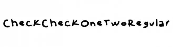
A playful, handwritten font with a casual and friendly style.
![Check Check One Two Regular تنزيل الخطوط]() تنزيل 124 التنزيلات@WebFont
تنزيل 124 التنزيلات@WebFont


ما هي أبرز الخطوط الآن؟
تحظى Craps of Paper, Burgos city, OrangeCounty, Now your conscience is clear and Crime Syndicate Gradient Regular بشعبية لخطوطها النظيفة وتطبيقاتها الواسعة — من الهوية البصرية إلى الصفحات المقصودة والملصقات.
أي الخطوط تُستخدم كثيرًا في الشعارات؟
تُعد السان سيريف الهندسية (مثل Poppins وعائلات على نمط Gotham) خيارًا شائعًا لعلامات نظيفة قابلة للتوسع. ولإضفاء طابع ودي، تبقى السكريبت واليدوية خيارًا كلاسيكيًا. اجمع عنوانًا بارزًا مع خط نصي محايد لتحقيق التوازن والتميّز.
كم مرة يتم تحديث قائمة أعلى الخطوط؟
نحدّثها بانتظام استنادًا إلى التنزيلات والنشاط الفعلي. عُد إليها كثيرًا لاكتشاف النجوم الصاعدة مبكرًا.
💡 نصيحة: أضف هذه الصفحة إلى العلامات — تتغير الاتجاهات بسرعة وقد تُلهم خطوط اليوم الرائجة إعادة العلامة غدًا.