مرحبًا بك في قسم أعلى الخطوط — حيث تلتقي الشعبية بالجودة. هذه هي الخطوط الأكثر تنزيلًا واستخدامًا هذا العام من قبل مجتمعنا. إذا كنت بحاجة إلى اختيار موثوق للشعارات أو الويب أو وسائل التواصل، فابدأ من هنا.
يتميز كل خط رائج بتوازن جيد وقابلية قراءة وتعدد استخدامات. ستجد سان سيريف حديثة، وسكريبتات أنيقة، وسيريف كلاسيكية، وخطوط عرض minimal مختارة بعناية.
-
( Fonts by Manfred Klein. Free for private and charity use. Free for commercial with donation to organizations )
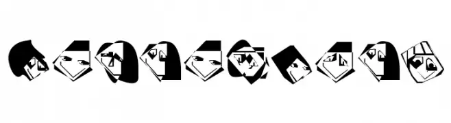
A playful, face-themed decorative font with bold geometric shapes.
 تنزيل 96 التنزيلات@WebFont
 -
( Fonts by junkohanhero )
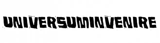
A bold, distressed font with rugged, uneven strokes and a vintage, industrial feel.
![Universum Invenire تنزيل الخطوط]() تنزيل 96 التنزيلات@WebFont
تنزيل 96 التنزيلات@WebFont -
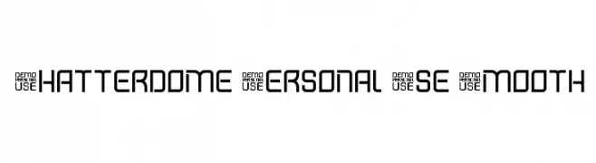
![Shatterdome Personal Use Smooth تنزيل الخطوط]() تنزيل 96 التنزيلات@WebFont
تنزيل 96 التنزيلات@WebFont -
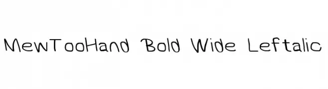
![MewTooHand Bold Wide Leftalic تنزيل الخطوط]() تنزيل 96 التنزيلات@WebFont
تنزيل 96 التنزيلات@WebFont -
( Fonts by Goodrichees - Ainur Fariz - Personal-use only. For commercial use please contact owner. )
A lively and elegant script font with flowing, cursive letterforms.
![Alicia تنزيل الخطوط]() تنزيل 96 التنزيلات@WebFont
تنزيل 96 التنزيلات@WebFont -
-
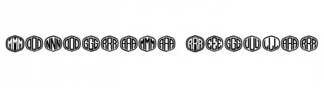
( Fonts by Vladimir Nikolic - https://www.creativefabrica.com/product/educated-deers/ref/144265/ - Personal-use only. For commercial use please contact owner. )
A bold, geometric monogram font with characters enclosed in hexagons.
![Monograma Regular تنزيل الخطوط]() تنزيل 96 التنزيلات@WebFont
تنزيل 96 التنزيلات@WebFont -
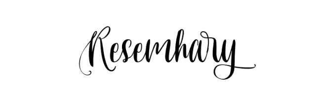
( Fonts by www.movefont .com - Personal-use only. For commercial use please contact owner. )
An elegant, flowing script font with intricate swirls and loops.
![Resemhary تنزيل الخطوط]() تنزيل 96 التنزيلات@WebFont
تنزيل 96 التنزيلات@WebFont -
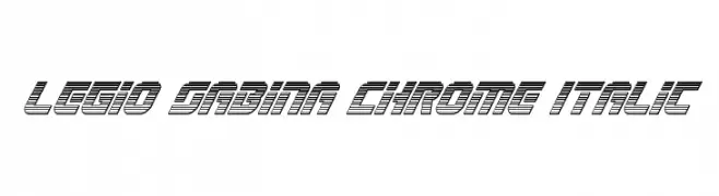
( Iconian Fonts - Daniel Zadorozny - www.iconian.com )
A bold, italicized font with a futuristic, chrome-like striped design.
![Legio Sabina Chrome Italic تنزيل الخطوط]() تنزيل 96 التنزيلات@WebFont
تنزيل 96 التنزيلات@WebFont -
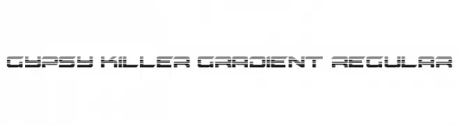
( Fonts by Daniel Zadorozny - www.iconian.com - Free for personal use )
A bold, futuristic font with a gradient effect and tight character spacing.
![Gypsy Killer Gradient Regular تنزيل الخطوط]() تنزيل 96 التنزيلات@WebFont
تنزيل 96 التنزيلات@WebFont -
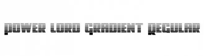
( Fonts by Iconian Fonts - Daniel Zadorozny )
A bold, futuristic font with a gradient effect created by horizontal lines.
![Power Lord Gradient Regular تنزيل الخطوط]() تنزيل 96 التنزيلات@WebFont
تنزيل 96 التنزيلات@WebFont

ما هي أبرز الخطوط الآن؟
تحظى EdgedFaces, Universum Invenire, Shatterdome Personal Use Smooth, MewTooHand Bold Wide Leftalic and Alicia بشعبية لخطوطها النظيفة وتطبيقاتها الواسعة — من الهوية البصرية إلى الصفحات المقصودة والملصقات.
أي الخطوط تُستخدم كثيرًا في الشعارات؟
تُعد السان سيريف الهندسية (مثل Poppins وعائلات على نمط Gotham) خيارًا شائعًا لعلامات نظيفة قابلة للتوسع. ولإضفاء طابع ودي، تبقى السكريبت واليدوية خيارًا كلاسيكيًا. اجمع عنوانًا بارزًا مع خط نصي محايد لتحقيق التوازن والتميّز.
كم مرة يتم تحديث قائمة أعلى الخطوط؟
نحدّثها بانتظام استنادًا إلى التنزيلات والنشاط الفعلي. عُد إليها كثيرًا لاكتشاف النجوم الصاعدة مبكرًا.
💡 نصيحة: أضف هذه الصفحة إلى العلامات — تتغير الاتجاهات بسرعة وقد تُلهم خطوط اليوم الرائجة إعادة العلامة غدًا.