مرحبًا بك في قسم أعلى الخطوط — حيث تلتقي الشعبية بالجودة. هذه هي الخطوط الأكثر تنزيلًا واستخدامًا هذا العام من قبل مجتمعنا. إذا كنت بحاجة إلى اختيار موثوق للشعارات أو الويب أو وسائل التواصل، فابدأ من هنا.
يتميز كل خط رائج بتوازن جيد وقابلية قراءة وتعدد استخدامات. ستجد سان سيريف حديثة، وسكريبتات أنيقة، وسيريف كلاسيكية، وخطوط عرض minimal مختارة بعناية.
-
( Fonts by Manfred Klein. Free for private and charity use. Free for commercial with donation to organizations )
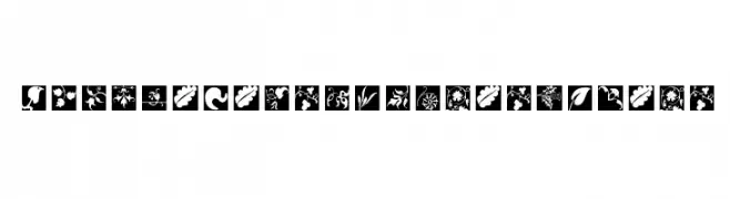
Square-framed floral and botanical decorative glyphs.
 تنزيل 96 التنزيلات@WebFont
 -
( Fonts by Geronimo Fonts - Personal-use only. For commercial use please contact owner. )
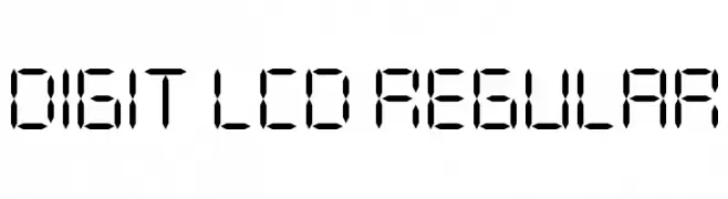
A segmented, geometric font inspired by classic LCD digital displays.
![DIGIT LCD Regular تنزيل الخطوط]() تنزيل 96 التنزيلات@WebFont
تنزيل 96 التنزيلات@WebFont -
( Iconian Fonts - Daniel Zadorozny - www.iconian.com )
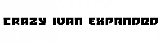
A bold, geometric font with sharp angles and an expanded width.
![Crazy Ivan Expanded تنزيل الخطوط]() تنزيل 96 التنزيلات@WebFont
تنزيل 96 التنزيلات@WebFont -
![SF Covington Rev Italic تنزيل الخطوط]() تنزيل 96 التنزيلات@WebFont
تنزيل 96 التنزيلات@WebFont -
![Stereofidelic-Regular تنزيل الخطوط]() تنزيل 96 التنزيلات@WebFont
تنزيل 96 التنزيلات@WebFont -
-
( Jmk - Jason Muriithi Kiama )
A bold, geometric font with rounded edges and a modern, playful style.
![Finger-Maniac Regular تنزيل الخطوط]() تنزيل 96 التنزيلات@WebFont
تنزيل 96 التنزيلات@WebFont -
( Fonts by Muhammad Yafinuha )
Hand-drawn botanical and geometric decorative set.
![Floresta تنزيل الخطوط]() تنزيل 96 التنزيلات@WebFont
تنزيل 96 التنزيلات@WebFont -
( Fonts by Woodcutter )
A bold, playful font with rounded, hand-drawn style characters.
![Supermarket of Love تنزيل الخطوط]() تنزيل 96 التنزيلات@WebFont
تنزيل 96 التنزيلات@WebFont -
( Fonts by a Max Infeld - XEROGRAPHER FONTS - xerographer.blogspot.com . Personal-use only. For commercial use please contact owner. )
A bold, distressed font with ink splatter effects for a grunge aesthetic.
![InkSpecial تنزيل الخطوط]() تنزيل 96 التنزيلات@WebFont
تنزيل 96 التنزيلات@WebFont -
( گالری فانت فارسی پژوهش آريانا - only compatible with Farsi and Arabic )
A bold, modern font with geometric lines and balanced spacing.
![Yaldaa تنزيل الخطوط]() تنزيل 96 التنزيلات@WebFont
تنزيل 96 التنزيلات@WebFont

ما هي أبرز الخطوط الآن؟
تحظى TypoJewelsSquaresInvers, DIGIT LCD Regular, Crazy Ivan Expanded, SF Covington Rev Italic and Stereofidelic-Regular بشعبية لخطوطها النظيفة وتطبيقاتها الواسعة — من الهوية البصرية إلى الصفحات المقصودة والملصقات.
أي الخطوط تُستخدم كثيرًا في الشعارات؟
تُعد السان سيريف الهندسية (مثل Poppins وعائلات على نمط Gotham) خيارًا شائعًا لعلامات نظيفة قابلة للتوسع. ولإضفاء طابع ودي، تبقى السكريبت واليدوية خيارًا كلاسيكيًا. اجمع عنوانًا بارزًا مع خط نصي محايد لتحقيق التوازن والتميّز.
كم مرة يتم تحديث قائمة أعلى الخطوط؟
نحدّثها بانتظام استنادًا إلى التنزيلات والنشاط الفعلي. عُد إليها كثيرًا لاكتشاف النجوم الصاعدة مبكرًا.
💡 نصيحة: أضف هذه الصفحة إلى العلامات — تتغير الاتجاهات بسرعة وقد تُلهم خطوط اليوم الرائجة إعادة العلامة غدًا.