مرحبًا بك في قسم أعلى الخطوط — حيث تلتقي الشعبية بالجودة. هذه هي الخطوط الأكثر تنزيلًا واستخدامًا هذا العام من قبل مجتمعنا. إذا كنت بحاجة إلى اختيار موثوق للشعارات أو الويب أو وسائل التواصل، فابدأ من هنا.
يتميز كل خط رائج بتوازن جيد وقابلية قراءة وتعدد استخدامات. ستجد سان سيريف حديثة، وسكريبتات أنيقة، وسيريف كلاسيكية، وخطوط عرض minimal مختارة بعناية.
-
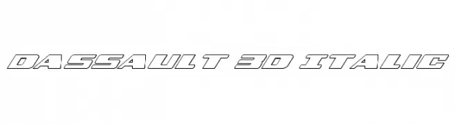
( Fonts by Daniel Zadorozny - www.iconian.com - Free for personal use )
A bold, 3D italic font with a futuristic and dynamic design.
 تنزيل 101 التنزيلات@WebFont
 -
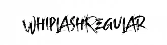
( Fonts by 38.lineart - Muhammad Ridha Agusni - Personal-use only. For commercial use please contact owner. )
A bold, brush-style font with dynamic and expressive strokes.
![Whiplash Regular تنزيل الخطوط]() تنزيل 101 التنزيلات@WebFont
تنزيل 101 التنزيلات@WebFont -
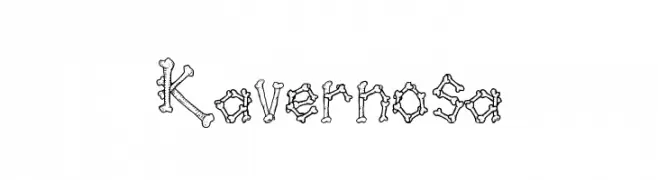
( Fonts by Galdino Otten )
A playful, bone-like decorative font with a hand-drawn aesthetic.
![Kavernosa تنزيل الخطوط]() تنزيل 101 التنزيلات@WebFont
تنزيل 101 التنزيلات@WebFont -
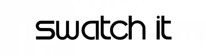
( Fonts by Samuel Park - Personal-use only. For commercial use please contact owner. )
A modern, geometric font with clean lines and rounded edges.
![Swatch it تنزيل الخطوط]() تنزيل 101 التنزيلات@WebFont
تنزيل 101 التنزيلات@WebFont -
( Elementype - www.facebook.com/elementype )
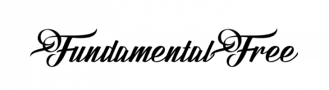
An elegant and flowing script font with decorative loops and swirls.
![FundamentalFree تنزيل الخطوط]() تنزيل 101 التنزيلات@WebFont
تنزيل 101 التنزيلات@WebFont -
-
( Fonts by Vladimir Nikolic )
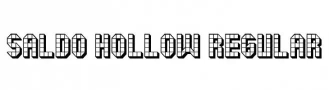
A geometric, hollow font with a grid-like, three-dimensional design.
![Saldo Hollow Regular تنزيل الخطوط]() تنزيل 101 التنزيلات@WebFont
تنزيل 101 التنزيلات@WebFont -
( Fonts by Iconian Fonts )
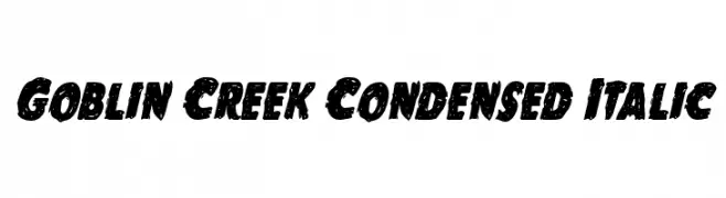
A bold, condensed, and italic font with jagged edges and dynamic style.
![Goblin Creek Condensed Italic تنزيل الخطوط]() تنزيل 101 التنزيلات@WebFont
تنزيل 101 التنزيلات@WebFont -
( Fonts by Subectype & Orenari )
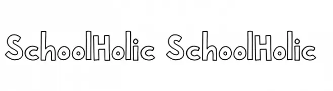
A playful, bold outline font with a hand-drawn aesthetic.
![School Holic 1 School Holic 1 تنزيل الخطوط]() تنزيل 101 التنزيلات@WebFont
تنزيل 101 التنزيلات@WebFont -
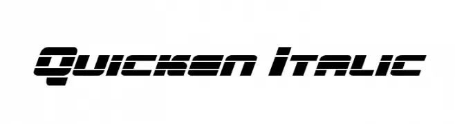
( Fonts by Daniel Zadorozny - www.iconian.com )
A bold, italicized font with a futuristic, segmented design.
![Quicken Italic تنزيل الخطوط]() تنزيل 101 التنزيلات@WebFont
تنزيل 101 التنزيلات@WebFont -
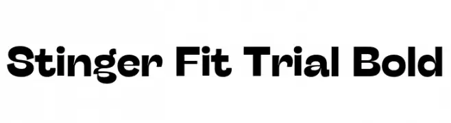
( Fonts by Zetafonts - Personal-use only. For commercial use please contact owner. )
A bold, modern font with clean lines and a strong presence.
![Stinger Fit Trial Bold تنزيل الخطوط]() تنزيل 101 التنزيلات@WebFont
تنزيل 101 التنزيلات@WebFont
ما هي أبرز الخطوط الآن؟
تحظى Dassault 3D Italic, Whiplash Regular, Kavernosa, Swatch it and FundamentalFree بشعبية لخطوطها النظيفة وتطبيقاتها الواسعة — من الهوية البصرية إلى الصفحات المقصودة والملصقات.
أي الخطوط تُستخدم كثيرًا في الشعارات؟
تُعد السان سيريف الهندسية (مثل Poppins وعائلات على نمط Gotham) خيارًا شائعًا لعلامات نظيفة قابلة للتوسع. ولإضفاء طابع ودي، تبقى السكريبت واليدوية خيارًا كلاسيكيًا. اجمع عنوانًا بارزًا مع خط نصي محايد لتحقيق التوازن والتميّز.
كم مرة يتم تحديث قائمة أعلى الخطوط؟
نحدّثها بانتظام استنادًا إلى التنزيلات والنشاط الفعلي. عُد إليها كثيرًا لاكتشاف النجوم الصاعدة مبكرًا.
💡 نصيحة: أضف هذه الصفحة إلى العلامات — تتغير الاتجاهات بسرعة وقد تُلهم خطوط اليوم الرائجة إعادة العلامة غدًا.