مرحبًا بك في قسم أعلى الخطوط — حيث تلتقي الشعبية بالجودة. هذه هي الخطوط الأكثر تنزيلًا واستخدامًا هذا العام من قبل مجتمعنا. إذا كنت بحاجة إلى اختيار موثوق للشعارات أو الويب أو وسائل التواصل، فابدأ من هنا.
يتميز كل خط رائج بتوازن جيد وقابلية قراءة وتعدد استخدامات. ستجد سان سيريف حديثة، وسكريبتات أنيقة، وسيريف كلاسيكية، وخطوط عرض minimal مختارة بعناية.
-
( Fonts by Dan P. Lyons - Personal-use only. For commercial use please contact owner. )
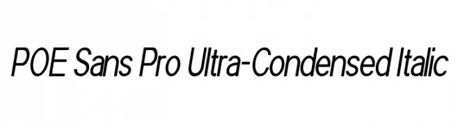
A modern, ultra-condensed sans-serif italic font with a sleek and dynamic style.
 تنزيل 102 التنزيلات@WebFont
 -
( Iconian Fonts - Daniel Zadorozny - www.iconian.com )
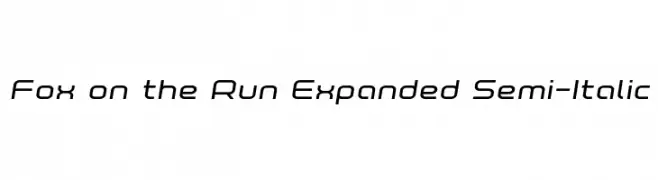
A modern, expanded semi-italic font with smooth curves and consistent stroke thickness.
![Fox on the Run Expanded Semi-Italic تنزيل الخطوط]() تنزيل 102 التنزيلات@WebFont
تنزيل 102 التنزيلات@WebFont -
( volcanolam.comxa.com )
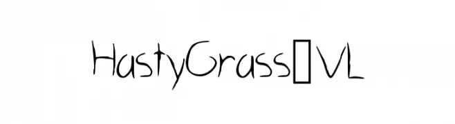
A whimsical, hand-drawn font with playful, uneven strokes and a dynamic feel.
![HastyGrass_VL تنزيل الخطوط]() تنزيل 102 التنزيلات@WebFont
تنزيل 102 التنزيلات@WebFont -
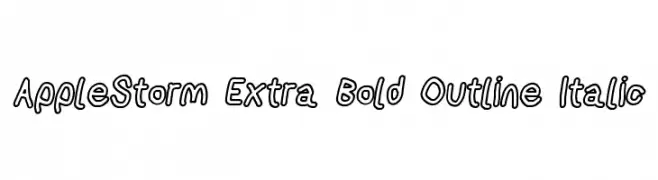
![AppleStorm Extra Bold Outline Italic تنزيل الخطوط]() تنزيل 102 التنزيلات@WebFont
تنزيل 102 التنزيلات@WebFont -
( Fonts by Graphicxell - Usman Al Baehaqi - Personal-use only. For commercial use please contact owner. )
An elegant and sophisticated cursive font with ornate uppercase and smooth lowercase letters.
![Berllina تنزيل الخطوط]() تنزيل 102 التنزيلات@WebFont
تنزيل 102 التنزيلات@WebFont -
-
![Pixelhole Regular تنزيل الخطوط]() تنزيل 102 التنزيلات@WebFont
تنزيل 102 التنزيلات@WebFont -
( Fonts by Manfred Klein. Free for private and charity use. Free for commercial with donation to organizations )
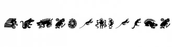
A decorative set of glyphs inspired by Mesoamerican fauna, featuring intricate and bold designs.
![MesoFaunaTwo تنزيل الخطوط]() تنزيل 102 التنزيلات@WebFont
تنزيل 102 التنزيلات@WebFont -
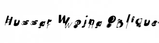
![Hussar Wojna Oblique تنزيل الخطوط]() تنزيل 102 التنزيلات@WebFont
تنزيل 102 التنزيلات@WebFont -
( Fonts by Ianmikraz )
A bold, cursive font with a dynamic, handwritten style.
![Badeg تنزيل الخطوط]() تنزيل 102 التنزيلات@WebFont
تنزيل 102 التنزيلات@WebFont -
( Noto is a trademark of Google Inc. Noto fonts are open source. All Noto fonts are published under the SIL Open Font License, Version 1.1 )
A modern, extra-condensed sans-serif font with medium weight, ideal for space-saving designs.
![Noto Sans Arabic UI ExtraCondensed Medium تنزيل الخطوط]() تنزيل 102 التنزيلات@WebFont
تنزيل 102 التنزيلات@WebFont


ما هي أبرز الخطوط الآن؟
تحظى POE Sans Pro Ultra-Condensed Italic, Fox on the Run Expanded Semi-Italic, HastyGrass_VL, AppleStorm Extra Bold Outline Italic and Berllina بشعبية لخطوطها النظيفة وتطبيقاتها الواسعة — من الهوية البصرية إلى الصفحات المقصودة والملصقات.
أي الخطوط تُستخدم كثيرًا في الشعارات؟
تُعد السان سيريف الهندسية (مثل Poppins وعائلات على نمط Gotham) خيارًا شائعًا لعلامات نظيفة قابلة للتوسع. ولإضفاء طابع ودي، تبقى السكريبت واليدوية خيارًا كلاسيكيًا. اجمع عنوانًا بارزًا مع خط نصي محايد لتحقيق التوازن والتميّز.
كم مرة يتم تحديث قائمة أعلى الخطوط؟
نحدّثها بانتظام استنادًا إلى التنزيلات والنشاط الفعلي. عُد إليها كثيرًا لاكتشاف النجوم الصاعدة مبكرًا.
💡 نصيحة: أضف هذه الصفحة إلى العلامات — تتغير الاتجاهات بسرعة وقد تُلهم خطوط اليوم الرائجة إعادة العلامة غدًا.