مرحبًا بك في قسم أعلى الخطوط — حيث تلتقي الشعبية بالجودة. هذه هي الخطوط الأكثر تنزيلًا واستخدامًا هذا العام من قبل مجتمعنا. إذا كنت بحاجة إلى اختيار موثوق للشعارات أو الويب أو وسائل التواصل، فابدأ من هنا.
يتميز كل خط رائج بتوازن جيد وقابلية قراءة وتعدد استخدامات. ستجد سان سيريف حديثة، وسكريبتات أنيقة، وسيريف كلاسيكية، وخطوط عرض minimal مختارة بعناية.
-
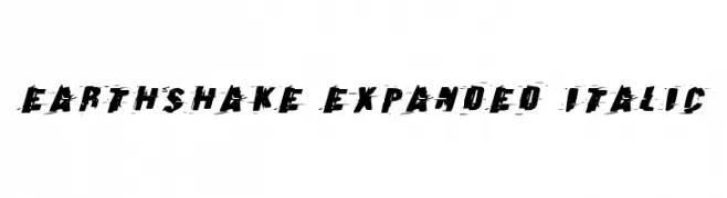
( Fonts by Daniel Zadorozny - www.iconian.com - Free for personal use )
A bold, distressed, and italic font with an expanded width for dynamic designs.
 تنزيل 103 التنزيلات@WebFont
 -
( Fonts by Graphicxell - Usman Al Baehaqi - Personal-use only. For commercial use please contact owner. )
An elegant and sophisticated cursive font with ornate uppercase and smooth lowercase letters.
![Berllina تنزيل الخطوط]() تنزيل 103 التنزيلات@WebFont
تنزيل 103 التنزيلات@WebFont -
( Fonts by Manfred Klein. Free for private and charity use. Free for commercial with donation to organizations )
Hand-drawn stick-figure font with expressive, emotive characters.
![SometimesSmiley تنزيل الخطوط]() تنزيل 103 التنزيلات@WebFont
تنزيل 103 التنزيلات@WebFont -
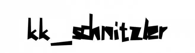
![kk_schnitzler تنزيل الخطوط]() تنزيل 103 التنزيلات@WebFont
تنزيل 103 التنزيلات@WebFont -
![Saturday Vibes تنزيل الخطوط]() تنزيل 103 التنزيلات@WebFont
تنزيل 103 التنزيلات@WebFont -
-
( Fonts by Kong Font )
A fluid and elegant script font with a handwritten calligraphic style.
![Bronskiy تنزيل الخطوط]() تنزيل 103 التنزيلات@WebFont
تنزيل 103 التنزيلات@WebFont -
( Fonts by Daniel Zadorozny - www.iconian.com )
A bold, angular font with a futuristic and condensed design.
![Devil Summoner Laser تنزيل الخطوط]() تنزيل 103 التنزيلات@WebFont
تنزيل 103 التنزيلات@WebFont -
( Fonts by Ef Studio - Personal-use only. For commercial use please contact owner. )
An elegant script font with intricate swashes and high contrast, ideal for formal uses.
![Glaston تنزيل الخطوط]() تنزيل 103 التنزيلات@WebFont
تنزيل 103 التنزيلات@WebFont -
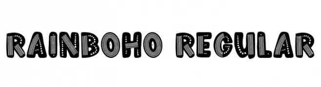
( Fonts by Stephanie Peay )
A playful, decorative font with bold, textured characters featuring lines and dots.
![Rainboho Regular تنزيل الخطوط]() تنزيل 103 التنزيلات@WebFont
تنزيل 103 التنزيلات@WebFont -
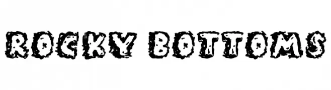
( Fonts by Jonathan S. Harris )
A bold, textured font with a rugged, rocky appearance.
![Rocky Bottoms تنزيل الخطوط]() تنزيل 103 التنزيلات@WebFont
تنزيل 103 التنزيلات@WebFont


ما هي أبرز الخطوط الآن؟
تحظى Earthshake Expanded Italic, Berllina, SometimesSmiley, kk_schnitzler and Saturday Vibes بشعبية لخطوطها النظيفة وتطبيقاتها الواسعة — من الهوية البصرية إلى الصفحات المقصودة والملصقات.
أي الخطوط تُستخدم كثيرًا في الشعارات؟
تُعد السان سيريف الهندسية (مثل Poppins وعائلات على نمط Gotham) خيارًا شائعًا لعلامات نظيفة قابلة للتوسع. ولإضفاء طابع ودي، تبقى السكريبت واليدوية خيارًا كلاسيكيًا. اجمع عنوانًا بارزًا مع خط نصي محايد لتحقيق التوازن والتميّز.
كم مرة يتم تحديث قائمة أعلى الخطوط؟
نحدّثها بانتظام استنادًا إلى التنزيلات والنشاط الفعلي. عُد إليها كثيرًا لاكتشاف النجوم الصاعدة مبكرًا.
💡 نصيحة: أضف هذه الصفحة إلى العلامات — تتغير الاتجاهات بسرعة وقد تُلهم خطوط اليوم الرائجة إعادة العلامة غدًا.