مرحبًا بك في قسم أعلى الخطوط — حيث تلتقي الشعبية بالجودة. هذه هي الخطوط الأكثر تنزيلًا واستخدامًا هذا العام من قبل مجتمعنا. إذا كنت بحاجة إلى اختيار موثوق للشعارات أو الويب أو وسائل التواصل، فابدأ من هنا.
يتميز كل خط رائج بتوازن جيد وقابلية قراءة وتعدد استخدامات. ستجد سان سيريف حديثة، وسكريبتات أنيقة، وسيريف كلاسيكية، وخطوط عرض minimal مختارة بعناية.
-
( Fonts by Kotak Kuning Studio - kotakkuning.com - Personal-use only. For commercial use please contact owner. )
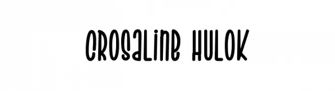
A playful, rounded font with elongated strokes and a friendly appearance.
 تنزيل 104 التنزيلات@WebFont
 -
( Fonts by Muhammad Sirojuddin - lettersiro.com - Personal-use only. For commercial use please contact owner. )
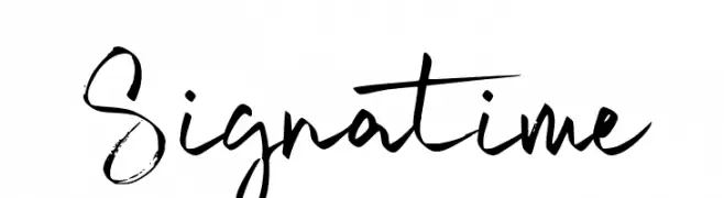
A dynamic, expressive handwritten font with varied strokes and artistic flair.
![Signatime تنزيل الخطوط]() تنزيل 104 التنزيلات@WebFont
تنزيل 104 التنزيلات@WebFont -
( Fonts by Lettersweet Studio )
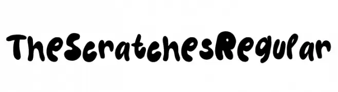
A playful, bold, and hand-drawn style with thick, rounded strokes.
![The Scratches Regular تنزيل الخطوط]() تنزيل 104 التنزيلات@WebFont
تنزيل 104 التنزيلات@WebFont -
( Fonts by Allouse Studio - Personal-use only. For commercial use please contact owner. )
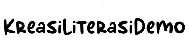
A playful, bold handwritten font with rounded edges and a casual style.
![Kreasi Literasi Demo تنزيل الخطوط]() تنزيل 104 التنزيلات@WebFont
تنزيل 104 التنزيلات@WebFont -
( Fonts by Brian Zick - Personal-use only. For commercial use please contact owner. )
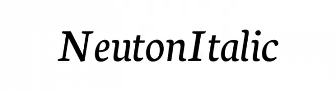
Elegant serif font with a subtle italic slant and moderate stroke contrast.
![Neuton Italic تنزيل الخطوط]() تنزيل 104 التنزيلات@WebFont
تنزيل 104 التنزيلات@WebFont -
-
( Fonts by www.chequered.ink - Chequered Ink - Personal-use only. For commercial use please contact owner. )
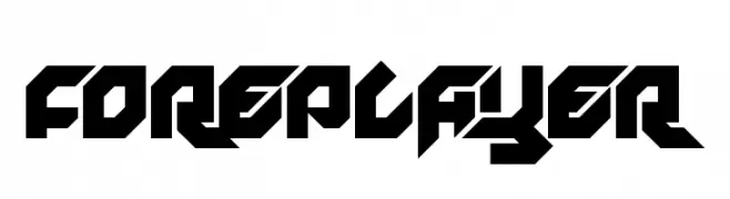
A bold, angular font with a futuristic and dynamic design.
![Foreplayer تنزيل الخطوط]() تنزيل 104 التنزيلات@WebFont
تنزيل 104 التنزيلات@WebFont -
( Fonts by Jeff Levine. FREEWARE )
A novelty dingbat font with detailed medical-themed icons.
![Doctor's Dings JL تنزيل الخطوط]() تنزيل 104 التنزيلات@WebFont
تنزيل 104 التنزيلات@WebFont -
( Fonts by Letterhend Studio )
Bold, modern handwritten script font.
![HelloFlorida-Regular تنزيل الخطوط]() تنزيل 104 التنزيلات@WebFont
تنزيل 104 التنزيلات@WebFont -
( Fonts by Manfred Klein. Free for private and charity use. Free for commercial with donation to organizations )
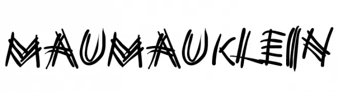
A bold, hand-drawn font with dynamic, irregular strokes and artistic flair.
![MauMauKlein تنزيل الخطوط]() تنزيل 104 التنزيلات@WebFont
تنزيل 104 التنزيلات@WebFont -
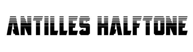
![Antilles Halftone تنزيل الخطوط]() تنزيل 104 التنزيلات@WebFont
تنزيل 104 التنزيلات@WebFont


ما هي أبرز الخطوط الآن؟
تحظى Crosaline Hulok, Signatime, The Scratches Regular, Kreasi Literasi Demo and Neuton Italic بشعبية لخطوطها النظيفة وتطبيقاتها الواسعة — من الهوية البصرية إلى الصفحات المقصودة والملصقات.
أي الخطوط تُستخدم كثيرًا في الشعارات؟
تُعد السان سيريف الهندسية (مثل Poppins وعائلات على نمط Gotham) خيارًا شائعًا لعلامات نظيفة قابلة للتوسع. ولإضفاء طابع ودي، تبقى السكريبت واليدوية خيارًا كلاسيكيًا. اجمع عنوانًا بارزًا مع خط نصي محايد لتحقيق التوازن والتميّز.
كم مرة يتم تحديث قائمة أعلى الخطوط؟
نحدّثها بانتظام استنادًا إلى التنزيلات والنشاط الفعلي. عُد إليها كثيرًا لاكتشاف النجوم الصاعدة مبكرًا.
💡 نصيحة: أضف هذه الصفحة إلى العلامات — تتغير الاتجاهات بسرعة وقد تُلهم خطوط اليوم الرائجة إعادة العلامة غدًا.