مرحبًا بك في قسم أعلى الخطوط — حيث تلتقي الشعبية بالجودة. هذه هي الخطوط الأكثر تنزيلًا واستخدامًا هذا العام من قبل مجتمعنا. إذا كنت بحاجة إلى اختيار موثوق للشعارات أو الويب أو وسائل التواصل، فابدأ من هنا.
يتميز كل خط رائج بتوازن جيد وقابلية قراءة وتعدد استخدامات. ستجد سان سيريف حديثة، وسكريبتات أنيقة، وسيريف كلاسيكية، وخطوط عرض minimal مختارة بعناية.
-
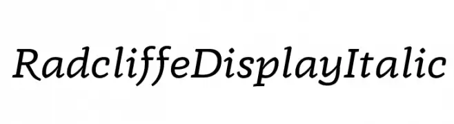
( Zetafonts - www.zetafonts.com )
An elegant italic font with moderate contrast and fluid style.
 تنزيل 106 التنزيلات@WebFont
 -
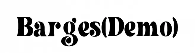
( Fonts by Wildan Type )
A bold, high-contrast font with dynamic curves and artistic flair.
![Barges (Demo) تنزيل الخطوط]() تنزيل 106 التنزيلات@WebFont
تنزيل 106 التنزيلات@WebFont -
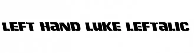
( Fonts by Iconian Fonts )
A bold, stencil-like font with a rugged, dynamic style and slanted characters.
![Left Hand Luke Leftalic تنزيل الخطوط]() تنزيل 106 التنزيلات@WebFont
تنزيل 106 التنزيلات@WebFont -
( Fonts by Inermedia Studio )
A bold, playful font with a zigzag pattern through each character.
![JUNGGLE تنزيل الخطوط]() تنزيل 106 التنزيلات@WebFont
تنزيل 106 التنزيلات@WebFont -
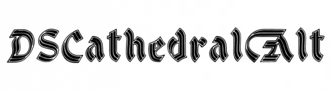
( Fonts by Dieter Steffmann - Personal-use only. For commercial use please contact owner. )
A bold, Gothic-inspired font with intricate detailing and a dramatic presence.
![DSCathedralAlt تنزيل الخطوط]() تنزيل 106 التنزيلات@WebFont
تنزيل 106 التنزيلات@WebFont -
-
( Fonts by Darrell Flood )
A bold, rounded, and playful handwritten-style font.
![Marker Notes تنزيل الخطوط]() تنزيل 106 التنزيلات@WebFont
تنزيل 106 التنزيلات@WebFont -
( Fonts by www.chequered.ink - Chequered Ink - Personal-use only. For commercial use please contact owner. )
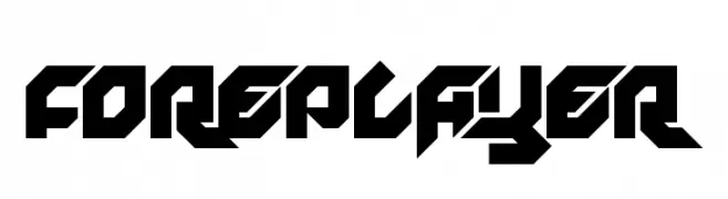
A bold, angular font with a futuristic and dynamic design.
![Foreplayer تنزيل الخطوط]() تنزيل 106 التنزيلات@WebFont
تنزيل 106 التنزيلات@WebFont -
( Fonts by Manfred Klein. Free for private and charity use. Free for commercial with donation to organizations )
An artistic font featuring abstract human figures as characters.
![NudesOne تنزيل الخطوط]() تنزيل 106 التنزيلات@WebFont
تنزيل 106 التنزيلات@WebFont -
( Fonts by a Max Infeld - XEROGRAPHER FONTS - xerographer.blogspot.com . Personal-use only. For commercial use please contact owner. )
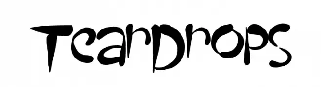
A bold, expressive font with brush-like strokes and dynamic forms.
![TearDrops تنزيل الخطوط]() تنزيل 106 التنزيلات@WebFont
تنزيل 106 التنزيلات@WebFont -
![mannacrypt تنزيل الخطوط]() تنزيل 106 التنزيلات@WebFont
تنزيل 106 التنزيلات@WebFont


ما هي أبرز الخطوط الآن؟
تحظى Radcliffe Display Italic, Barges (Demo), Left Hand Luke Leftalic, JUNGGLE and DSCathedralAlt بشعبية لخطوطها النظيفة وتطبيقاتها الواسعة — من الهوية البصرية إلى الصفحات المقصودة والملصقات.
أي الخطوط تُستخدم كثيرًا في الشعارات؟
تُعد السان سيريف الهندسية (مثل Poppins وعائلات على نمط Gotham) خيارًا شائعًا لعلامات نظيفة قابلة للتوسع. ولإضفاء طابع ودي، تبقى السكريبت واليدوية خيارًا كلاسيكيًا. اجمع عنوانًا بارزًا مع خط نصي محايد لتحقيق التوازن والتميّز.
كم مرة يتم تحديث قائمة أعلى الخطوط؟
نحدّثها بانتظام استنادًا إلى التنزيلات والنشاط الفعلي. عُد إليها كثيرًا لاكتشاف النجوم الصاعدة مبكرًا.
💡 نصيحة: أضف هذه الصفحة إلى العلامات — تتغير الاتجاهات بسرعة وقد تُلهم خطوط اليوم الرائجة إعادة العلامة غدًا.