مرحبًا بك في قسم أعلى الخطوط — حيث تلتقي الشعبية بالجودة. هذه هي الخطوط الأكثر تنزيلًا واستخدامًا هذا العام من قبل مجتمعنا. إذا كنت بحاجة إلى اختيار موثوق للشعارات أو الويب أو وسائل التواصل، فابدأ من هنا.
يتميز كل خط رائج بتوازن جيد وقابلية قراءة وتعدد استخدامات. ستجد سان سيريف حديثة، وسكريبتات أنيقة، وسيريف كلاسيكية، وخطوط عرض minimal مختارة بعناية.
-
( Fonts by nariswari_creative - Taufik Dwi Purnomo - Personal-use only. For commercial use please contact owner. )
A bold, geometric sans-serif font with a modern and clean design.
 تنزيل 107 التنزيلات@WebFont
 -
( David Lindecrantz - lindecrantz.com/ )
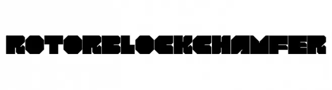
A bold, geometric font with chamfered edges and a modern industrial style.
![ROTORblock Chamfer تنزيل الخطوط]() تنزيل 107 التنزيلات@WebFont
تنزيل 107 التنزيلات@WebFont -
( Fonts by Daniel Zadorozny - www.iconian.com - Free for personal use )
A bold, futuristic font with geometric and angular design elements.
![Interdiction Expanded تنزيل الخطوط]() تنزيل 107 التنزيلات@WebFont
تنزيل 107 التنزيلات@WebFont -
( fontm.com/author/weknow/ )
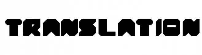
A bold, geometric font with a futuristic and industrial design.
![translation تنزيل الخطوط]() تنزيل 107 التنزيلات@WebFont
تنزيل 107 التنزيلات@WebFont -
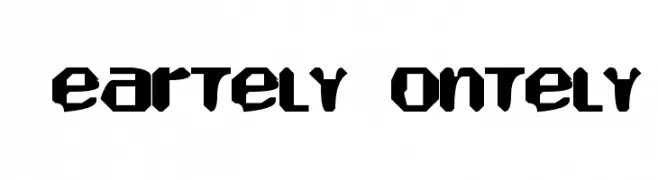
![Heartely Fontely تنزيل الخطوط]() تنزيل 107 التنزيلات@WebFont
تنزيل 107 التنزيلات@WebFont -
-
( Fonts by Apostrophic Lab )
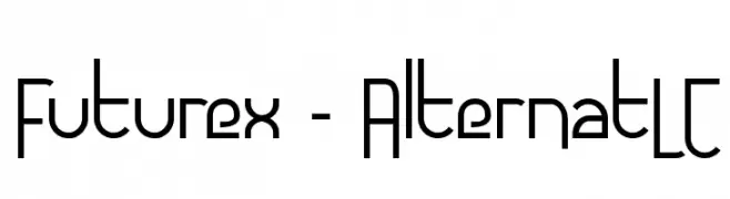
A modern, geometric font with clean lines and a futuristic aesthetic.
![Futurex - AlternatLC تنزيل الخطوط]() تنزيل 107 التنزيلات@WebFont
تنزيل 107 التنزيلات@WebFont -
( Roger White - web.archive.org/web/20120416090521/www.rogersfonts.org.uk/ )
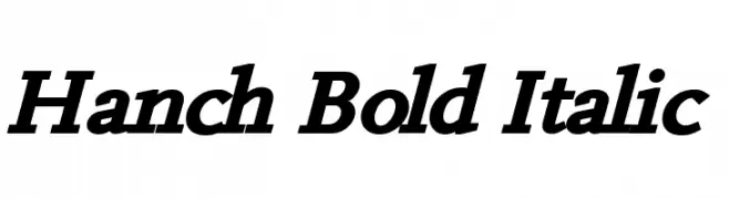
A bold, italicized font with strong strokes and a modern yet classic appeal.
![Hanch Bold Italic تنزيل الخطوط]() تنزيل 107 التنزيلات@WebFont
تنزيل 107 التنزيلات@WebFont -
( Fonts by Daniel Zadorozny - www.iconian.com - Free for personal use )
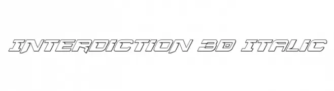
A bold, 3D italic font with a futuristic, tech-inspired design.
![Interdiction 3D Italic تنزيل الخطوط]() تنزيل 107 التنزيلات@WebFont
تنزيل 107 التنزيلات@WebFont -
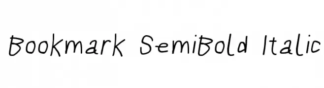
![Bookmark SemiBold Italic تنزيل الخطوط]() تنزيل 107 التنزيلات@WebFont
تنزيل 107 التنزيلات@WebFont -
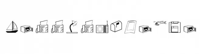
( Fonts by Manfred Klein. Free for private and charity use. Free for commercial with donation to organizations )
A dingbat font with office and business-themed pictograms.
![LessIsMoreOne تنزيل الخطوط]() تنزيل 107 التنزيلات@WebFont
تنزيل 107 التنزيلات@WebFont

ما هي أبرز الخطوط الآن؟
تحظى Bingke Berendam DEMO, ROTORblock Chamfer, Interdiction Expanded, translation and Heartely Fontely بشعبية لخطوطها النظيفة وتطبيقاتها الواسعة — من الهوية البصرية إلى الصفحات المقصودة والملصقات.
أي الخطوط تُستخدم كثيرًا في الشعارات؟
تُعد السان سيريف الهندسية (مثل Poppins وعائلات على نمط Gotham) خيارًا شائعًا لعلامات نظيفة قابلة للتوسع. ولإضفاء طابع ودي، تبقى السكريبت واليدوية خيارًا كلاسيكيًا. اجمع عنوانًا بارزًا مع خط نصي محايد لتحقيق التوازن والتميّز.
كم مرة يتم تحديث قائمة أعلى الخطوط؟
نحدّثها بانتظام استنادًا إلى التنزيلات والنشاط الفعلي. عُد إليها كثيرًا لاكتشاف النجوم الصاعدة مبكرًا.
💡 نصيحة: أضف هذه الصفحة إلى العلامات — تتغير الاتجاهات بسرعة وقد تُلهم خطوط اليوم الرائجة إعادة العلامة غدًا.