مرحبًا بك في قسم أعلى الخطوط — حيث تلتقي الشعبية بالجودة. هذه هي الخطوط الأكثر تنزيلًا واستخدامًا هذا العام من قبل مجتمعنا. إذا كنت بحاجة إلى اختيار موثوق للشعارات أو الويب أو وسائل التواصل، فابدأ من هنا.
يتميز كل خط رائج بتوازن جيد وقابلية قراءة وتعدد استخدامات. ستجد سان سيريف حديثة، وسكريبتات أنيقة، وسيريف كلاسيكية، وخطوط عرض minimal مختارة بعناية.
-
 تنزيل 107 التنزيلات@WebFont
 -
( Misti's Fonts - mistifonts.com/ )
A playful, modern font with rounded edges and a clean, minimalist aesthetic.
![We Are In Love [Heartless] تنزيل الخطوط]() تنزيل 107 التنزيلات@WebFont
تنزيل 107 التنزيلات@WebFont -
( Fonts by Manuel Viergutz - Typo Graphic Design - www.typographicdesign.de )
A pixelated, bitmap-style font with a retro digital feel.
![webpixelbitmap-Medium تنزيل الخطوط]() تنزيل 107 التنزيلات@WebFont
تنزيل 107 التنزيلات@WebFont -
( Fonts by Iconian Fonts )
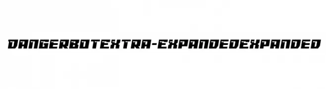
A bold, futuristic font with angular, geometric shapes and an extra expanded width.
![Dangerbot Extra-Expanded Expanded تنزيل الخطوط]() تنزيل 107 التنزيلات@WebFont
تنزيل 107 التنزيلات@WebFont -
( Fonts by Daniel Zadorozny - www.iconian.com )
A bold, angular font with a medieval or gothic style, featuring thick strokes and pointed edges.
![Empire Crown Laser Regular تنزيل الخطوط]() تنزيل 107 التنزيلات@WebFont
تنزيل 107 التنزيلات@WebFont -
-
( Fonts by Daniel Zadorozny - www.iconian.com - Personal-use only. For commercial use please contact owner. )
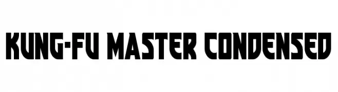
A bold, condensed font with geometric and angular characters.
![Kung-Fu Master Condensed تنزيل الخطوط]() تنزيل 107 التنزيلات@WebFont
تنزيل 107 التنزيلات@WebFont -
( Fonts by Vladimir Nikolic - www.creativefabrica.com/designer/vladimirnikolic/ - Personal-use only. For commercial use please contact owner. )
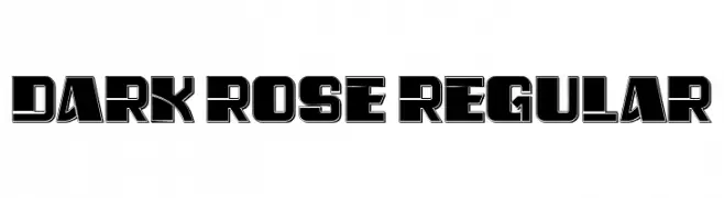
A bold, geometric font with a three-dimensional effect.
![Dark Rose Regular تنزيل الخطوط]() تنزيل 107 التنزيلات@WebFont
تنزيل 107 التنزيلات@WebFont -
![Alyfe Demo تنزيل الخطوط]() تنزيل 107 التنزيلات@WebFont
تنزيل 107 التنزيلات@WebFont -
( Fonts by Billy Argel Fonts - www.billyargel.com - Personal-use only. For commercial use please contact owner. )
An elegant, flowing script font with ornate uppercase and connected lowercase letters.
![Star Light Personal Use تنزيل الخطوط]() تنزيل 107 التنزيلات@WebFont
تنزيل 107 التنزيلات@WebFont -
( Fonts by Vladimir Nikolic )
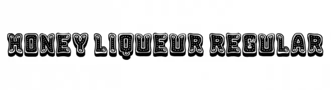
A playful, decorative font with bold outlines and intricate dot patterns.
![Honey Liqueur Regular تنزيل الخطوط]() تنزيل 107 التنزيلات@WebFont
تنزيل 107 التنزيلات@WebFont
![We Are In Love [Heartless] تنزيل الخطوط](https://d144mzi0q5mijx.cloudfront.net/img/W/E/We-Are-In-Love-Heartless.webp)


ما هي أبرز الخطوط الآن؟
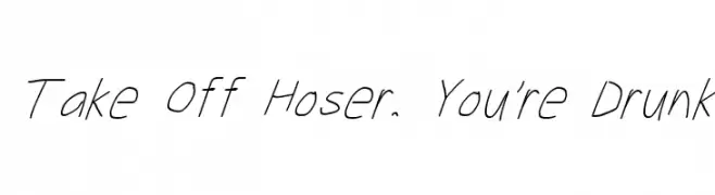
تحظى Take Off Hoser, You're Drunk, We Are In Love [Heartless], webpixelbitmap-Medium, Dangerbot Extra-Expanded Expanded and Empire Crown Laser Regular بشعبية لخطوطها النظيفة وتطبيقاتها الواسعة — من الهوية البصرية إلى الصفحات المقصودة والملصقات.
أي الخطوط تُستخدم كثيرًا في الشعارات؟
تُعد السان سيريف الهندسية (مثل Poppins وعائلات على نمط Gotham) خيارًا شائعًا لعلامات نظيفة قابلة للتوسع. ولإضفاء طابع ودي، تبقى السكريبت واليدوية خيارًا كلاسيكيًا. اجمع عنوانًا بارزًا مع خط نصي محايد لتحقيق التوازن والتميّز.
كم مرة يتم تحديث قائمة أعلى الخطوط؟
نحدّثها بانتظام استنادًا إلى التنزيلات والنشاط الفعلي. عُد إليها كثيرًا لاكتشاف النجوم الصاعدة مبكرًا.
💡 نصيحة: أضف هذه الصفحة إلى العلامات — تتغير الاتجاهات بسرعة وقد تُلهم خطوط اليوم الرائجة إعادة العلامة غدًا.