مرحبًا بك في قسم أعلى الخطوط — حيث تلتقي الشعبية بالجودة. هذه هي الخطوط الأكثر تنزيلًا واستخدامًا هذا العام من قبل مجتمعنا. إذا كنت بحاجة إلى اختيار موثوق للشعارات أو الويب أو وسائل التواصل، فابدأ من هنا.
يتميز كل خط رائج بتوازن جيد وقابلية قراءة وتعدد استخدامات. ستجد سان سيريف حديثة، وسكريبتات أنيقة، وسيريف كلاسيكية، وخطوط عرض minimal مختارة بعناية.
-
( Fonts by omnibus-type.com. Personal-use only. For commercial use please contact owner. )
A modern sans-serif font with a clean, professional look and uniform stroke widths.
 تنزيل 108 التنزيلات@WebFont
 -
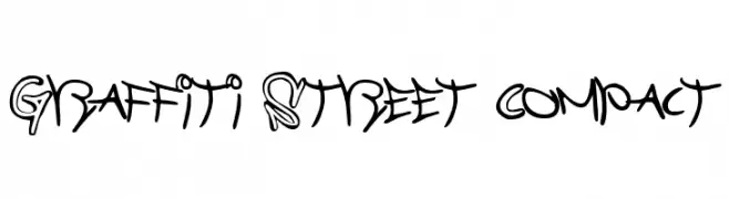
![Graffiti Street Compact تنزيل الخطوط]() تنزيل 108 التنزيلات@WebFont
تنزيل 108 التنزيلات@WebFont -
( Fonts by Daniel Zadorozny - www.iconian.com )
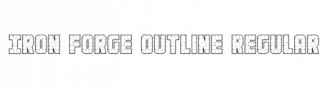
A bold, industrial outline font with a riveted, mechanical appearance.
![Iron Forge Outline Regular تنزيل الخطوط]() تنزيل 108 التنزيلات@WebFont
تنزيل 108 التنزيلات@WebFont -
( Fonts by Vladimir Nikolic )
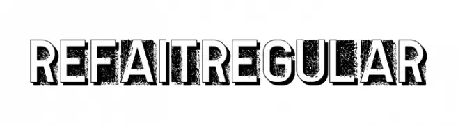
A bold, distressed font with a textured, grunge effect and strong outlines.
![Refait Regular تنزيل الخطوط]() تنزيل 108 التنزيلات@WebFont
تنزيل 108 التنزيلات@WebFont -
( Fonts by Apostrophic Lab )
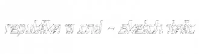
A sketch-style, condensed italic font with a modern and artistic flair.
![Republika III Cnd - Sketch Italic تنزيل الخطوط]() تنزيل 108 التنزيلات@WebFont
تنزيل 108 التنزيلات@WebFont -
-
( Fonts by Daniel Zadorozny - www.iconian.com )
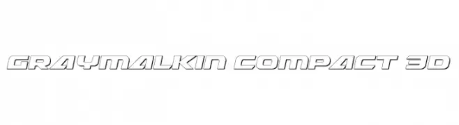
A bold, 3D-effect font with a futuristic and geometric design.
![Graymalkin Compact 3D تنزيل الخطوط]() تنزيل 108 التنزيلات@WebFont
تنزيل 108 التنزيلات@WebFont -
( Fonts by Ahmad Syarif Afandi - https://delapan.studio - Personal-use only. For commercial use please contact owner. )
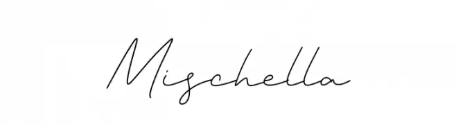
A graceful, handwritten script font with a fluid and elegant style.
![Mischella تنزيل الخطوط]() تنزيل 108 التنزيلات@WebFont
تنزيل 108 التنزيلات@WebFont -
( Fonts by Woodcutter )
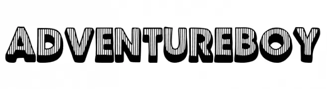
A bold, playful font with a 3D striped effect, perfect for adventurous themes.
![Adventure Boy تنزيل الخطوط]() تنزيل 108 التنزيلات@WebFont
تنزيل 108 التنزيلات@WebFont -
( Fonts by CannotIntoSpaceFonts - KineticPlasma Fonts - Personal-use only. For commercial use please contact owner. )
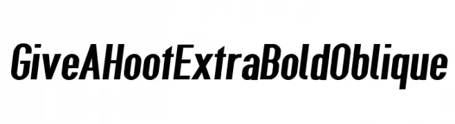
A bold, oblique font with a modern and dynamic style.
![Give A Hoot ExtraBold Oblique تنزيل الخطوط]() تنزيل 108 التنزيلات@WebFont
تنزيل 108 التنزيلات@WebFont -
( Fonts by Rajesh Rajput - gumroad.com/rajputrajesh_448 - Personal-use only. For commercial use please contact owner. )
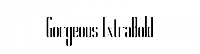
A sleek, modern font with elongated, narrow letterforms and high contrast strokes.
![Gorgeous ExtraBold تنزيل الخطوط]() تنزيل 108 التنزيلات@WebFont
تنزيل 108 التنزيلات@WebFont
ما هي أبرز الخطوط الآن؟
تحظى Chivo, Graffiti Street Compact, Iron Forge Outline Regular, Refait Regular and Republika III Cnd - Sketch Italic بشعبية لخطوطها النظيفة وتطبيقاتها الواسعة — من الهوية البصرية إلى الصفحات المقصودة والملصقات.
أي الخطوط تُستخدم كثيرًا في الشعارات؟
تُعد السان سيريف الهندسية (مثل Poppins وعائلات على نمط Gotham) خيارًا شائعًا لعلامات نظيفة قابلة للتوسع. ولإضفاء طابع ودي، تبقى السكريبت واليدوية خيارًا كلاسيكيًا. اجمع عنوانًا بارزًا مع خط نصي محايد لتحقيق التوازن والتميّز.
كم مرة يتم تحديث قائمة أعلى الخطوط؟
نحدّثها بانتظام استنادًا إلى التنزيلات والنشاط الفعلي. عُد إليها كثيرًا لاكتشاف النجوم الصاعدة مبكرًا.
💡 نصيحة: أضف هذه الصفحة إلى العلامات — تتغير الاتجاهات بسرعة وقد تُلهم خطوط اليوم الرائجة إعادة العلامة غدًا.