مرحبًا بك في قسم أعلى الخطوط — حيث تلتقي الشعبية بالجودة. هذه هي الخطوط الأكثر تنزيلًا واستخدامًا هذا العام من قبل مجتمعنا. إذا كنت بحاجة إلى اختيار موثوق للشعارات أو الويب أو وسائل التواصل، فابدأ من هنا.
يتميز كل خط رائج بتوازن جيد وقابلية قراءة وتعدد استخدامات. ستجد سان سيريف حديثة، وسكريبتات أنيقة، وسيريف كلاسيكية، وخطوط عرض minimal مختارة بعناية.
-
( Fonts by Iconian Fonts )
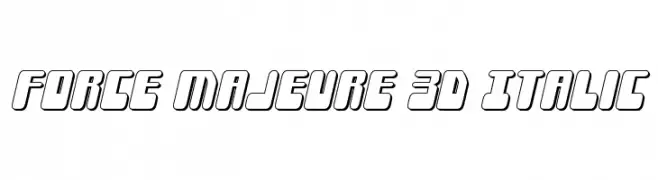
A bold, 3D italic font with a modern, geometric style.
 تنزيل 109 التنزيلات@WebFont
 -
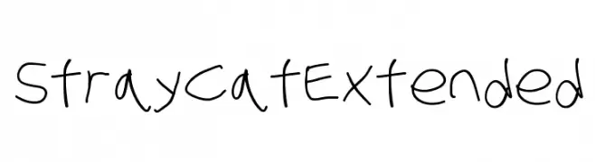
![Stray Cat Extended تنزيل الخطوط]() تنزيل 109 التنزيلات@WebFont
تنزيل 109 التنزيلات@WebFont -
( Fonts by Julia Pond )
A playful, whimsical handwritten font with irregular strokes.
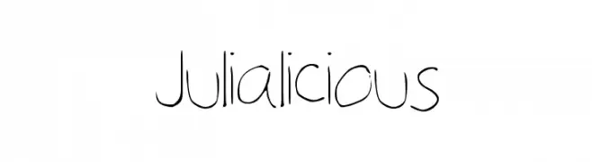
![Julialicious تنزيل الخطوط]() تنزيل 109 التنزيلات@WebFont
تنزيل 109 التنزيلات@WebFont -
( Fonts by wep - Wahyu Eka Prasetya - Personal-use only. For commercial use please contact owner. )
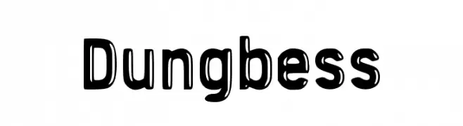
A bold, playful font with a unique cut-out effect and rounded edges.
![Dungbess تنزيل الخطوط]() تنزيل 109 التنزيلات@WebFont
تنزيل 109 التنزيلات@WebFont -
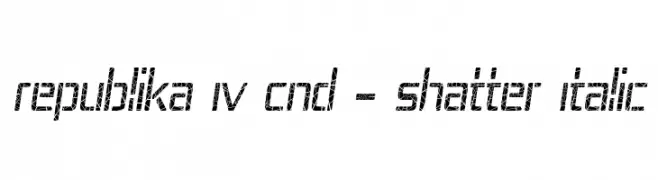
( Fonts by Apostrophic Lab )
A bold, italicized font with a unique shattered effect, perfect for modern and dynamic designs.
![Republika IV Cnd - Shatter Italic تنزيل الخطوط]() تنزيل 109 التنزيلات@WebFont
تنزيل 109 التنزيلات@WebFont -
-
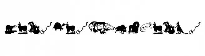
( Fonts by Manfred Klein. Free for private and charity use. Free for commercial with donation to organizations )
Animal-themed decorative font with illustrated characters.
![MensBestFriends تنزيل الخطوط]() تنزيل 109 التنزيلات@WebFont
تنزيل 109 التنزيلات@WebFont -
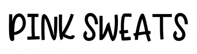
( Fonts by Aqeela Studio - Muhammad Nasir - Personal-use only. For commercial use please contact owner. )
A playful, handwritten font with a bold and lively style.
![PINK SWEATS تنزيل الخطوط]() تنزيل 109 التنزيلات@WebFont
تنزيل 109 التنزيلات@WebFont -
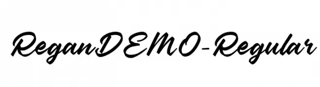
( Fonts by Colative Studio - Personal-use only. For commercial use please contact owner. )
A bold, dynamic script font with flowing cursive letterforms.
![ReganDEMO-Regular تنزيل الخطوط]() تنزيل 109 التنزيلات@WebFont
تنزيل 109 التنزيلات@WebFont -
( Fonts by Graphix Line Studio - Personal-use only. For commercial use please contact owner. )
A graceful and flowing script font with a handwritten appearance.
![Brittany تنزيل الخطوط]() تنزيل 109 التنزيلات@WebFont
تنزيل 109 التنزيلات@WebFont -
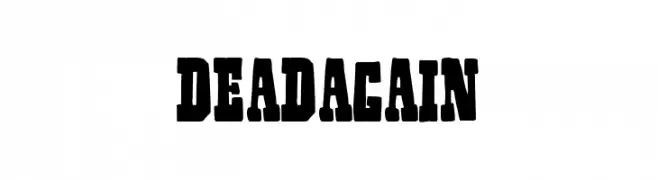
( Fonts by Woodcutter Manero - http://www.woodcutter.es - Personal-use only. For commercial use please contact owner. )
A bold, rugged font with a distressed, vintage appearance.
![Dead Again تنزيل الخطوط]() تنزيل 109 التنزيلات@WebFont
تنزيل 109 التنزيلات@WebFont

ما هي أبرز الخطوط الآن؟
تحظى Force Majeure 3D Italic, Stray Cat Extended, Julialicious, Dungbess and Republika IV Cnd - Shatter Italic بشعبية لخطوطها النظيفة وتطبيقاتها الواسعة — من الهوية البصرية إلى الصفحات المقصودة والملصقات.
أي الخطوط تُستخدم كثيرًا في الشعارات؟
تُعد السان سيريف الهندسية (مثل Poppins وعائلات على نمط Gotham) خيارًا شائعًا لعلامات نظيفة قابلة للتوسع. ولإضفاء طابع ودي، تبقى السكريبت واليدوية خيارًا كلاسيكيًا. اجمع عنوانًا بارزًا مع خط نصي محايد لتحقيق التوازن والتميّز.
كم مرة يتم تحديث قائمة أعلى الخطوط؟
نحدّثها بانتظام استنادًا إلى التنزيلات والنشاط الفعلي. عُد إليها كثيرًا لاكتشاف النجوم الصاعدة مبكرًا.
💡 نصيحة: أضف هذه الصفحة إلى العلامات — تتغير الاتجاهات بسرعة وقد تُلهم خطوط اليوم الرائجة إعادة العلامة غدًا.