مرحبًا بك في قسم أعلى الخطوط — حيث تلتقي الشعبية بالجودة. هذه هي الخطوط الأكثر تنزيلًا واستخدامًا هذا العام من قبل مجتمعنا. إذا كنت بحاجة إلى اختيار موثوق للشعارات أو الويب أو وسائل التواصل، فابدأ من هنا.
يتميز كل خط رائج بتوازن جيد وقابلية قراءة وتعدد استخدامات. ستجد سان سيريف حديثة، وسكريبتات أنيقة، وسيريف كلاسيكية، وخطوط عرض minimal مختارة بعناية.
-
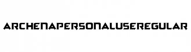
( Tama Putra - be.net/tmptr )
A bold, angular font with a futuristic and dynamic design.
 تنزيل 116 التنزيلات@WebFont
 -
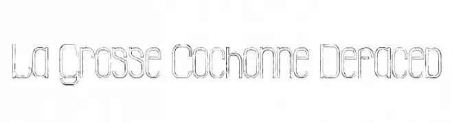
( Fonts by Maelle.K - Thomas Boucherie )
A modern, defaced font with geometric shapes and distressed outlines.
![La Grosse Cochonne Defaced تنزيل الخطوط]() تنزيل 116 التنزيلات@WebFont
تنزيل 116 التنزيلات@WebFont -
خط بواسطة joorgemoron. For commercial use please contact the owner.
( Free for personal use )
A bold, angular font with a modern, edgy style.
![JMHTHESPIDER-Regular تنزيل الخطوط]() تنزيل 116 التنزيلات@WebFont
تنزيل 116 التنزيلات@WebFont -
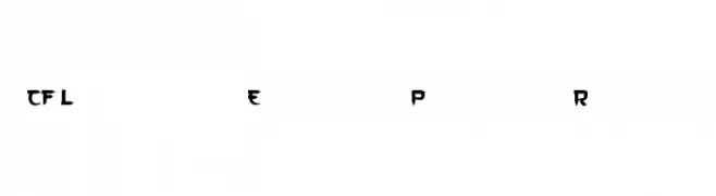
( CloutierFontes - Steve Cloutier - www.cloutierfontes.ca/ )
A bold, angular font with a futuristic and decorative style.
![CF Le dernier Empereur Personal Regular تنزيل الخطوط]() تنزيل 116 التنزيلات@WebFont
تنزيل 116 التنزيلات@WebFont -
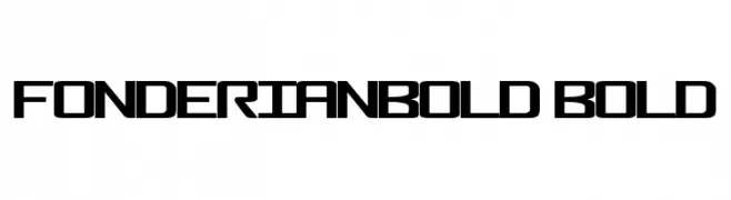
( Xerographer Fonts - Max Infeld - xerographer.blogspot.com )
A bold, geometric font with a modern and futuristic style.
![FonderianBold Bold تنزيل الخطوط]() تنزيل 116 التنزيلات@WebFont
تنزيل 116 التنزيلات@WebFont -
-
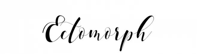
( aldedesign - Alde Saputro - creativemarket.com/aldedesign?u=aldedesign )
An elegant, flowing script font with graceful curves and fluid strokes.
![Ectomorph تنزيل الخطوط]() تنزيل 116 التنزيلات@WebFont
تنزيل 116 التنزيلات@WebFont -
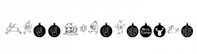
( fontsandfashion - www.fontsandfashion.com/ )
A festive, decorative font with holiday-themed illustrations and a playful, hand-drawn style.
![Merry Christmas تنزيل الخطوط]() تنزيل 115 التنزيلات@WebFont
تنزيل 115 التنزيلات@WebFont -
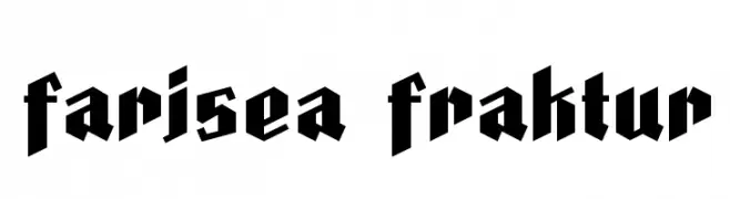
( Fonts by deFharo - Personal-use only. For commercial use please contact owner. )
A bold, gothic-inspired Blackletter font with sharp angles and thick strokes.
![Farisea Fraktur تنزيل الخطوط]() تنزيل 115 التنزيلات@WebFont
تنزيل 115 التنزيلات@WebFont -
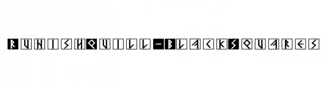
( Fonts by Manfred Klein. Free for private and charity use. Free for commercial with donation to organizations )
A bold, geometric font with characters enclosed in black squares, featuring sharp, angular lines.
![RunishQuill-BlackSquares تنزيل الخطوط]() تنزيل 115 التنزيلات@WebFont
تنزيل 115 التنزيلات@WebFont -
( Fonts by Hoperative )
A playful, decorative font with bold, rounded characters and whimsical curls.
![Austria Rainbow تنزيل الخطوط]() تنزيل 115 التنزيلات@WebFont
تنزيل 115 التنزيلات@WebFont


ما هي أبرز الخطوط الآن؟
تحظى Archena Personal Use Regular, La Grosse Cochonne Defaced, JMHTHESPIDER-Regular, CF Le dernier Empereur Personal Regular and FonderianBold Bold بشعبية لخطوطها النظيفة وتطبيقاتها الواسعة — من الهوية البصرية إلى الصفحات المقصودة والملصقات.
أي الخطوط تُستخدم كثيرًا في الشعارات؟
تُعد السان سيريف الهندسية (مثل Poppins وعائلات على نمط Gotham) خيارًا شائعًا لعلامات نظيفة قابلة للتوسع. ولإضفاء طابع ودي، تبقى السكريبت واليدوية خيارًا كلاسيكيًا. اجمع عنوانًا بارزًا مع خط نصي محايد لتحقيق التوازن والتميّز.
كم مرة يتم تحديث قائمة أعلى الخطوط؟
نحدّثها بانتظام استنادًا إلى التنزيلات والنشاط الفعلي. عُد إليها كثيرًا لاكتشاف النجوم الصاعدة مبكرًا.
💡 نصيحة: أضف هذه الصفحة إلى العلامات — تتغير الاتجاهات بسرعة وقد تُلهم خطوط اليوم الرائجة إعادة العلامة غدًا.