مرحبًا بك في قسم أعلى الخطوط — حيث تلتقي الشعبية بالجودة. هذه هي الخطوط الأكثر تنزيلًا واستخدامًا هذا العام من قبل مجتمعنا. إذا كنت بحاجة إلى اختيار موثوق للشعارات أو الويب أو وسائل التواصل، فابدأ من هنا.
يتميز كل خط رائج بتوازن جيد وقابلية قراءة وتعدد استخدامات. ستجد سان سيريف حديثة، وسكريبتات أنيقة، وسيريف كلاسيكية، وخطوط عرض minimal مختارة بعناية.
-
 تنزيل 113 التنزيلات@WebFont
 -
( Fonts by Manfred Klein. Free for private and charity use. Free for commercial with donation to organizations )
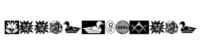
A detailed decorative symbol font with emblems and pictograms.
![ToolsSymbols تنزيل الخطوط]() تنزيل 113 التنزيلات@WebFont
تنزيل 113 التنزيلات@WebFont -
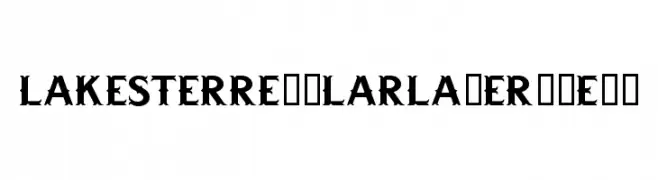
![LAKESTERREGULARLAYER1DEMO تنزيل الخطوط]() تنزيل 113 التنزيلات@WebFont
تنزيل 113 التنزيلات@WebFont -
( Fonts by Daniel Zadorozny - www.iconian.com - Free for personal use )
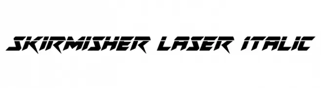
A bold, futuristic font with sharp, angular edges and an italicized slant.
![Skirmisher Laser Italic تنزيل الخطوط]() تنزيل 113 التنزيلات@WebFont
تنزيل 113 التنزيلات@WebFont -
( Fonts by Vladimir Nikolic - www.creativefabrica.com/designer/vladimirnikolic/ - Personal-use only. For commercial use please contact owner. )
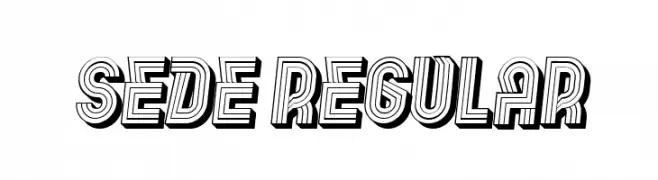
A bold, decorative font with a retro, three-dimensional line effect.
![Sede Regular تنزيل الخطوط]() تنزيل 113 التنزيلات@WebFont
تنزيل 113 التنزيلات@WebFont -
-
( Fonts by Daniel Zadorozny - www.iconian.com )
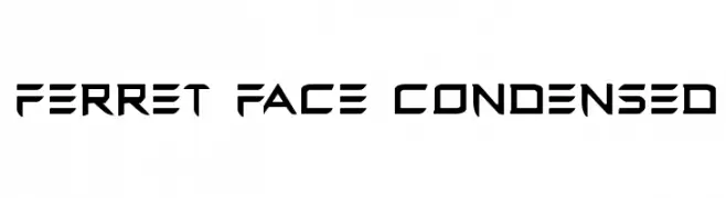
A bold, futuristic font with sharp, angular lines and a condensed structure.
![Ferret Face Condensed تنزيل الخطوط]() تنزيل 113 التنزيلات@WebFont
تنزيل 113 التنزيلات@WebFont -
( Fonts by MadeType - Personal-use only. For commercial use please contact owner. )
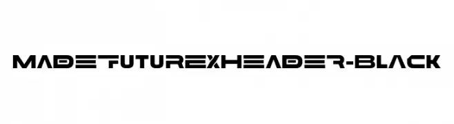
A bold, futuristic font with geometric and dynamic design elements.
![MADEFutureXHEADER-Black تنزيل الخطوط]() تنزيل 113 التنزيلات@WebFont
تنزيل 113 التنزيلات@WebFont -
( Fonts by Fontfabric - Svetoslav Simov - Personal-use only. For commercial use please contact owner. )
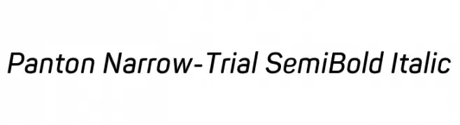
A modern, narrow, semi-bold italic font with a sleek and dynamic style.
![Panton Narrow-Trial SemiBold Italic تنزيل الخطوط]() تنزيل 113 التنزيلات@WebFont
تنزيل 113 التنزيلات@WebFont -
( Fonts by Chank Co. - www.chank.com )
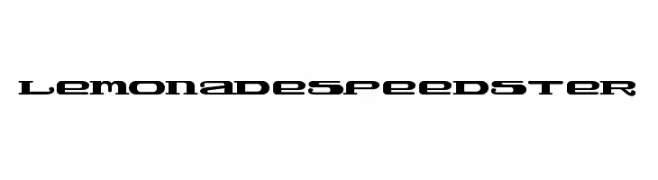
A bold, futuristic font with sharp angles and a sleek, dynamic design.
![LemonadeSpeedster تنزيل الخطوط]() تنزيل 113 التنزيلات@WebFont
تنزيل 113 التنزيلات@WebFont -
( Fonts by ingoFonts - Ingo Zimmermann - Personal-use only. For commercial use please contact owner. )
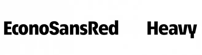
A bold, modern sans-serif font with strong geometric shapes and uniform stroke width.
![EconoSansRed-85Heavy تنزيل الخطوط]() تنزيل 113 التنزيلات@WebFont
تنزيل 113 التنزيلات@WebFont
ما هي أبرز الخطوط الآن؟
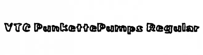
تحظى VTC PunkettePumps Regular, ToolsSymbols, LAKESTERREGULARLAYER1DEMO, Skirmisher Laser Italic and Sede Regular بشعبية لخطوطها النظيفة وتطبيقاتها الواسعة — من الهوية البصرية إلى الصفحات المقصودة والملصقات.
أي الخطوط تُستخدم كثيرًا في الشعارات؟
تُعد السان سيريف الهندسية (مثل Poppins وعائلات على نمط Gotham) خيارًا شائعًا لعلامات نظيفة قابلة للتوسع. ولإضفاء طابع ودي، تبقى السكريبت واليدوية خيارًا كلاسيكيًا. اجمع عنوانًا بارزًا مع خط نصي محايد لتحقيق التوازن والتميّز.
كم مرة يتم تحديث قائمة أعلى الخطوط؟
نحدّثها بانتظام استنادًا إلى التنزيلات والنشاط الفعلي. عُد إليها كثيرًا لاكتشاف النجوم الصاعدة مبكرًا.
💡 نصيحة: أضف هذه الصفحة إلى العلامات — تتغير الاتجاهات بسرعة وقد تُلهم خطوط اليوم الرائجة إعادة العلامة غدًا.