مرحبًا بك في قسم أعلى الخطوط — حيث تلتقي الشعبية بالجودة. هذه هي الخطوط الأكثر تنزيلًا واستخدامًا هذا العام من قبل مجتمعنا. إذا كنت بحاجة إلى اختيار موثوق للشعارات أو الويب أو وسائل التواصل، فابدأ من هنا.
يتميز كل خط رائج بتوازن جيد وقابلية قراءة وتعدد استخدامات. ستجد سان سيريف حديثة، وسكريبتات أنيقة، وسيريف كلاسيكية، وخطوط عرض minimal مختارة بعناية.
-
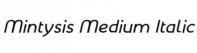
( Fonts by Arkandis Digital Foundry )
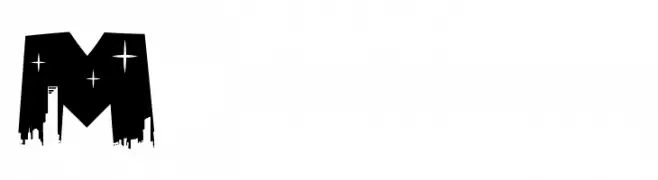
A modern, italic font with clean lines and a dynamic style.
 تنزيل 117 التنزيلات@WebFont
 -
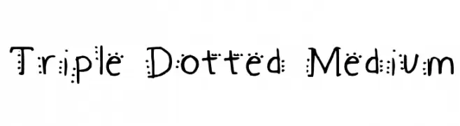
![Triple Dotted Medium تنزيل الخطوط]() تنزيل 117 التنزيلات@WebFont
تنزيل 117 التنزيلات@WebFont -
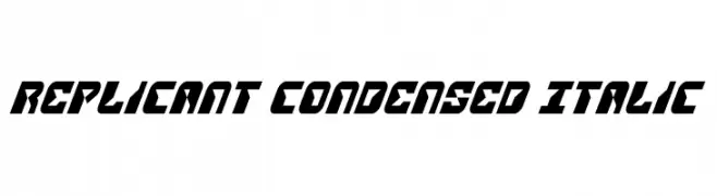
( Fonts by Daniel Zadorozny - www.iconian.com - Free for personal use )
A futuristic, bold, and italic font with a condensed and angular design.
![Replicant Condensed Italic تنزيل الخطوط]() تنزيل 117 التنزيلات@WebFont
تنزيل 117 التنزيلات@WebFont -
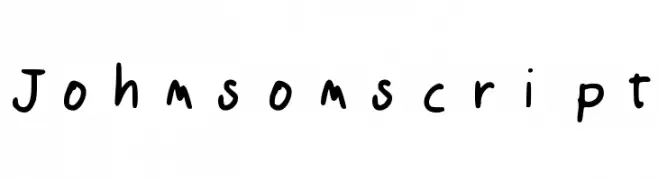
( Marco Ballarè - www.marcoballare.com )
A playful handwritten font with an informal and casual style.
![Johnsonscript تنزيل الخطوط]() تنزيل 117 التنزيلات@WebFont
تنزيل 117 التنزيلات@WebFont -
( Fonts by www.fenotype.com )
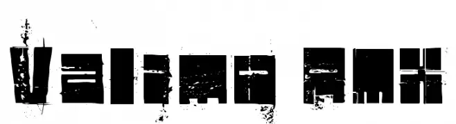
A bold, distressed font with a grunge aesthetic and geometric shapes.
![Valimo RMX تنزيل الخطوط]() تنزيل 117 التنزيلات@WebFont
تنزيل 117 التنزيلات@WebFont -
-
( Fonts by Letterena Studios )
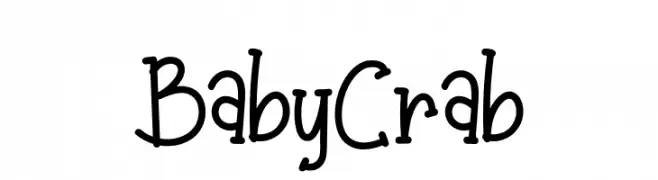
A playful, handwritten font with a casual and friendly style.
![Baby Crab تنزيل الخطوط]() تنزيل 117 التنزيلات@WebFont
تنزيل 117 التنزيلات@WebFont -
( Fonts by FactoryType - Wahyu Rahmawan - Personal-use only. For commercial use please contact owner. )
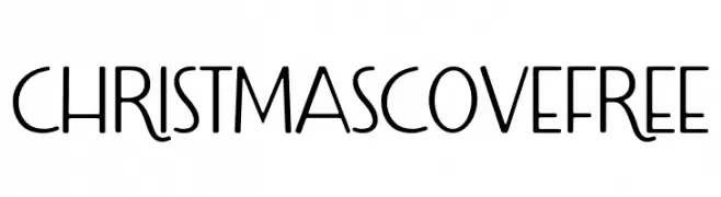
A playful and whimsical font with smooth, flowing lines and slightly irregular shapes.
![Christmas Cove Free تنزيل الخطوط]() تنزيل 117 التنزيلات@WebFont
تنزيل 117 التنزيلات@WebFont -
( Fonts by Wino S Kadir - weknow - www.revolge.com/shop/weknow/ - Personal-use only. For commercial use please contact owner. )
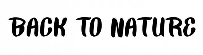
A bold, playful script font with a handwritten feel.
![BACK TO NATURE تنزيل الخطوط]() تنزيل 117 التنزيلات@WebFont
تنزيل 117 التنزيلات@WebFont -
( Fonts by imagex )
A bold, urban-style font with a dripping cityscape effect.
![Megapoliscape تنزيل الخطوط]() تنزيل 117 التنزيلات@WebFont
تنزيل 117 التنزيلات@WebFont -
( Fonts by Manfred Klein. Free for private and charity use. Free for commercial with donation to organizations )
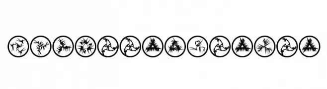
Intricate, abstract symbols with a futuristic and dynamic design.
![RosettaMutanta تنزيل الخطوط]() تنزيل 117 التنزيلات@WebFont
تنزيل 117 التنزيلات@WebFont
ما هي أبرز الخطوط الآن؟
تحظى Mintysis Medium Italic, Triple Dotted Medium, Replicant Condensed Italic, Johnsonscript and Valimo RMX بشعبية لخطوطها النظيفة وتطبيقاتها الواسعة — من الهوية البصرية إلى الصفحات المقصودة والملصقات.
أي الخطوط تُستخدم كثيرًا في الشعارات؟
تُعد السان سيريف الهندسية (مثل Poppins وعائلات على نمط Gotham) خيارًا شائعًا لعلامات نظيفة قابلة للتوسع. ولإضفاء طابع ودي، تبقى السكريبت واليدوية خيارًا كلاسيكيًا. اجمع عنوانًا بارزًا مع خط نصي محايد لتحقيق التوازن والتميّز.
كم مرة يتم تحديث قائمة أعلى الخطوط؟
نحدّثها بانتظام استنادًا إلى التنزيلات والنشاط الفعلي. عُد إليها كثيرًا لاكتشاف النجوم الصاعدة مبكرًا.
💡 نصيحة: أضف هذه الصفحة إلى العلامات — تتغير الاتجاهات بسرعة وقد تُلهم خطوط اليوم الرائجة إعادة العلامة غدًا.