مرحبًا بك في قسم أعلى الخطوط — حيث تلتقي الشعبية بالجودة. هذه هي الخطوط الأكثر تنزيلًا واستخدامًا هذا العام من قبل مجتمعنا. إذا كنت بحاجة إلى اختيار موثوق للشعارات أو الويب أو وسائل التواصل، فابدأ من هنا.
يتميز كل خط رائج بتوازن جيد وقابلية قراءة وتعدد استخدامات. ستجد سان سيريف حديثة، وسكريبتات أنيقة، وسيريف كلاسيكية، وخطوط عرض minimal مختارة بعناية.
-
( Insane Machina - Fernando Henrique de Sousa - www.insanemachina.com )
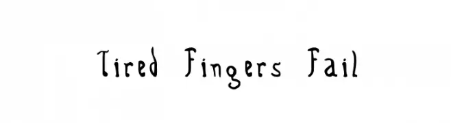
A whimsical, hand-drawn font with irregular shapes and playful character.
 تنزيل 118 التنزيلات@WebFont
 -
( Noto is a trademark of Google Inc. Noto fonts are open source. All Noto fonts are published under the SIL Open Font License, Version 1.1 )
No valid font glyphs are visible, only placeholder boxes.
![Noto Sans Imperial Aramaic Regular تنزيل الخطوط]() تنزيل 118 التنزيلات@WebFont
تنزيل 118 التنزيلات@WebFont -
( Fonts by Darrell Flood )
A geometric, pixelated font with a modular and digital aesthetic.
![Super Skinny Pixel Bricks تنزيل الخطوط]() تنزيل 118 التنزيلات@WebFont
تنزيل 118 التنزيلات@WebFont -
( Fonts by a Max Infeld - XEROGRAPHER FONTS - xerographer.blogspot.com . Personal-use only. For commercial use please contact owner. )
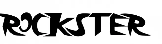
A bold, edgy font with sharp, angular lines and a modern, rebellious style.
![rockster تنزيل الخطوط]() تنزيل 118 التنزيلات@WebFont
تنزيل 118 التنزيلات@WebFont -
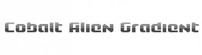
![Cobalt Alien Gradient تنزيل الخطوط]() تنزيل 118 التنزيلات@WebFont
تنزيل 118 التنزيلات@WebFont -
-
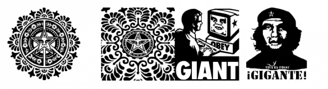
( Fonts by bob istheowl http://luc.devroye.org/bobistheowl.html )
A display font with each character as a detailed graphic illustration.
![ObeyXL2Caps تنزيل الخطوط]() تنزيل 118 التنزيلات@WebFont
تنزيل 118 التنزيلات@WebFont -
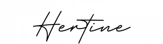
( Fonts by Ef Studio - Luthfi Ef - Personal-use only. For commercial use please contact owner. )
A cursive, handwritten-style font with elegant, flowing characters.
![Hertine تنزيل الخطوط]() تنزيل 118 التنزيلات@WebFont
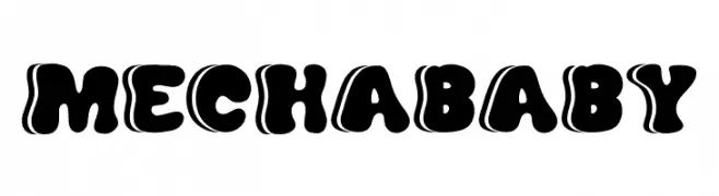
تنزيل 118 التنزيلات@WebFont -
( Fonts by Beautypes )
A playful, bold font with a bubbly, cartoon-like appearance.
![mechababy تنزيل الخطوط]() تنزيل 118 التنزيلات@WebFont
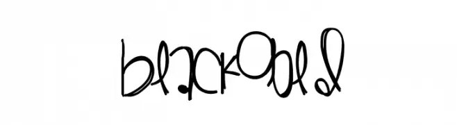
تنزيل 118 التنزيلات@WebFont -
( Fonts by Des Gomez )
A playful, handwritten font with bold strokes and quirky characters.
![Blackgold تنزيل الخطوط]() تنزيل 118 التنزيلات@WebFont
تنزيل 118 التنزيلات@WebFont -
( Fonts by Vladimir Nikolic - www.creativefabrica.com/designer/vladimirnikolic/ - Personal-use only. For commercial use please contact owner. )
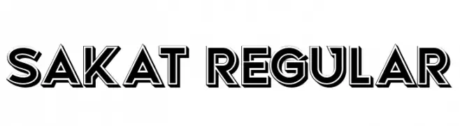
A bold, geometric font with outlined characters and sharp edges.
![Sakat Regular تنزيل الخطوط]() تنزيل 118 التنزيلات@WebFont
تنزيل 118 التنزيلات@WebFont
ما هي أبرز الخطوط الآن؟
تحظى Tired Fingers Fail, Noto Sans Imperial Aramaic Regular, Super Skinny Pixel Bricks, rockster and Cobalt Alien Gradient بشعبية لخطوطها النظيفة وتطبيقاتها الواسعة — من الهوية البصرية إلى الصفحات المقصودة والملصقات.
أي الخطوط تُستخدم كثيرًا في الشعارات؟
تُعد السان سيريف الهندسية (مثل Poppins وعائلات على نمط Gotham) خيارًا شائعًا لعلامات نظيفة قابلة للتوسع. ولإضفاء طابع ودي، تبقى السكريبت واليدوية خيارًا كلاسيكيًا. اجمع عنوانًا بارزًا مع خط نصي محايد لتحقيق التوازن والتميّز.
كم مرة يتم تحديث قائمة أعلى الخطوط؟
نحدّثها بانتظام استنادًا إلى التنزيلات والنشاط الفعلي. عُد إليها كثيرًا لاكتشاف النجوم الصاعدة مبكرًا.
💡 نصيحة: أضف هذه الصفحة إلى العلامات — تتغير الاتجاهات بسرعة وقد تُلهم خطوط اليوم الرائجة إعادة العلامة غدًا.