مرحبًا بك في قسم أعلى الخطوط — حيث تلتقي الشعبية بالجودة. هذه هي الخطوط الأكثر تنزيلًا واستخدامًا هذا العام من قبل مجتمعنا. إذا كنت بحاجة إلى اختيار موثوق للشعارات أو الويب أو وسائل التواصل، فابدأ من هنا.
يتميز كل خط رائج بتوازن جيد وقابلية قراءة وتعدد استخدامات. ستجد سان سيريف حديثة، وسكريبتات أنيقة، وسيريف كلاسيكية، وخطوط عرض minimal مختارة بعناية.
-
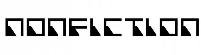
( Fonts by Jacob Fisher - www.pizzadude.dk )
A bold, geometric font with a futuristic and angular design.
 تنزيل 123 التنزيلات@WebFont
 -
( Fonts by blueroom - Personal-use only. For commercial use please contact owner. )
A bold, condensed, and oblique font with a modern and dynamic style.
![Sacco SemBd Cond Obliq تنزيل الخطوط]() تنزيل 123 التنزيلات@WebFont
تنزيل 123 التنزيلات@WebFont -
( Fonts by David Espinosa [Type Sailor] - www.facebook.com/typesailor - Personal-use only. For commercial use please contact owner. )
A modern, clean sans-serif font with balanced spacing and clear characters.
![Imelda Medium تنزيل الخطوط]() تنزيل 123 التنزيلات@WebFont
تنزيل 123 التنزيلات@WebFont -
( Fonts by zainstudio )
A bold, dynamic font with a playful and aggressive style.
![ROAR ROCK تنزيل الخطوط]() تنزيل 123 التنزيلات@WebFont
تنزيل 123 التنزيلات@WebFont -
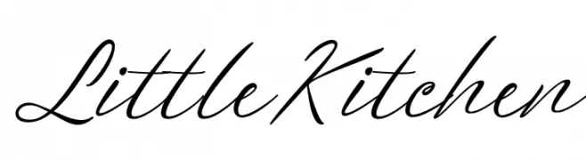
( Fonts by Ayudia Creative )
Elegant script font with a handwritten feel.
![Little Kitchen تنزيل الخطوط]() تنزيل 123 التنزيلات@WebFont
تنزيل 123 التنزيلات@WebFont -
-
![City of Rain تنزيل الخطوط]() تنزيل 123 التنزيلات@WebFont
تنزيل 123 التنزيلات@WebFont -
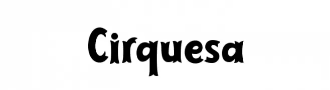
( 7NTypes - Situjuh Nazara - 7ntypes.com )
A playful, circus-themed font with bold, dynamic characters.
![Cirquesa تنزيل الخطوط]() تنزيل 123 التنزيلات@WebFont
تنزيل 123 التنزيلات@WebFont -
( Fonts by a Andrew Hart Dirt2.com - SickCapital. Personal-use only. For commercial use please contact owner. )
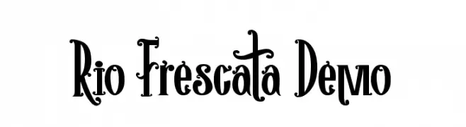
A playful, decorative font with whimsical serifs and exaggerated curves.
![Rio Frescata Demo تنزيل الخطوط]() تنزيل 123 التنزيلات@WebFont
تنزيل 123 التنزيلات@WebFont -
( Fonts by Dmitry Astakhov - www.behance.net/adonis-abe1e - Personal-use only. For commercial use please contact owner. )
A bold, playful font with a hand-drawn feel and retro-modern aesthetics.
![Astakhov Dished تنزيل الخطوط]() تنزيل 123 التنزيلات@WebFont
تنزيل 123 التنزيلات@WebFont -
( Fonts by Eimantas Paškonis - Personal-use only. For commercial use please contact owner. )
A modern, thin, and geometric typeface with clean lines and excellent readability.
![Neris Thin تنزيل الخطوط]() تنزيل 123 التنزيلات@WebFont
تنزيل 123 التنزيلات@WebFont


ما هي أبرز الخطوط الآن؟
تحظى Nonfiction, Sacco SemBd Cond Obliq, Imelda Medium, ROAR ROCK and Little Kitchen بشعبية لخطوطها النظيفة وتطبيقاتها الواسعة — من الهوية البصرية إلى الصفحات المقصودة والملصقات.
أي الخطوط تُستخدم كثيرًا في الشعارات؟
تُعد السان سيريف الهندسية (مثل Poppins وعائلات على نمط Gotham) خيارًا شائعًا لعلامات نظيفة قابلة للتوسع. ولإضفاء طابع ودي، تبقى السكريبت واليدوية خيارًا كلاسيكيًا. اجمع عنوانًا بارزًا مع خط نصي محايد لتحقيق التوازن والتميّز.
كم مرة يتم تحديث قائمة أعلى الخطوط؟
نحدّثها بانتظام استنادًا إلى التنزيلات والنشاط الفعلي. عُد إليها كثيرًا لاكتشاف النجوم الصاعدة مبكرًا.
💡 نصيحة: أضف هذه الصفحة إلى العلامات — تتغير الاتجاهات بسرعة وقد تُلهم خطوط اليوم الرائجة إعادة العلامة غدًا.