مرحبًا بك في قسم أعلى الخطوط — حيث تلتقي الشعبية بالجودة. هذه هي الخطوط الأكثر تنزيلًا واستخدامًا هذا العام من قبل مجتمعنا. إذا كنت بحاجة إلى اختيار موثوق للشعارات أو الويب أو وسائل التواصل، فابدأ من هنا.
يتميز كل خط رائج بتوازن جيد وقابلية قراءة وتعدد استخدامات. ستجد سان سيريف حديثة، وسكريبتات أنيقة، وسيريف كلاسيكية، وخطوط عرض minimal مختارة بعناية.
-
 تنزيل 127 التنزيلات@WebFont
 -
( Fonts by Manuel Ramos - www.infinitismo.com - Personal-use only. For commercial use please contact owner. )
An artistic, elongated font with narrow letterforms and subtle curves.
![Soma تنزيل الخطوط]() تنزيل 127 التنزيلات@WebFont
تنزيل 127 التنزيلات@WebFont -
( Fonts by Jeff Levine. FREEWARE )
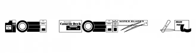
A decorative font inspired by automotive parts and accessories, featuring bold, blocky letters with intricate details.
![Auto Store JL تنزيل الخطوط]() تنزيل 127 التنزيلات@WebFont
تنزيل 127 التنزيلات@WebFont -
( Fonts by Looseleaf Fonts - Personal-use only. For commercial use please contact owner. )
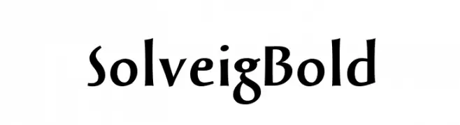
A bold, dynamic font with sharp angles and consistent thickness.
![SolveigBold تنزيل الخطوط]() تنزيل 127 التنزيلات@WebFont
تنزيل 127 التنزيلات@WebFont -
( Fonts by Daniel Zadorozny - www.iconian.com - Free for personal use )
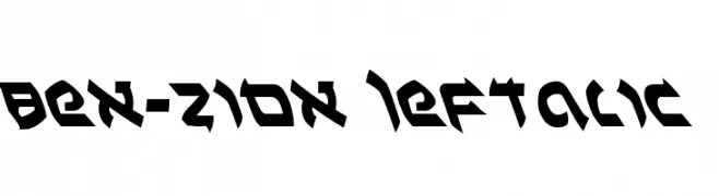
A bold, angular font with a futuristic and dynamic design.
![Ben-Zion Leftalic تنزيل الخطوط]() تنزيل 127 التنزيلات@WebFont
تنزيل 127 التنزيلات@WebFont -
-
( Fonts by Daniel Zadorozny - www.iconian.com - Free for personal use )
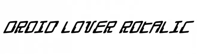
A futuristic, slanted font with bold, angular characters and a dynamic style.
![Droid Lover Rotalic تنزيل الخطوط]() تنزيل 127 التنزيلات@WebFont
تنزيل 127 التنزيلات@WebFont -
( Carlos Horacio Valera )
A bold, rounded font with a modern and clean aesthetic.
![wec-Bold تنزيل الخطوط]() تنزيل 127 التنزيلات@WebFont
تنزيل 127 التنزيلات@WebFont -
![Orient Pattern Dings Set 5 تنزيل الخطوط]() تنزيل 127 التنزيلات@WebFont
تنزيل 127 التنزيلات@WebFont -
( Fonts by www.typodermicfonts.com - Ray Larabie )
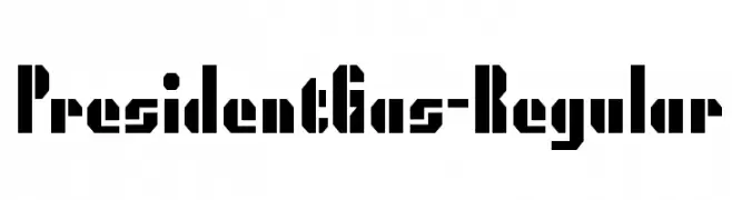
A bold, geometric font with a stencil-like, industrial design.
![PresidentGas-Regular تنزيل الخطوط]() تنزيل 127 التنزيلات@WebFont
تنزيل 127 التنزيلات@WebFont -
( Fonts by Artcoast Studio )
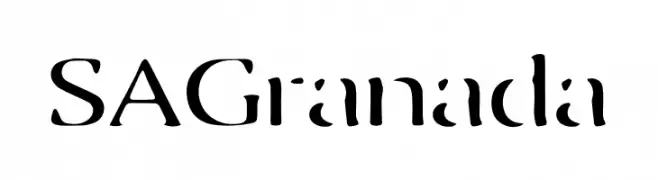
A modern, stencil-inspired font with bold, geometric characters.
![SA Granada تنزيل الخطوط]() تنزيل 127 التنزيلات@WebFont
تنزيل 127 التنزيلات@WebFont


ما هي أبرز الخطوط الآن؟
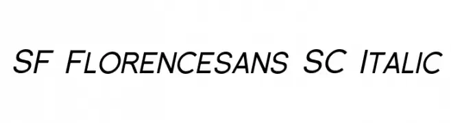
تحظى SF Florencesans SC Italic, Soma, Auto Store JL, SolveigBold and Ben-Zion Leftalic بشعبية لخطوطها النظيفة وتطبيقاتها الواسعة — من الهوية البصرية إلى الصفحات المقصودة والملصقات.
أي الخطوط تُستخدم كثيرًا في الشعارات؟
تُعد السان سيريف الهندسية (مثل Poppins وعائلات على نمط Gotham) خيارًا شائعًا لعلامات نظيفة قابلة للتوسع. ولإضفاء طابع ودي، تبقى السكريبت واليدوية خيارًا كلاسيكيًا. اجمع عنوانًا بارزًا مع خط نصي محايد لتحقيق التوازن والتميّز.
كم مرة يتم تحديث قائمة أعلى الخطوط؟
نحدّثها بانتظام استنادًا إلى التنزيلات والنشاط الفعلي. عُد إليها كثيرًا لاكتشاف النجوم الصاعدة مبكرًا.
💡 نصيحة: أضف هذه الصفحة إلى العلامات — تتغير الاتجاهات بسرعة وقد تُلهم خطوط اليوم الرائجة إعادة العلامة غدًا.