مرحبًا بك في قسم أعلى الخطوط — حيث تلتقي الشعبية بالجودة. هذه هي الخطوط الأكثر تنزيلًا واستخدامًا هذا العام من قبل مجتمعنا. إذا كنت بحاجة إلى اختيار موثوق للشعارات أو الويب أو وسائل التواصل، فابدأ من هنا.
يتميز كل خط رائج بتوازن جيد وقابلية قراءة وتعدد استخدامات. ستجد سان سيريف حديثة، وسكريبتات أنيقة، وسيريف كلاسيكية، وخطوط عرض minimal مختارة بعناية.
-
( Fonts by www.aenigmafonts.com )
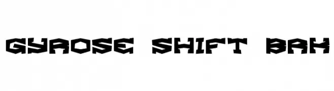
A bold, angular font with a geometric and futuristic style.
 تنزيل 130 التنزيلات@WebFont
 -
( Fonts by Arkandis Digital Foundry )
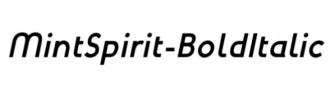
A modern, bold, and italicized font with a sleek and dynamic style.
![MintSpirit-BoldItalic تنزيل الخطوط]() تنزيل 130 التنزيلات@WebFont
تنزيل 130 التنزيلات@WebFont -
![SmileysMarker تنزيل الخطوط]() تنزيل 130 التنزيلات@WebFont
تنزيل 130 التنزيلات@WebFont -
( Fonts by Allouse Studio - Personal-use only. For commercial use please contact owner. )
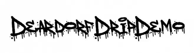
A bold, graffiti-inspired font with a distinctive dripping effect.
![Deardorf Drip Demo تنزيل الخطوط]() تنزيل 130 التنزيلات@WebFont
تنزيل 130 التنزيلات@WebFont -
( Fonts by Markus Schröppel )
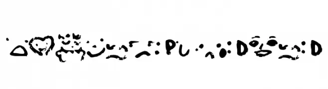
A playful, dotted font with consistent spacing and a decorative style.
![LLDCL تنزيل الخطوط]() تنزيل 130 التنزيلات@WebFont
تنزيل 130 التنزيلات@WebFont -
-
( www.studiotypo.com )
An edgy font with barbed wire elements, offering a rugged and industrial look.
![Barbed تنزيل الخطوط]() تنزيل 130 التنزيلات@WebFont
تنزيل 130 التنزيلات@WebFont -
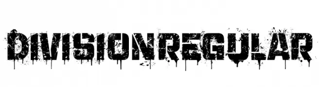
( Fonts by Vladimir Nikolic - www.creativefabrica.com/designer/vladimirnikolic/ - Personal-use only. For commercial use please contact owner. )
A bold, distressed font with a grunge, graffiti-inspired style.
![Division Regular تنزيل الخطوط]() تنزيل 130 التنزيلات@WebFont
تنزيل 130 التنزيلات@WebFont -
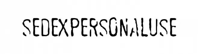
( Fonts by Billy Argel )
A distressed, hand-drawn font with bold, elongated characters and tight spacing.
![SEDEXPERSONALUSE تنزيل الخطوط]() تنزيل 130 التنزيلات@WebFont
تنزيل 130 التنزيلات@WebFont -
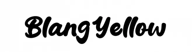
( Fonts by Syaf Rizal - Khurasan - Personal-use only. For commercial use please contact owner. )
A bold, cursive font with a playful and energetic style.
![Blang Yellow تنزيل الخطوط]() تنزيل 130 التنزيلات@WebFont
تنزيل 130 التنزيلات@WebFont -
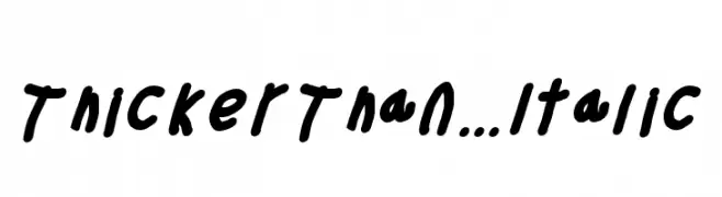
( Fonts by Cannot Into Space Fonts )
A bold, handwritten font with a playful, italicized style.
![Thicker Than... Italic تنزيل الخطوط]() تنزيل 130 التنزيلات@WebFont
تنزيل 130 التنزيلات@WebFont


ما هي أبرز الخطوط الآن؟
تحظى Gyrose Shift BRK, MintSpirit-BoldItalic, SmileysMarker, Deardorf Drip Demo and LLDCL بشعبية لخطوطها النظيفة وتطبيقاتها الواسعة — من الهوية البصرية إلى الصفحات المقصودة والملصقات.
أي الخطوط تُستخدم كثيرًا في الشعارات؟
تُعد السان سيريف الهندسية (مثل Poppins وعائلات على نمط Gotham) خيارًا شائعًا لعلامات نظيفة قابلة للتوسع. ولإضفاء طابع ودي، تبقى السكريبت واليدوية خيارًا كلاسيكيًا. اجمع عنوانًا بارزًا مع خط نصي محايد لتحقيق التوازن والتميّز.
كم مرة يتم تحديث قائمة أعلى الخطوط؟
نحدّثها بانتظام استنادًا إلى التنزيلات والنشاط الفعلي. عُد إليها كثيرًا لاكتشاف النجوم الصاعدة مبكرًا.
💡 نصيحة: أضف هذه الصفحة إلى العلامات — تتغير الاتجاهات بسرعة وقد تُلهم خطوط اليوم الرائجة إعادة العلامة غدًا.