مرحبًا بك في قسم أعلى الخطوط — حيث تلتقي الشعبية بالجودة. هذه هي الخطوط الأكثر تنزيلًا واستخدامًا هذا العام من قبل مجتمعنا. إذا كنت بحاجة إلى اختيار موثوق للشعارات أو الويب أو وسائل التواصل، فابدأ من هنا.
يتميز كل خط رائج بتوازن جيد وقابلية قراءة وتعدد استخدامات. ستجد سان سيريف حديثة، وسكريبتات أنيقة، وسيريف كلاسيكية، وخطوط عرض minimal مختارة بعناية.
-
( Fonts by dustBUST - Andreas Nylin )
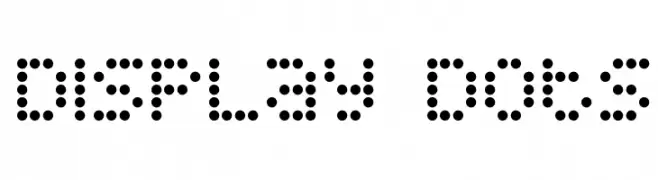
A dot-based font with a digital, modern aesthetic.
 تنزيل 2417 التنزيلات@WebFont
 -
( Fonts by Yadhie Setiawan - typelinestudio.com - Personal-use only. For commercial use please contact owner. )
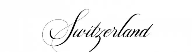
An elegant script font with flowing, cursive letters and intricate flourishes.
![Switzerland تنزيل الخطوط]() تنزيل 2416 التنزيلات@WebFont
تنزيل 2416 التنزيلات@WebFont -
( Fonts by a Max Infeld - XEROGRAPHER FONTS - xerographer.blogspot.com . Personal-use only. For commercial use please contact owner. )
A bold, textured font with a scratched, distressed appearance.
![WildScratch تنزيل الخطوط]() تنزيل 2416 التنزيلات@WebFont
تنزيل 2416 التنزيلات@WebFont -
( Copyright (c) 2012, Brian J. Bonislawsky DBA Astigmatic (AOETI) (astigma@astigmatic.com), with Reserved Font Names "McLaren" )
A modern, geometric sans-serif font with balanced spacing and clear characters.
![McLaren تنزيل الخطوط]() تنزيل 2416 التنزيلات@WebFont
تنزيل 2416 التنزيلات@WebFont -
( Fonts by Benoit Sjoholm - www.benoitsjoholm.com - All my fonts are for sale )
A modern, geometric font with rounded edges and a sleek design.
![Balkeno تنزيل الخطوط]() تنزيل 2416 التنزيلات@WebFont
تنزيل 2416 التنزيلات@WebFont -
-
( Fonts by Eric Kurniawan )
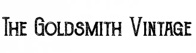
A vintage-style font with distressed, decorative characters.
![The Goldsmith Vintage تنزيل الخطوط]() تنزيل 2415 التنزيلات@WebFont
تنزيل 2415 التنزيلات@WebFont -
( Copyright 2016 The Cabin Project Authors (impallari@gmail.com) )
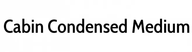
A modern, condensed sans-serif font with medium weight and excellent readability.
![Cabin Condensed Medium تنزيل الخطوط]() تنزيل 2415 التنزيلات@WebFont
تنزيل 2415 التنزيلات@WebFont -
( Copyright (c) 2011, Pablo Impallari (www.impallari.com|impallari@gmail.com) )
A modern sans-serif font with clean lines and excellent readability.
![Quattrocento Sans تنزيل الخطوط]() تنزيل 2415 التنزيلات@WebFont
تنزيل 2415 التنزيلات@WebFont -
![Gnarly تنزيل الخطوط]() تنزيل 2415 التنزيلات@WebFont
تنزيل 2415 التنزيلات@WebFont -
( Fonts by fabiandesmet.com )
A bold stencil font with high contrast and geometric shapes.
![ButlerStencil-ExtraBold تنزيل الخطوط]() تنزيل 2414 التنزيلات@WebFont
تنزيل 2414 التنزيلات@WebFont


ما هي أبرز الخطوط الآن؟
تحظى Display Dots, Switzerland, WildScratch, McLaren and Balkeno بشعبية لخطوطها النظيفة وتطبيقاتها الواسعة — من الهوية البصرية إلى الصفحات المقصودة والملصقات.
أي الخطوط تُستخدم كثيرًا في الشعارات؟
تُعد السان سيريف الهندسية (مثل Poppins وعائلات على نمط Gotham) خيارًا شائعًا لعلامات نظيفة قابلة للتوسع. ولإضفاء طابع ودي، تبقى السكريبت واليدوية خيارًا كلاسيكيًا. اجمع عنوانًا بارزًا مع خط نصي محايد لتحقيق التوازن والتميّز.
كم مرة يتم تحديث قائمة أعلى الخطوط؟
نحدّثها بانتظام استنادًا إلى التنزيلات والنشاط الفعلي. عُد إليها كثيرًا لاكتشاف النجوم الصاعدة مبكرًا.
💡 نصيحة: أضف هذه الصفحة إلى العلامات — تتغير الاتجاهات بسرعة وقد تُلهم خطوط اليوم الرائجة إعادة العلامة غدًا.