مرحبًا بك في قسم أعلى الخطوط — حيث تلتقي الشعبية بالجودة. هذه هي الخطوط الأكثر تنزيلًا واستخدامًا هذا العام من قبل مجتمعنا. إذا كنت بحاجة إلى اختيار موثوق للشعارات أو الويب أو وسائل التواصل، فابدأ من هنا.
يتميز كل خط رائج بتوازن جيد وقابلية قراءة وتعدد استخدامات. ستجد سان سيريف حديثة، وسكريبتات أنيقة، وسيريف كلاسيكية، وخطوط عرض minimal مختارة بعناية.
-
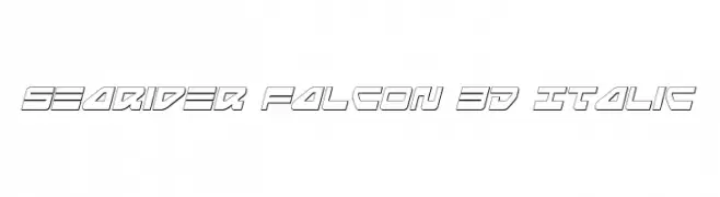
( Fonts by Daniel Zadorozny - www.iconian.com - Free for personal use )
A futuristic, 3D italic font with angular, outlined characters.
 تنزيل 131 التنزيلات@WebFont
 -
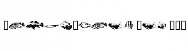
( Fonts by Astigmatic One Eye Typographic Institute - Brian J. Bonislawsky - astigmatic.com )
A decorative display font using fish illustrations for each character.
![FishyPrint One AOE تنزيل الخطوط]() تنزيل 131 التنزيلات@WebFont
تنزيل 131 التنزيلات@WebFont -
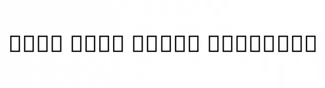
( Noto is a trademark of Google Inc. Noto fonts are open source. All Noto fonts are published under the SIL Open Font License, Version 1.1 )
A clean, modern sans-serif typeface with semi-bold weight and uniform stroke width.
![Noto Sans Tamil SemiBold تنزيل الخطوط]() تنزيل 131 التنزيلات@WebFont
تنزيل 131 التنزيلات@WebFont -
( Fonts by Woodcutter Manero - www.woodcutter.es - Personal-use only. For commercial use please contact owner. )
A bold decorative font of pagan and esoteric symbols.
![Pagan Symbols تنزيل الخطوط]() تنزيل 131 التنزيلات@WebFont
تنزيل 131 التنزيلات@WebFont -
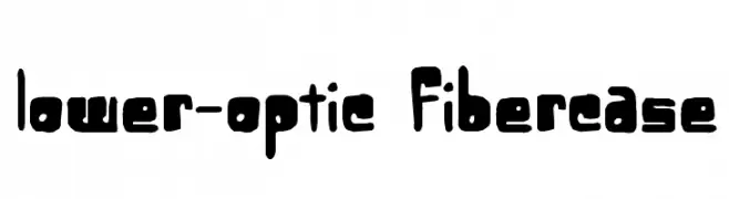
( - ekloff.com )
A bold, playful font with thick, rounded edges and a hand-drawn appearance.
![Lower-optic Fibercase تنزيل الخطوط]() تنزيل 131 التنزيلات@WebFont
تنزيل 131 التنزيلات@WebFont -
-
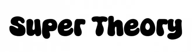
( Fonts by fsuarez913 )
A bold, playful font with rounded, bubbly characters and a retro-modern vibe.
![Super Theory تنزيل الخطوط]() تنزيل 131 التنزيلات@WebFont
تنزيل 131 التنزيلات@WebFont -
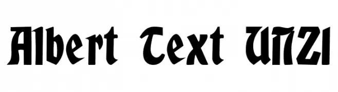
( Fonts by Peter Wiegel - www.peter-wiegel.de - Personal-use only. For commercial use please contact owner. )
A bold, dramatic font with vintage and gothic influences, featuring thick strokes and sharp angles.
![Albert Text UNZ1 تنزيل الخطوط]() تنزيل 131 التنزيلات@WebFont
تنزيل 131 التنزيلات@WebFont -
![Guyona تنزيل الخطوط]() تنزيل 131 التنزيلات@WebFont
تنزيل 131 التنزيلات@WebFont -
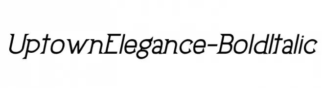
خط بواسطة JamboFonts. For commercial use please contact the owner.
![UptownElegance-BoldItalic تنزيل الخطوط]() تنزيل 131 التنزيلات@WebFont
تنزيل 131 التنزيلات@WebFont -
( www.chrisvile.com/ )
A bold, distressed grunge font with a textured, weathered appearance.
![Never Speak Of تنزيل الخطوط]() تنزيل 131 التنزيلات@WebFont
تنزيل 131 التنزيلات@WebFont


ما هي أبرز الخطوط الآن؟
تحظى Searider Falcon 3D Italic, FishyPrint One AOE, Noto Sans Tamil SemiBold, Pagan Symbols and Lower-optic Fibercase بشعبية لخطوطها النظيفة وتطبيقاتها الواسعة — من الهوية البصرية إلى الصفحات المقصودة والملصقات.
أي الخطوط تُستخدم كثيرًا في الشعارات؟
تُعد السان سيريف الهندسية (مثل Poppins وعائلات على نمط Gotham) خيارًا شائعًا لعلامات نظيفة قابلة للتوسع. ولإضفاء طابع ودي، تبقى السكريبت واليدوية خيارًا كلاسيكيًا. اجمع عنوانًا بارزًا مع خط نصي محايد لتحقيق التوازن والتميّز.
كم مرة يتم تحديث قائمة أعلى الخطوط؟
نحدّثها بانتظام استنادًا إلى التنزيلات والنشاط الفعلي. عُد إليها كثيرًا لاكتشاف النجوم الصاعدة مبكرًا.
💡 نصيحة: أضف هذه الصفحة إلى العلامات — تتغير الاتجاهات بسرعة وقد تُلهم خطوط اليوم الرائجة إعادة العلامة غدًا.