مرحبًا بك في قسم أعلى الخطوط — حيث تلتقي الشعبية بالجودة. هذه هي الخطوط الأكثر تنزيلًا واستخدامًا هذا العام من قبل مجتمعنا. إذا كنت بحاجة إلى اختيار موثوق للشعارات أو الويب أو وسائل التواصل، فابدأ من هنا.
يتميز كل خط رائج بتوازن جيد وقابلية قراءة وتعدد استخدامات. ستجد سان سيريف حديثة، وسكريبتات أنيقة، وسيريف كلاسيكية، وخطوط عرض minimal مختارة بعناية.
-
 تنزيل 132 التنزيلات@WebFont
 -
( Fonts by Klaus Johansen - www.listemageren.dK )
The image does not depict a valid font.
![Engle تنزيل الخطوط]() تنزيل 132 التنزيلات@WebFont
تنزيل 132 التنزيلات@WebFont -
( Fonts by dot colon - Personal-use only. For commercial use please contact owner. )
A sleek, modern, and italicized thin font with elegant strokes.
![Aileron Thin Italic تنزيل الخطوط]() تنزيل 132 التنزيلات@WebFont
تنزيل 132 التنزيلات@WebFont -
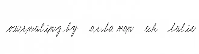
![Journaling by Marta van Eck Italic تنزيل الخطوط]() تنزيل 132 التنزيلات@WebFont
تنزيل 132 التنزيلات@WebFont -
( Fonts by Manfred Klein. Free for private and charity use. Free for commercial with donation to organizations )
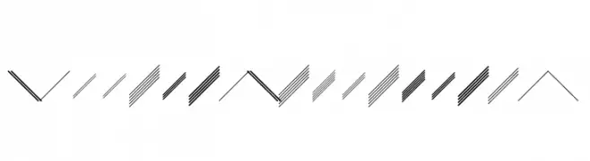
A geometric pattern with parallel lines creating dynamic and rhythmic visual flow.
![GalleriaGeometricaA تنزيل الخطوط]() تنزيل 132 التنزيلات@WebFont
تنزيل 132 التنزيلات@WebFont -
-
( Character )
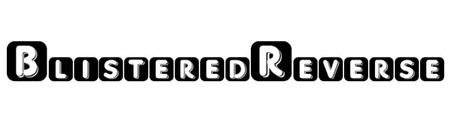
Bold, uppercase letters in rounded squares with a modern, striking design.
![BlisteredReverse تنزيل الخطوط]() تنزيل 132 التنزيلات@WebFont
تنزيل 132 التنزيلات@WebFont -
( Fonts by Paul Reid - tracertong.co.uk )
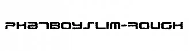
A bold, rough-textured font with a grunge-like, distressed appearance.
![PhatBoySlim-Rough تنزيل الخطوط]() تنزيل 132 التنزيلات@WebFont
تنزيل 132 التنزيلات@WebFont -
( Fonts by Daniel Zadorozny - www.iconian.com )
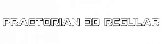
A bold, 3D geometric font with a modern, futuristic style.
![Praetorian 3D Regular تنزيل الخطوط]() تنزيل 132 التنزيلات@WebFont
تنزيل 132 التنزيلات@WebFont -
( Fonts by Ahmad Muzayyin - Paypal account for donation: paypal.me/azhein13 - Personal-use only. For commercial use please contact owner. )
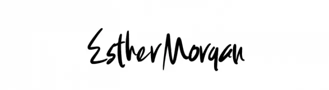
A bold, handwritten font with dynamic strokes and a lively, personal touch.
![Esther Morgan تنزيل الخطوط]() تنزيل 132 التنزيلات@WebFont
تنزيل 132 التنزيلات@WebFont -
( Fonts by Maelle.K - Thomas Boucherie )
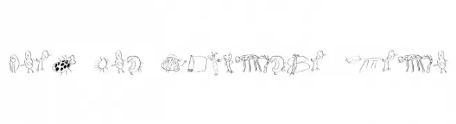
A playful, hand-drawn font with whimsical illustrations for each character.
![Font for Children Indo تنزيل الخطوط]() تنزيل 132 التنزيلات@WebFont
تنزيل 132 التنزيلات@WebFont


ما هي أبرز الخطوط الآن؟
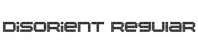
تحظى Disorient Regular, Engle, Aileron Thin Italic, Journaling by Marta van Eck Italic and GalleriaGeometricaA بشعبية لخطوطها النظيفة وتطبيقاتها الواسعة — من الهوية البصرية إلى الصفحات المقصودة والملصقات.
أي الخطوط تُستخدم كثيرًا في الشعارات؟
تُعد السان سيريف الهندسية (مثل Poppins وعائلات على نمط Gotham) خيارًا شائعًا لعلامات نظيفة قابلة للتوسع. ولإضفاء طابع ودي، تبقى السكريبت واليدوية خيارًا كلاسيكيًا. اجمع عنوانًا بارزًا مع خط نصي محايد لتحقيق التوازن والتميّز.
كم مرة يتم تحديث قائمة أعلى الخطوط؟
نحدّثها بانتظام استنادًا إلى التنزيلات والنشاط الفعلي. عُد إليها كثيرًا لاكتشاف النجوم الصاعدة مبكرًا.
💡 نصيحة: أضف هذه الصفحة إلى العلامات — تتغير الاتجاهات بسرعة وقد تُلهم خطوط اليوم الرائجة إعادة العلامة غدًا.