مرحبًا بك في قسم أعلى الخطوط — حيث تلتقي الشعبية بالجودة. هذه هي الخطوط الأكثر تنزيلًا واستخدامًا هذا العام من قبل مجتمعنا. إذا كنت بحاجة إلى اختيار موثوق للشعارات أو الويب أو وسائل التواصل، فابدأ من هنا.
يتميز كل خط رائج بتوازن جيد وقابلية قراءة وتعدد استخدامات. ستجد سان سيريف حديثة، وسكريبتات أنيقة، وسيريف كلاسيكية، وخطوط عرض minimal مختارة بعناية.
-
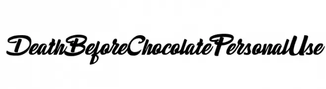
( Fonts by Billy Argel Fonts - www.billyargel.com - Personal-use only. For commercial use please contact owner. )
A bold, dynamic script font with a modern and elegant style.
 تنزيل 133 التنزيلات@WebFont
 -
( Fonts by Emil Bertell - www.fenotype.com )
A bold, angular, and futuristic italic font with a strong visual impact.
![cheaptype [italic] تنزيل الخطوط]() تنزيل 133 التنزيلات@WebFont
تنزيل 133 التنزيلات@WebFont -
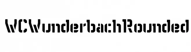
( Fonts by Christophe Feray - www.wcfonts.com )
A bold, geometric font with rounded edges and a stencil-like design.
![WCWunderbachRounded تنزيل الخطوط]() تنزيل 133 التنزيلات@WebFont
تنزيل 133 التنزيلات@WebFont -
( Copyright (c) 2014, Neelakash Kshetrimayum (www.neelakash.com|neelakash.k@gmail.com). )
A bold, robust font ideal for impactful and commanding designs.
![Sitara Bold تنزيل الخطوط]() تنزيل 133 التنزيلات@WebFont
تنزيل 133 التنزيلات@WebFont -
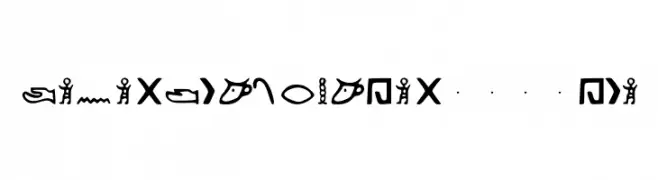
( Fonts by Kemetic 3200 BCE )
A decorative, pictorial font inspired by ancient Egyptian hieroglyphs.
![Kemetic_Alphabet_3.200_BCE تنزيل الخطوط]() تنزيل 133 التنزيلات@WebFont
تنزيل 133 التنزيلات@WebFont -
-
( Fonts by U.S. Web Design System )
A clean, modern sans-serif font with light weight and low contrast.
![Public Sans Light تنزيل الخطوط]() تنزيل 133 التنزيلات@WebFont
تنزيل 133 التنزيلات@WebFont -
( Fonts by Adien Gunarta - fontasticindonesia.blogspot.com )
A geometric and minimalistic font with consistent stroke width and modern design.
![Hangeul Simplify Regular تنزيل الخطوط]() تنزيل 133 التنزيلات@WebFont
تنزيل 133 التنزيلات@WebFont -
( Fonts by Carlos Daniel Matteoli - Qbotype Fonts - http://carlosmatteoli.wix.com/qbotype. Personal-use only. For commercial use please contact owner. )
A bold, geometric font with a military-inspired, stencil-like design.
![Oxin Army تنزيل الخطوط]() تنزيل 133 التنزيلات@WebFont
تنزيل 133 التنزيلات@WebFont -
( Fonts by pOPdOG fONTS - Dimitris Kolyris - Personal-use only. For commercial use please contact owner. )
A bold, playful font with a 3D effect and strong contrast.
![Benny Blanco تنزيل الخطوط]() تنزيل 133 التنزيلات@WebFont
تنزيل 133 التنزيلات@WebFont -
![VTC Bad DataTrip Bold تنزيل الخطوط]() تنزيل 133 التنزيلات@WebFont
تنزيل 133 التنزيلات@WebFont
![cheaptype [italic] تنزيل الخطوط](https://d144mzi0q5mijx.cloudfront.net/img/C/H/cheaptype-italic.webp)

ما هي أبرز الخطوط الآن؟
تحظى Death Before Chocolate Personal Use , cheaptype [italic], WCWunderbachRounded, Sitara Bold and Kemetic_Alphabet_3.200_BCE بشعبية لخطوطها النظيفة وتطبيقاتها الواسعة — من الهوية البصرية إلى الصفحات المقصودة والملصقات.
أي الخطوط تُستخدم كثيرًا في الشعارات؟
تُعد السان سيريف الهندسية (مثل Poppins وعائلات على نمط Gotham) خيارًا شائعًا لعلامات نظيفة قابلة للتوسع. ولإضفاء طابع ودي، تبقى السكريبت واليدوية خيارًا كلاسيكيًا. اجمع عنوانًا بارزًا مع خط نصي محايد لتحقيق التوازن والتميّز.
كم مرة يتم تحديث قائمة أعلى الخطوط؟
نحدّثها بانتظام استنادًا إلى التنزيلات والنشاط الفعلي. عُد إليها كثيرًا لاكتشاف النجوم الصاعدة مبكرًا.
💡 نصيحة: أضف هذه الصفحة إلى العلامات — تتغير الاتجاهات بسرعة وقد تُلهم خطوط اليوم الرائجة إعادة العلامة غدًا.