مرحبًا بك في قسم أعلى الخطوط — حيث تلتقي الشعبية بالجودة. هذه هي الخطوط الأكثر تنزيلًا واستخدامًا هذا العام من قبل مجتمعنا. إذا كنت بحاجة إلى اختيار موثوق للشعارات أو الويب أو وسائل التواصل، فابدأ من هنا.
يتميز كل خط رائج بتوازن جيد وقابلية قراءة وتعدد استخدامات. ستجد سان سيريف حديثة، وسكريبتات أنيقة، وسيريف كلاسيكية، وخطوط عرض minimal مختارة بعناية.
-
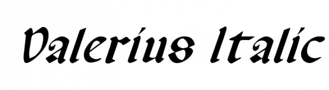
( Fonts by Daniel Zadorozny - www.iconian.com - Free for personal use )
An elegant and dynamic italic font with bold, flowing strokes.
 تنزيل 135 التنزيلات@WebFont
 -
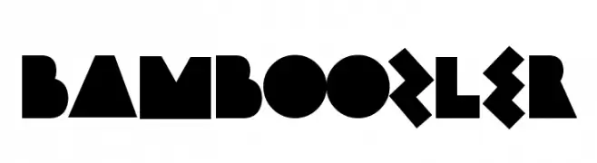
( Fonts by Andrew McCluskey - nalgames.com. Personal-use only. For commercial use please contact owner. )
A bold, geometric font with sharp angles and a modern style.
![Bamboozler تنزيل الخطوط]() تنزيل 135 التنزيلات@WebFont
تنزيل 135 التنزيلات@WebFont -
![Bad Ice Cream Demo Regular تنزيل الخطوط]() تنزيل 135 التنزيلات@WebFont
تنزيل 135 التنزيلات@WebFont -
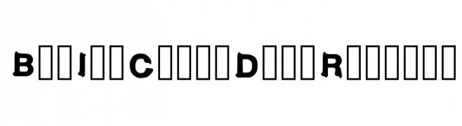
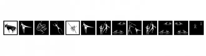
( Fonts by Manfred Klein. Free for private and charity use. Free for commercial with donation to organizations )
A collection of cave painting-style pictographs with expressive, bold lines.
![CavePaintings تنزيل الخطوط]() تنزيل 135 التنزيلات@WebFont
تنزيل 135 التنزيلات@WebFont -
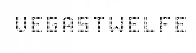
( Fonts by Altsys Metamorphosis )
A modern, dotted font with a digital display aesthetic.
![VegasTWELFE تنزيل الخطوط]() تنزيل 135 التنزيلات@WebFont
تنزيل 135 التنزيلات@WebFont -
-
( گالری فانت فارسی پژوهش آريانا - only compatible with Farsi and Arabic )
A bold, geometric font with a futuristic and digital style.
![Future II تنزيل الخطوط]() تنزيل 135 التنزيلات@WebFont
تنزيل 135 التنزيلات@WebFont -
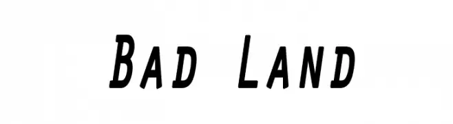
( Fonts by Leonard Posavec - leosupply.co - Personal-use only. For commercial use please contact owner. )
A bold, slightly italicized font with a modern and dynamic style.
![Bad Land تنزيل الخطوط]() تنزيل 135 التنزيلات@WebFont
تنزيل 135 التنزيلات@WebFont -
( Rahmat Hidayat )
An elegant and flowing script font with graceful curves and loops.
![Angelica Free تنزيل الخطوط]() تنزيل 135 التنزيلات@WebFont
تنزيل 135 التنزيلات@WebFont -
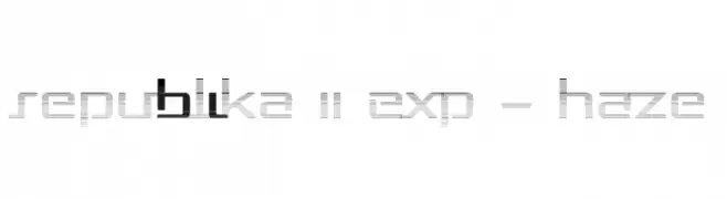
( Fonts by Apostrophic Lab )
A modern, digital-inspired font with geometric and linear elements.
![Republika II Exp - Haze تنزيل الخطوط]() تنزيل 135 التنزيلات@WebFont
تنزيل 135 التنزيلات@WebFont -
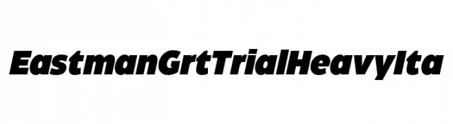
( Fonts by Zetafonts - Personal-use only. For commercial use please contact owner. )
A bold, italicized font with thick strokes and a modern, impactful style.
![Eastman Grt Trial Heavy Ita تنزيل الخطوط]() تنزيل 135 التنزيلات@WebFont
تنزيل 135 التنزيلات@WebFont


ما هي أبرز الخطوط الآن؟
تحظى Valerius Italic, Bamboozler, Bad Ice Cream Demo Regular, CavePaintings and VegasTWELFE بشعبية لخطوطها النظيفة وتطبيقاتها الواسعة — من الهوية البصرية إلى الصفحات المقصودة والملصقات.
أي الخطوط تُستخدم كثيرًا في الشعارات؟
تُعد السان سيريف الهندسية (مثل Poppins وعائلات على نمط Gotham) خيارًا شائعًا لعلامات نظيفة قابلة للتوسع. ولإضفاء طابع ودي، تبقى السكريبت واليدوية خيارًا كلاسيكيًا. اجمع عنوانًا بارزًا مع خط نصي محايد لتحقيق التوازن والتميّز.
كم مرة يتم تحديث قائمة أعلى الخطوط؟
نحدّثها بانتظام استنادًا إلى التنزيلات والنشاط الفعلي. عُد إليها كثيرًا لاكتشاف النجوم الصاعدة مبكرًا.
💡 نصيحة: أضف هذه الصفحة إلى العلامات — تتغير الاتجاهات بسرعة وقد تُلهم خطوط اليوم الرائجة إعادة العلامة غدًا.