مرحبًا بك في قسم أعلى الخطوط — حيث تلتقي الشعبية بالجودة. هذه هي الخطوط الأكثر تنزيلًا واستخدامًا هذا العام من قبل مجتمعنا. إذا كنت بحاجة إلى اختيار موثوق للشعارات أو الويب أو وسائل التواصل، فابدأ من هنا.
يتميز كل خط رائج بتوازن جيد وقابلية قراءة وتعدد استخدامات. ستجد سان سيريف حديثة، وسكريبتات أنيقة، وسيريف كلاسيكية، وخطوط عرض minimal مختارة بعناية.
-
( Fonts by Sang Seo - LALATO FONTS. Personal-use only. For commercial use please contact owner. )
A playful, handwritten font with smooth, flowing lines and consistent stroke width.
 تنزيل 141 التنزيلات@WebFont
 -
( Haksen Letters - Sarwo Edhi Prayitno )
A playful, handwritten font with tall, narrow letters and a slight slant.
![Hello Pretty تنزيل الخطوط]() تنزيل 141 التنزيلات@WebFont
تنزيل 141 التنزيلات@WebFont -
![Vintage Frames 10 تنزيل الخطوط]() تنزيل 141 التنزيلات@WebFont
تنزيل 141 التنزيلات@WebFont -
( Igor Berck - www.igorberck.com )
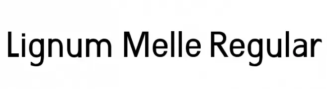
A modern, geometric sans-serif font with clean lines and uniform strokes.
![Lignum Melle Regular تنزيل الخطوط]() تنزيل 141 التنزيلات@WebFont
تنزيل 141 التنزيلات@WebFont -
( Fonts by Iconian Fonts - Daniel Zadorozny - Personal-use only. For commercial use please contact owner. )
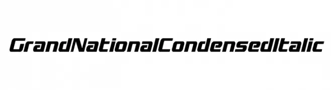
A modern, condensed italic font with a sleek and dynamic design.
![Grand National Condensed Italic تنزيل الخطوط]() تنزيل 141 التنزيلات@WebFont
تنزيل 141 التنزيلات@WebFont -
-
( Thor Christopher Arisland - www.tcarisland.com )
A modern, geometric font with tall, narrow characters and consistent stroke weight.
![Sullivan تنزيل الخطوط]() تنزيل 141 التنزيلات@WebFont
تنزيل 141 التنزيلات@WebFont -
( Fonts by Andrew McCluskey - nalgames.com. Personal-use only. For commercial use please contact owner. )
A bold, geometric font with a futuristic and industrial style.
![Comfortably Fucked تنزيل الخطوط]() تنزيل 141 التنزيلات@WebFont
تنزيل 141 التنزيلات@WebFont -
( THESE ARE SHAREWARE FONTS ! NOT FREEWARE ! PLEASE VISIT www.fuelfonts.com )
A futuristic, geometric font with bold, angular letterforms.
![Eclipser تنزيل الخطوط]() تنزيل 141 التنزيلات@WebFont
تنزيل 141 التنزيلات@WebFont -
( Fonts by www.dcoxy.com )
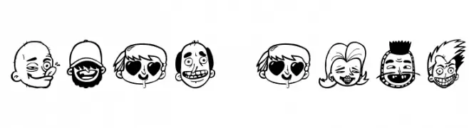
Cartoonish, expressive font made of illustrated faces.
![sick crew تنزيل الخطوط]() تنزيل 141 التنزيلات@WebFont
تنزيل 141 التنزيلات@WebFont -
![LaMorte6 تنزيل الخطوط]() تنزيل 141 التنزيلات@WebFont
تنزيل 141 التنزيلات@WebFont


ما هي أبرز الخطوط الآن؟
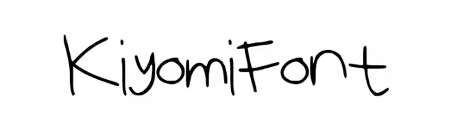
تحظى KiyomiFont, Hello Pretty, Vintage Frames 10, Lignum Melle Regular and Grand National Condensed Italic بشعبية لخطوطها النظيفة وتطبيقاتها الواسعة — من الهوية البصرية إلى الصفحات المقصودة والملصقات.
أي الخطوط تُستخدم كثيرًا في الشعارات؟
تُعد السان سيريف الهندسية (مثل Poppins وعائلات على نمط Gotham) خيارًا شائعًا لعلامات نظيفة قابلة للتوسع. ولإضفاء طابع ودي، تبقى السكريبت واليدوية خيارًا كلاسيكيًا. اجمع عنوانًا بارزًا مع خط نصي محايد لتحقيق التوازن والتميّز.
كم مرة يتم تحديث قائمة أعلى الخطوط؟
نحدّثها بانتظام استنادًا إلى التنزيلات والنشاط الفعلي. عُد إليها كثيرًا لاكتشاف النجوم الصاعدة مبكرًا.
💡 نصيحة: أضف هذه الصفحة إلى العلامات — تتغير الاتجاهات بسرعة وقد تُلهم خطوط اليوم الرائجة إعادة العلامة غدًا.