مرحبًا بك في قسم أعلى الخطوط — حيث تلتقي الشعبية بالجودة. هذه هي الخطوط الأكثر تنزيلًا واستخدامًا هذا العام من قبل مجتمعنا. إذا كنت بحاجة إلى اختيار موثوق للشعارات أو الويب أو وسائل التواصل، فابدأ من هنا.
يتميز كل خط رائج بتوازن جيد وقابلية قراءة وتعدد استخدامات. ستجد سان سيريف حديثة، وسكريبتات أنيقة، وسيريف كلاسيكية، وخطوط عرض minimal مختارة بعناية.
-
( Fonts by www.gliphmaker.com. Personal-use only. For commercial use please contact owner. )
A bold slab serif font with strong, block-like serifs and consistent stroke widths.
 تنزيل 144 التنزيلات@WebFont
 -
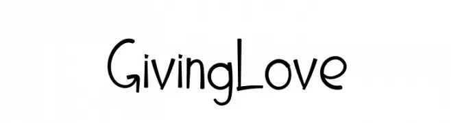
![Giving Love تنزيل الخطوط]() تنزيل 144 التنزيلات@WebFont
تنزيل 144 التنزيلات@WebFont -
( Fonts by Misti's Fonts )
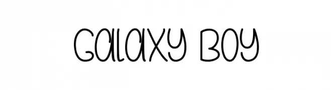
A playful, rounded font with a whimsical, handwritten style.
![Galaxy Boy تنزيل الخطوط]() تنزيل 144 التنزيلات@WebFont
تنزيل 144 التنزيلات@WebFont -
( Fonts by Daniel Zadorozny - www.iconian.com - Free for personal use )
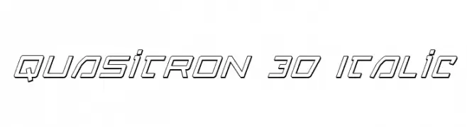
A futuristic, 3D geometric font with italicized, angular letterforms.
![Quasitron 3D Italic تنزيل الخطوط]() تنزيل 144 التنزيلات@WebFont
تنزيل 144 التنزيلات@WebFont -
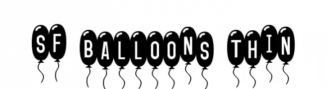
![SF Balloons Thin تنزيل الخطوط]() تنزيل 144 التنزيلات@WebFont
تنزيل 144 التنزيلات@WebFont -
-
( Fonts by Manfred Klein. Free for private and charity use. Free for commercial with donation to organizations )
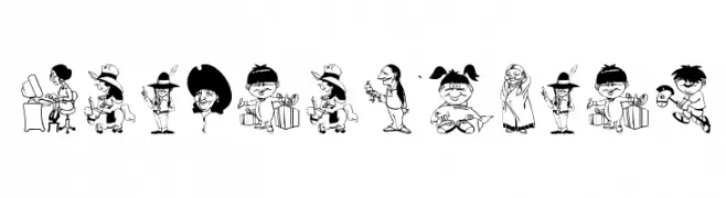
Cartoonish, illustrated font with each character as a unique caricature.
![Indians Today تنزيل الخطوط]() تنزيل 144 التنزيلات@WebFont
تنزيل 144 التنزيلات@WebFont -
خط بواسطة NicholasJudy456. For commercial use please contact the owner.
( Here's More of the House Fonts )
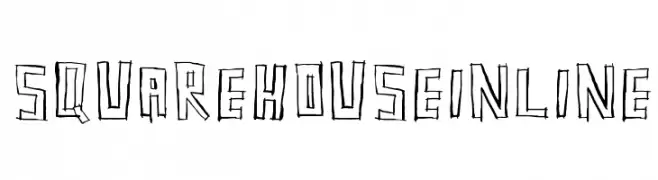
A bold, hand-drawn inline font with a sketch-like appearance.
![SquarehouseInline تنزيل الخطوط]() تنزيل 144 التنزيلات@WebFont
تنزيل 144 التنزيلات@WebFont -
( Fonts by Manfred Klein. Free for private and charity use. Free for commercial with donation to organizations )
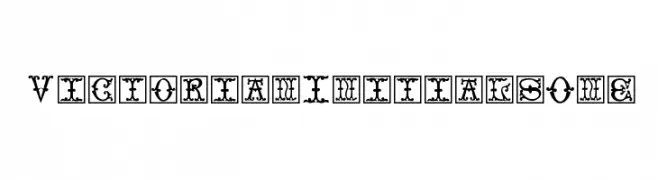
An ornate, Victorian-inspired decorative font with intricate flourishes.
![VictorianInitialsOne تنزيل الخطوط]() تنزيل 144 التنزيلات@WebFont
تنزيل 144 التنزيلات@WebFont -
( Fonts by simoherold - Personal-use only. For commercial use please contact owner. )
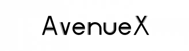
A modern, geometric font with clean lines and a bold appearance.
![AvenueX تنزيل الخطوط]() تنزيل 144 التنزيلات@WebFont
تنزيل 144 التنزيلات@WebFont -
خط بواسطة danny91194. For commercial use please contact the owner.
( tricky )
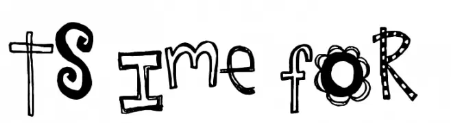
A playful, hand-drawn font with whimsical patterns and decorative elements.
![It's Time for FUN تنزيل الخطوط]() تنزيل 144 التنزيلات@WebFont
تنزيل 144 التنزيلات@WebFont
ما هي أبرز الخطوط الآن؟
تحظى Italy B, Giving Love, Galaxy Boy, Quasitron 3D Italic and SF Balloons Thin بشعبية لخطوطها النظيفة وتطبيقاتها الواسعة — من الهوية البصرية إلى الصفحات المقصودة والملصقات.
أي الخطوط تُستخدم كثيرًا في الشعارات؟
تُعد السان سيريف الهندسية (مثل Poppins وعائلات على نمط Gotham) خيارًا شائعًا لعلامات نظيفة قابلة للتوسع. ولإضفاء طابع ودي، تبقى السكريبت واليدوية خيارًا كلاسيكيًا. اجمع عنوانًا بارزًا مع خط نصي محايد لتحقيق التوازن والتميّز.
كم مرة يتم تحديث قائمة أعلى الخطوط؟
نحدّثها بانتظام استنادًا إلى التنزيلات والنشاط الفعلي. عُد إليها كثيرًا لاكتشاف النجوم الصاعدة مبكرًا.
💡 نصيحة: أضف هذه الصفحة إلى العلامات — تتغير الاتجاهات بسرعة وقد تُلهم خطوط اليوم الرائجة إعادة العلامة غدًا.