مرحبًا بك في قسم أعلى الخطوط — حيث تلتقي الشعبية بالجودة. هذه هي الخطوط الأكثر تنزيلًا واستخدامًا هذا العام من قبل مجتمعنا. إذا كنت بحاجة إلى اختيار موثوق للشعارات أو الويب أو وسائل التواصل، فابدأ من هنا.
يتميز كل خط رائج بتوازن جيد وقابلية قراءة وتعدد استخدامات. ستجد سان سيريف حديثة، وسكريبتات أنيقة، وسيريف كلاسيكية، وخطوط عرض minimal مختارة بعناية.
-
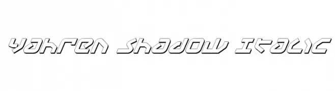
( Fonts by Daniel Zadorozny - www.iconian.com - Free for personal use )
A bold, italicized font with a shadow effect and geometric design.
 تنزيل 145 التنزيلات@WebFont
 -
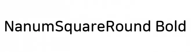
( Collection of Korean web fonts - Personal-use only. For commercial use please contact owner. )
A modern sans-serif font with rounded edges, offering a friendly and approachable style.
![NanumSquareRound Bold تنزيل الخطوط]() تنزيل 145 التنزيلات@WebFont
تنزيل 145 التنزيلات@WebFont -
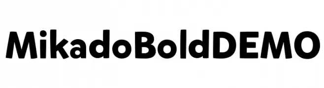
( HvD Fonts - Hannes von Döhren - www.hvdfonts.com )
A bold, playful font with rounded edges and strong presence.
![MikadoBoldDEMO تنزيل الخطوط]() تنزيل 145 التنزيلات@WebFont
تنزيل 145 التنزيلات@WebFont -
( Fonts by Galdino Otten Fonts )
A playful, handwritten font with a bold, rounded style and slight slant.
![Comic Balloon New Italic تنزيل الخطوط]() تنزيل 145 التنزيلات@WebFont
تنزيل 145 التنزيلات@WebFont -
( truefonts.blogspot.com )
A playful, dotted outline font with a whimsical, hand-drawn style.
![discontinuo tfb تنزيل الخطوط]() تنزيل 145 التنزيلات@WebFont
تنزيل 145 التنزيلات@WebFont -
-
( Creatype Studio - Rian Rahardi - creativemarket.com/creatype )
A dynamic, brush-stroke font with an energetic and expressive style.
![Granite تنزيل الخطوط]() تنزيل 145 التنزيلات@WebFont
تنزيل 145 التنزيلات@WebFont -
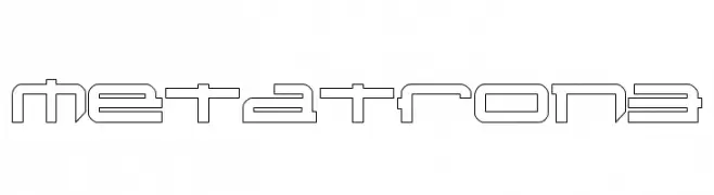
![Metatron3 تنزيل الخطوط]() تنزيل 145 التنزيلات@WebFont
تنزيل 145 التنزيلات@WebFont -
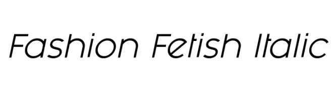
( Levi Szekeres - www.loremipsum.ro )
A sleek, modern italic font with clean lines and elegant curves.
![Fashion Fetish Italic تنزيل الخطوط]() تنزيل 145 التنزيلات@WebFont
تنزيل 145 التنزيلات@WebFont -
( Chung-deh Tien - www.redbubble.com/people/kaiju/portfolio )
A bold, geometric font with high contrast and unique angular cutouts.
![ATUYASDODI تنزيل الخطوط]() تنزيل 145 التنزيلات@WebFont
تنزيل 145 التنزيلات@WebFont -
( Fonts by Woodcutter Manero - www.woodcutter.es - Personal-use only. For commercial use please contact owner. )
A bold, intricate blackletter font with sharp, angular strokes.
![Westfalia تنزيل الخطوط]() تنزيل 145 التنزيلات@WebFont
تنزيل 145 التنزيلات@WebFont


ما هي أبرز الخطوط الآن؟
تحظى Yahren Shadow Italic, NanumSquareRound Bold, MikadoBoldDEMO, Comic Balloon New Italic and discontinuo tfb بشعبية لخطوطها النظيفة وتطبيقاتها الواسعة — من الهوية البصرية إلى الصفحات المقصودة والملصقات.
أي الخطوط تُستخدم كثيرًا في الشعارات؟
تُعد السان سيريف الهندسية (مثل Poppins وعائلات على نمط Gotham) خيارًا شائعًا لعلامات نظيفة قابلة للتوسع. ولإضفاء طابع ودي، تبقى السكريبت واليدوية خيارًا كلاسيكيًا. اجمع عنوانًا بارزًا مع خط نصي محايد لتحقيق التوازن والتميّز.
كم مرة يتم تحديث قائمة أعلى الخطوط؟
نحدّثها بانتظام استنادًا إلى التنزيلات والنشاط الفعلي. عُد إليها كثيرًا لاكتشاف النجوم الصاعدة مبكرًا.
💡 نصيحة: أضف هذه الصفحة إلى العلامات — تتغير الاتجاهات بسرعة وقد تُلهم خطوط اليوم الرائجة إعادة العلامة غدًا.