مرحبًا بك في قسم أعلى الخطوط — حيث تلتقي الشعبية بالجودة. هذه هي الخطوط الأكثر تنزيلًا واستخدامًا هذا العام من قبل مجتمعنا. إذا كنت بحاجة إلى اختيار موثوق للشعارات أو الويب أو وسائل التواصل، فابدأ من هنا.
يتميز كل خط رائج بتوازن جيد وقابلية قراءة وتعدد استخدامات. ستجد سان سيريف حديثة، وسكريبتات أنيقة، وسيريف كلاسيكية، وخطوط عرض minimal مختارة بعناية.
-
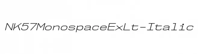
( Fonts by Typodermic Fonts )
A modern, monospaced italic font with light strokes and a clean design.
 تنزيل 145 التنزيلات@WebFont
 -
( Fonts by twinletter )
A bold, geometric font with a modern, futuristic style.
![FLASTY Regular تنزيل الخطوط]() تنزيل 145 التنزيلات@WebFont
تنزيل 145 التنزيلات@WebFont -
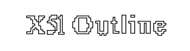
( Fonts by www.lifewithouttaffy.com )
A pixelated, outline font with a bold and structured design.
![X51 Outline تنزيل الخطوط]() تنزيل 145 التنزيلات@WebFont
تنزيل 145 التنزيلات@WebFont -
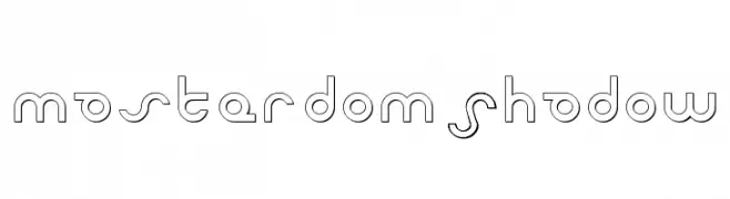
( Fonts by Daniel Zadorozny - www.iconian.com - Free for personal use )
A futuristic, geometric font with clean lines and circular elements.
![Masterdom Shadow تنزيل الخطوط]() تنزيل 145 التنزيلات@WebFont
تنزيل 145 التنزيلات@WebFont -
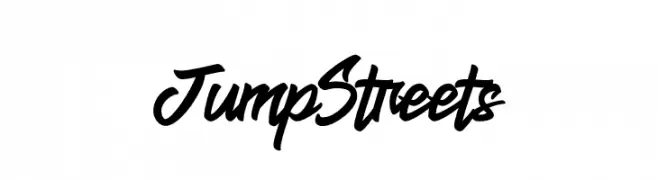
( Fonts by Krakenbox Std )
A bold, dynamic script font with a flowing, interconnected style.
![Jump Streets تنزيل الخطوط]() تنزيل 145 التنزيلات@WebFont
تنزيل 145 التنزيلات@WebFont -
-
( Fonts by Daniel Zadorozny - www.iconian.com )
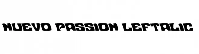
A bold, left-leaning font with a dynamic and playful style.
![Nuevo Passion Leftalic تنزيل الخطوط]() تنزيل 145 التنزيلات@WebFont
تنزيل 145 التنزيلات@WebFont -
( Fonts by Manfred Klein. Free for private and charity use. Free for commercial with donation to organizations )
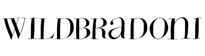
A high-contrast, elegant font with sharp serifs and dynamic curves.
![WildBradoni تنزيل الخطوط]() تنزيل 145 التنزيلات@WebFont
تنزيل 145 التنزيلات@WebFont -
( Fonts by Des Gomez )
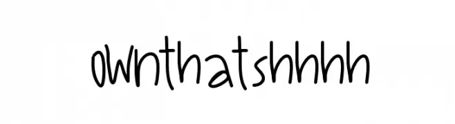
A playful, casual handwritten font with a friendly vibe.
![OwnThatShhhh تنزيل الخطوط]() تنزيل 145 التنزيلات@WebFont
تنزيل 145 التنزيلات@WebFont -
خط بواسطة typotopia. For commercial use please contact the owner.
( Fonts bt Typotopia - Typotopia.co - Personal Use Only, for Commercial Use, please contact us )
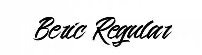
A bold, cursive script font with fluid, connected strokes and elegant flourishes.
![Beric Regular تنزيل الخطوط]() تنزيل 145 التنزيلات@WebFont
تنزيل 145 التنزيلات@WebFont -
( Fonts by a Situjuh Nazara - c7n1.wordpress.com. Personal-use only. For commercial use please contact owner. )
A sleek, modern italic font with smooth curves and uniform stroke width.
![Hurufo & Numero Italic Italic تنزيل الخطوط]() تنزيل 145 التنزيلات@WebFont
تنزيل 145 التنزيلات@WebFont

ما هي أبرز الخطوط الآن؟
تحظى NK57MonospaceExLt-Italic, FLASTY Regular, X51 Outline, Masterdom Shadow and Jump Streets بشعبية لخطوطها النظيفة وتطبيقاتها الواسعة — من الهوية البصرية إلى الصفحات المقصودة والملصقات.
أي الخطوط تُستخدم كثيرًا في الشعارات؟
تُعد السان سيريف الهندسية (مثل Poppins وعائلات على نمط Gotham) خيارًا شائعًا لعلامات نظيفة قابلة للتوسع. ولإضفاء طابع ودي، تبقى السكريبت واليدوية خيارًا كلاسيكيًا. اجمع عنوانًا بارزًا مع خط نصي محايد لتحقيق التوازن والتميّز.
كم مرة يتم تحديث قائمة أعلى الخطوط؟
نحدّثها بانتظام استنادًا إلى التنزيلات والنشاط الفعلي. عُد إليها كثيرًا لاكتشاف النجوم الصاعدة مبكرًا.
💡 نصيحة: أضف هذه الصفحة إلى العلامات — تتغير الاتجاهات بسرعة وقد تُلهم خطوط اليوم الرائجة إعادة العلامة غدًا.