مرحبًا بك في قسم أعلى الخطوط — حيث تلتقي الشعبية بالجودة. هذه هي الخطوط الأكثر تنزيلًا واستخدامًا هذا العام من قبل مجتمعنا. إذا كنت بحاجة إلى اختيار موثوق للشعارات أو الويب أو وسائل التواصل، فابدأ من هنا.
يتميز كل خط رائج بتوازن جيد وقابلية قراءة وتعدد استخدامات. ستجد سان سيريف حديثة، وسكريبتات أنيقة، وسيريف كلاسيكية، وخطوط عرض minimal مختارة بعناية.
-
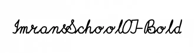
( Fonts by Peter Wiegel - www.peter-wiegel.de - Personal-use only. For commercial use please contact owner. )
A cursive, script-style font with connected letters and moderate stroke thickness.
 تنزيل 146 التنزيلات@WebFont
 -
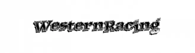
( Fonts by a Max Infeld - XEROGRAPHER FONTS - xerographer.blogspot.com . Personal-use only. For commercial use please contact owner. )
A bold, western-themed font with intricate detailing and a vintage feel.
![WesternRacing تنزيل الخطوط]() تنزيل 146 التنزيلات@WebFont
تنزيل 146 التنزيلات@WebFont -
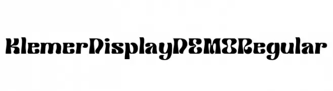
( Fonts by Prioritype Co - Prio Nurokhim Aji - Personal-use only. For commercial use please contact owner. )
A bold, artistic font with thick strokes and playful curves.
![Klemer Display DEMO Regular تنزيل الخطوط]() تنزيل 146 التنزيلات@WebFont
تنزيل 146 التنزيلات@WebFont -
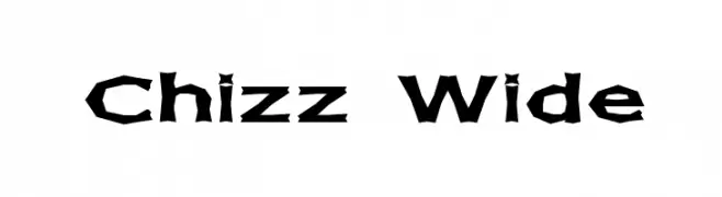
( Fonts by Apostrophic Lab )
A bold, chiseled font with a dynamic and artistic style.
![Chizz Wide تنزيل الخطوط]() تنزيل 146 التنزيلات@WebFont
تنزيل 146 التنزيلات@WebFont -
( Fonts by Dieter Steffmann )
A decorative and intricate font with geometric and ornamental details.
![Typographer Caps تنزيل الخطوط]() تنزيل 146 التنزيلات@WebFont
تنزيل 146 التنزيلات@WebFont -
-
( Fonts by Christophe Feray - www.wcfonts.com )
A novelty display font using adult-themed silhouettes to create characters.
![WC Zyzi Bta تنزيل الخطوط]() تنزيل 146 التنزيلات@WebFont
تنزيل 146 التنزيلات@WebFont -
( Fonts by Mr Letters )
A playful, hand-drawn font with bold outlines and a cartoonish style.
![SCHOOL-Regular تنزيل الخطوط]() تنزيل 146 التنزيلات@WebFont
تنزيل 146 التنزيلات@WebFont -
( Fonts by Graham Meade - GemFonts )
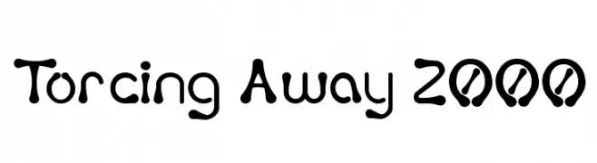
A playful, hand-drawn font with rounded, irregular shapes and a whimsical style.
![Torcing Away 2000 تنزيل الخطوط]() تنزيل 146 التنزيلات@WebFont
تنزيل 146 التنزيلات@WebFont -
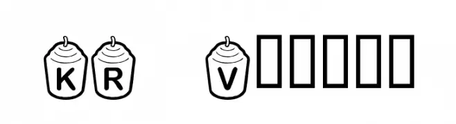
![KR Votive تنزيل الخطوط]() تنزيل 146 التنزيلات@WebFont
تنزيل 146 التنزيلات@WebFont -
( Fonts by Typodermic Fonts )
A classic serif font with elegant and refined characters.
![KingsbridgeCdLt-Regular تنزيل الخطوط]() تنزيل 146 التنزيلات@WebFont
تنزيل 146 التنزيلات@WebFont


ما هي أبرز الخطوط الآن؟
تحظى ImransSchoolOT-Bold, WesternRacing, Klemer Display DEMO Regular, Chizz Wide and Typographer Caps بشعبية لخطوطها النظيفة وتطبيقاتها الواسعة — من الهوية البصرية إلى الصفحات المقصودة والملصقات.
أي الخطوط تُستخدم كثيرًا في الشعارات؟
تُعد السان سيريف الهندسية (مثل Poppins وعائلات على نمط Gotham) خيارًا شائعًا لعلامات نظيفة قابلة للتوسع. ولإضفاء طابع ودي، تبقى السكريبت واليدوية خيارًا كلاسيكيًا. اجمع عنوانًا بارزًا مع خط نصي محايد لتحقيق التوازن والتميّز.
كم مرة يتم تحديث قائمة أعلى الخطوط؟
نحدّثها بانتظام استنادًا إلى التنزيلات والنشاط الفعلي. عُد إليها كثيرًا لاكتشاف النجوم الصاعدة مبكرًا.
💡 نصيحة: أضف هذه الصفحة إلى العلامات — تتغير الاتجاهات بسرعة وقد تُلهم خطوط اليوم الرائجة إعادة العلامة غدًا.