مرحبًا بك في قسم أعلى الخطوط — حيث تلتقي الشعبية بالجودة. هذه هي الخطوط الأكثر تنزيلًا واستخدامًا هذا العام من قبل مجتمعنا. إذا كنت بحاجة إلى اختيار موثوق للشعارات أو الويب أو وسائل التواصل، فابدأ من هنا.
يتميز كل خط رائج بتوازن جيد وقابلية قراءة وتعدد استخدامات. ستجد سان سيريف حديثة، وسكريبتات أنيقة، وسيريف كلاسيكية، وخطوط عرض minimal مختارة بعناية.
-
( Southype - Rodrigo Gonzalez - www.southype.com )
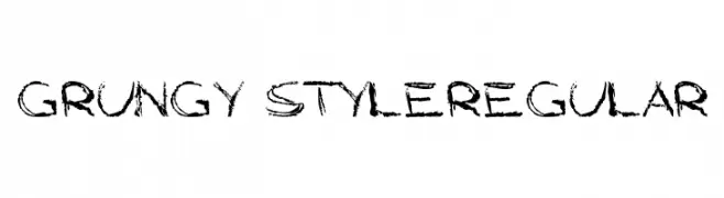
A bold, shadowed font with a modern, geometric style.
 تنزيل 151 التنزيلات@WebFont
 -
![Grungy StyleRegular تنزيل الخطوط]() تنزيل 151 التنزيلات@WebFont
تنزيل 151 التنزيلات@WebFont -
( !Exclamachine Type Foundry - exclamachine.com/ )
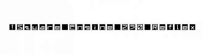
A bold, geometric font with angular shapes and a futuristic style.
![!Square Engine 250 Reflex تنزيل الخطوط]() تنزيل 151 التنزيلات@WebFont
تنزيل 151 التنزيلات@WebFont -
( Fonts by Apostrophic Lab )
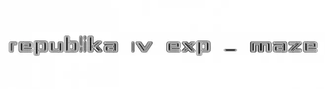
A bold, maze-like font with interconnected lines and a three-dimensional effect.
![Republika IV Exp - Maze تنزيل الخطوط]() تنزيل 151 التنزيلات@WebFont
تنزيل 151 التنزيلات@WebFont -
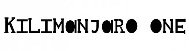
![Kilimanjaro One تنزيل الخطوط]() تنزيل 151 التنزيلات@WebFont
تنزيل 151 التنزيلات@WebFont -
-
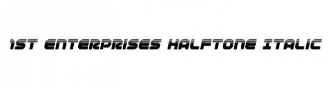
( Fonts by Iconian Fonts )
A bold, italicized font with a futuristic halftone effect and dynamic appearance.
![1st Enterprises Halftone Italic تنزيل الخطوط]() تنزيل 151 التنزيلات@WebFont
تنزيل 151 التنزيلات@WebFont -
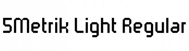
( Fonts by Winter Design Studio - winty5.wixsite.com/noahtheawesome/ - Personal-use only. For commercial use please contact owner. )
A geometric, angular font with a modern and technical style.
![5Metrik Light Regular تنزيل الخطوط]() تنزيل 151 التنزيلات@WebFont
تنزيل 151 التنزيلات@WebFont -
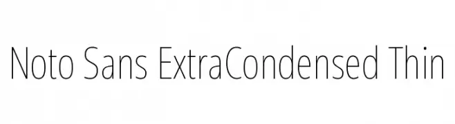
( Fonts by Google )
A modern, extra condensed sans-serif font with a thin weight and clean design.
![Noto Sans ExtraCondensed Thin تنزيل الخطوط]() تنزيل 151 التنزيلات@WebFont
تنزيل 151 التنزيلات@WebFont -
( Fonts by Digi Temply - Personal-use only. For commercial use please contact owner. )
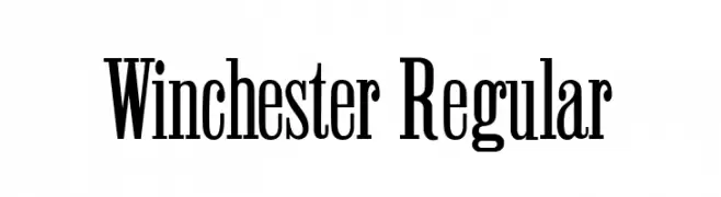
A bold, high-contrast serif font with tall, narrow letterforms and pronounced serifs.
![Winchester Regular تنزيل الخطوط]() تنزيل 151 التنزيلات@WebFont
تنزيل 151 التنزيلات@WebFont -
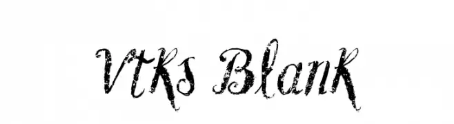
( Fonts by Douglas Vitkauskas - www.vtksdesign.com. Personal-use only. For commercial use please contact owner. )
A distressed, grunge script font with a bold, vintage style.
![Vtks Blank تنزيل الخطوط]() تنزيل 151 التنزيلات@WebFont
تنزيل 151 التنزيلات@WebFont
ما هي أبرز الخطوط الآن؟
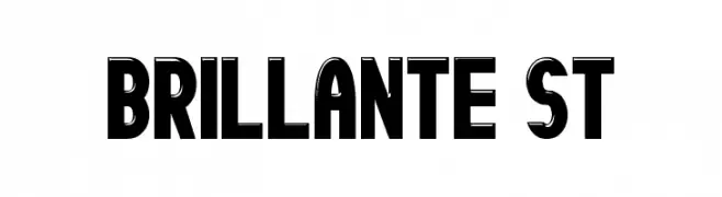
تحظى Brillante St, Grungy StyleRegular, !Square Engine 250 Reflex, Republika IV Exp - Maze and Kilimanjaro One بشعبية لخطوطها النظيفة وتطبيقاتها الواسعة — من الهوية البصرية إلى الصفحات المقصودة والملصقات.
أي الخطوط تُستخدم كثيرًا في الشعارات؟
تُعد السان سيريف الهندسية (مثل Poppins وعائلات على نمط Gotham) خيارًا شائعًا لعلامات نظيفة قابلة للتوسع. ولإضفاء طابع ودي، تبقى السكريبت واليدوية خيارًا كلاسيكيًا. اجمع عنوانًا بارزًا مع خط نصي محايد لتحقيق التوازن والتميّز.
كم مرة يتم تحديث قائمة أعلى الخطوط؟
نحدّثها بانتظام استنادًا إلى التنزيلات والنشاط الفعلي. عُد إليها كثيرًا لاكتشاف النجوم الصاعدة مبكرًا.
💡 نصيحة: أضف هذه الصفحة إلى العلامات — تتغير الاتجاهات بسرعة وقد تُلهم خطوط اليوم الرائجة إعادة العلامة غدًا.