مرحبًا بك في قسم أعلى الخطوط — حيث تلتقي الشعبية بالجودة. هذه هي الخطوط الأكثر تنزيلًا واستخدامًا هذا العام من قبل مجتمعنا. إذا كنت بحاجة إلى اختيار موثوق للشعارات أو الويب أو وسائل التواصل، فابدأ من هنا.
يتميز كل خط رائج بتوازن جيد وقابلية قراءة وتعدد استخدامات. ستجد سان سيريف حديثة، وسكريبتات أنيقة، وسيريف كلاسيكية، وخطوط عرض minimal مختارة بعناية.
-
( Fonts by www.foamtrain.com )
A bold, distressed font with a glitch effect, featuring jagged edges and irregular strokes.
 تنزيل 156 التنزيلات@WebFont
 -
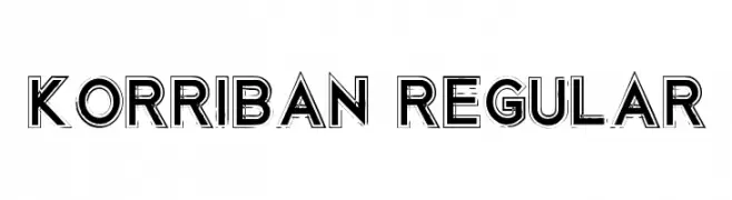
![Korriban Regular تنزيل الخطوط]() تنزيل 156 التنزيلات@WebFont
تنزيل 156 التنزيلات@WebFont -
( Fonts by Des Gomez )
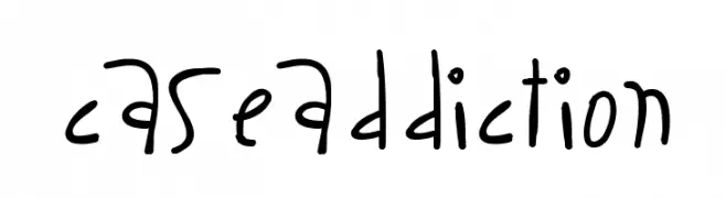
A playful, handwritten font with a casual and whimsical style.
![CaseAddiction تنزيل الخطوط]() تنزيل 156 التنزيلات@WebFont
تنزيل 156 التنزيلات@WebFont -
( Fonts by Vladimir Nikolic - www.creativefabrica.com/designer/vladimirnikolic/ - Personal-use only. For commercial use please contact owner. )
A bold, three-dimensional font with strong outlines and filled interiors, perfect for impactful designs.
![Extreme Filled Regular تنزيل الخطوط]() تنزيل 156 التنزيلات@WebFont
تنزيل 156 التنزيلات@WebFont -
( Fonts by www.DigitalDreamDesign.net )
A dot matrix style font with a modern, digital aesthetic.
![D3 Electronism Katakana تنزيل الخطوط]() تنزيل 156 التنزيلات@WebFont
تنزيل 156 التنزيلات@WebFont -
-
( Fonts by www.smeltery.net )
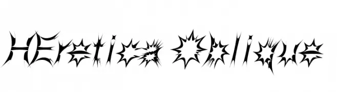
A bold, spiky, and dynamic decorative font with high contrast.
![HEretica Oblique تنزيل الخطوط]() تنزيل 156 التنزيلات@WebFont
تنزيل 156 التنزيلات@WebFont -
( Fonts by Manfred Klein. Free for private and charity use. Free for commercial with donation to organizations )
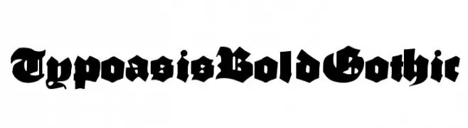
A bold Gothic font with sharp, angular lines and intricate detailing.
![TypoasisBoldGothic تنزيل الخطوط]() تنزيل 156 التنزيلات@WebFont
تنزيل 156 التنزيلات@WebFont -
( Fonts by www.peter-wiegel.de. Personal-use only. For commercial use please contact owner. )
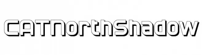
A bold, geometric font with a three-dimensional shadow effect.
![CATNorthShadow تنزيل الخطوط]() تنزيل 156 التنزيلات@WebFont
تنزيل 156 التنزيلات@WebFont -
( Fonts by www.gliphmaker.com. Personal-use only. For commercial use please contact owner. )
A bold Art Deco font with geometric shapes and strong lines, exuding vintage elegance.
![Promenad Deco تنزيل الخطوط]() تنزيل 156 التنزيلات@WebFont
تنزيل 156 التنزيلات@WebFont -
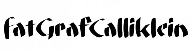
( Fonts by Manfred Klein. Free for private and charity use. Free for commercial with donation to organizations )
A bold, dynamic font with thick strokes and sharp angles, perfect for impactful designs.
![FatGrafCalliklein تنزيل الخطوط]() تنزيل 156 التنزيلات@WebFont
تنزيل 156 التنزيلات@WebFont


ما هي أبرز الخطوط الآن؟
تحظى deRez, Korriban Regular, CaseAddiction, Extreme Filled Regular and D3 Electronism Katakana بشعبية لخطوطها النظيفة وتطبيقاتها الواسعة — من الهوية البصرية إلى الصفحات المقصودة والملصقات.
أي الخطوط تُستخدم كثيرًا في الشعارات؟
تُعد السان سيريف الهندسية (مثل Poppins وعائلات على نمط Gotham) خيارًا شائعًا لعلامات نظيفة قابلة للتوسع. ولإضفاء طابع ودي، تبقى السكريبت واليدوية خيارًا كلاسيكيًا. اجمع عنوانًا بارزًا مع خط نصي محايد لتحقيق التوازن والتميّز.
كم مرة يتم تحديث قائمة أعلى الخطوط؟
نحدّثها بانتظام استنادًا إلى التنزيلات والنشاط الفعلي. عُد إليها كثيرًا لاكتشاف النجوم الصاعدة مبكرًا.
💡 نصيحة: أضف هذه الصفحة إلى العلامات — تتغير الاتجاهات بسرعة وقد تُلهم خطوط اليوم الرائجة إعادة العلامة غدًا.