مرحبًا بك في قسم أعلى الخطوط — حيث تلتقي الشعبية بالجودة. هذه هي الخطوط الأكثر تنزيلًا واستخدامًا هذا العام من قبل مجتمعنا. إذا كنت بحاجة إلى اختيار موثوق للشعارات أو الويب أو وسائل التواصل، فابدأ من هنا.
يتميز كل خط رائج بتوازن جيد وقابلية قراءة وتعدد استخدامات. ستجد سان سيريف حديثة، وسكريبتات أنيقة، وسيريف كلاسيكية، وخطوط عرض minimal مختارة بعناية.
-
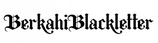
( Fonts by Faras Dina - Personal-use only. For commercial use please contact owner. )
A traditional Blackletter font with intricate, ornate designs and sharp, angular lines.
 تنزيل 162 التنزيلات@WebFont
 -
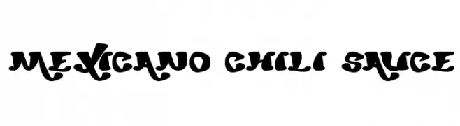
![mexicano chili sauce تنزيل الخطوط]() تنزيل 162 التنزيلات@WebFont
تنزيل 162 التنزيلات@WebFont -
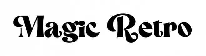
( Fonts by HansCo - Burhan Afif - Personal-use only. For commercial use please contact owner. )
A bold, retro font with playful, whimsical letterforms and decorative flourishes.
![Magic Retro تنزيل الخطوط]() تنزيل 162 التنزيلات@WebFont
تنزيل 162 التنزيلات@WebFont -
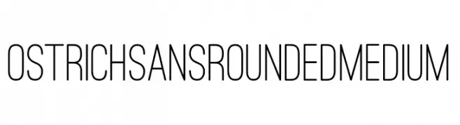
( Fonts by Tyler Finck )
A modern, rounded sans-serif font with a clean and approachable style.
![Ostrich Sans Rounded Medium تنزيل الخطوط]() تنزيل 162 التنزيلات@WebFont
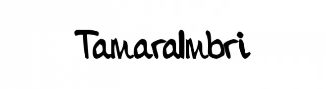
تنزيل 162 التنزيلات@WebFont -
![TamaraImbri تنزيل الخطوط]() تنزيل 162 التنزيلات@WebFont
تنزيل 162 التنزيلات@WebFont -
-
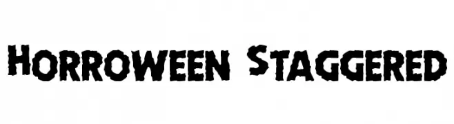
( Fonts by Daniel Zadorozny - www.iconian.com - Free for personal use )
A bold, jagged font with a spooky, chaotic aesthetic.
![Horroween Staggered تنزيل الخطوط]() تنزيل 162 التنزيلات@WebFont
تنزيل 162 التنزيلات@WebFont -
( Fonts by Wahyu Eka Prasetya - wepfont.com - Personal-use only. For commercial use please contact owner. )
A dynamic, cursive script font with a natural, handwritten feel.
![Citarasa تنزيل الخطوط]() تنزيل 162 التنزيلات@WebFont
تنزيل 162 التنزيلات@WebFont -
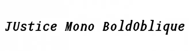
( Fonts by www.smeltery.net )
A bold, oblique, monospaced font with a modern and dynamic style.
![JUstice Mono BoldOblique تنزيل الخطوط]() تنزيل 162 التنزيلات@WebFont
تنزيل 162 التنزيلات@WebFont -
( Fonts by www.kimberlygeswein.com - Kimberly Geswein )
A playful, handwritten font with a bold, rounded style.
![Later Allie-Gator تنزيل الخطوط]() تنزيل 162 التنزيلات@WebFont
تنزيل 162 التنزيلات@WebFont -
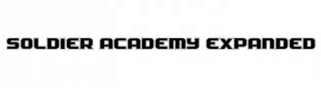
( Fonts by Daniel Zadorozny - www.iconian.com )
A bold, geometric font with a military-inspired, three-dimensional design.
![Soldier Academy Expanded تنزيل الخطوط]() تنزيل 162 التنزيلات@WebFont
تنزيل 162 التنزيلات@WebFont


ما هي أبرز الخطوط الآن؟
تحظى BerkahiBlackletter, mexicano chili sauce, Magic Retro, Ostrich Sans Rounded Medium and TamaraImbri بشعبية لخطوطها النظيفة وتطبيقاتها الواسعة — من الهوية البصرية إلى الصفحات المقصودة والملصقات.
أي الخطوط تُستخدم كثيرًا في الشعارات؟
تُعد السان سيريف الهندسية (مثل Poppins وعائلات على نمط Gotham) خيارًا شائعًا لعلامات نظيفة قابلة للتوسع. ولإضفاء طابع ودي، تبقى السكريبت واليدوية خيارًا كلاسيكيًا. اجمع عنوانًا بارزًا مع خط نصي محايد لتحقيق التوازن والتميّز.
كم مرة يتم تحديث قائمة أعلى الخطوط؟
نحدّثها بانتظام استنادًا إلى التنزيلات والنشاط الفعلي. عُد إليها كثيرًا لاكتشاف النجوم الصاعدة مبكرًا.
💡 نصيحة: أضف هذه الصفحة إلى العلامات — تتغير الاتجاهات بسرعة وقد تُلهم خطوط اليوم الرائجة إعادة العلامة غدًا.