مرحبًا بك في قسم أعلى الخطوط — حيث تلتقي الشعبية بالجودة. هذه هي الخطوط الأكثر تنزيلًا واستخدامًا هذا العام من قبل مجتمعنا. إذا كنت بحاجة إلى اختيار موثوق للشعارات أو الويب أو وسائل التواصل، فابدأ من هنا.
يتميز كل خط رائج بتوازن جيد وقابلية قراءة وتعدد استخدامات. ستجد سان سيريف حديثة، وسكريبتات أنيقة، وسيريف كلاسيكية، وخطوط عرض minimal مختارة بعناية.
-
( Fonts by www.selawetype.com - Personal-use only. FOR DONATION https://www.paypal.me/selawe . For commercial use please contact owner. )
A bold, edgy font with sharp, angular lines and a graffiti-like aesthetic.
 تنزيل 164 التنزيلات@WebFont
 -
( Fonts by Apostrophic Lab )
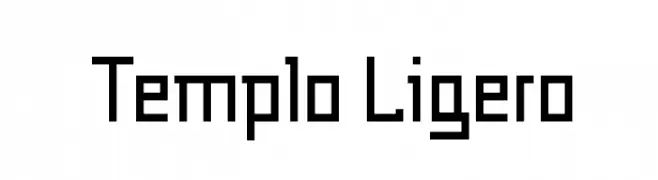
A geometric, pixelated font with a retro digital aesthetic.
![Templo Ligero تنزيل الخطوط]() تنزيل 164 التنزيلات@WebFont
تنزيل 164 التنزيلات@WebFont -
( Fonts by Daniel Zadorozny - www.iconian.com )
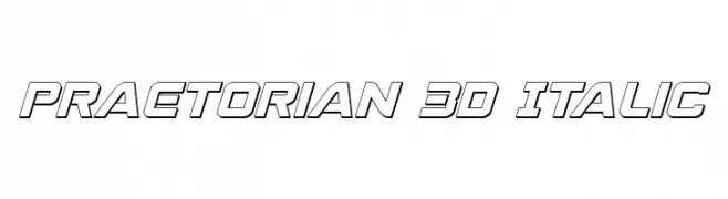
A bold, 3D italic font with outlined characters and a futuristic style.
![Praetorian 3D Italic تنزيل الخطوط]() تنزيل 164 التنزيلات@WebFont
تنزيل 164 التنزيلات@WebFont -
( Fonts by Craft Supply Co - Personal-use only. For commercial use please contact owner. )
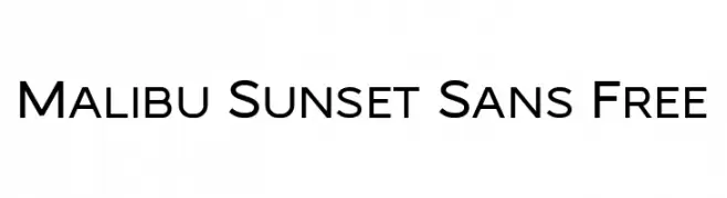
A modern, clean sans-serif font with uniform stroke width and high legibility.
![Malibu Sunset Sans Free تنزيل الخطوط]() تنزيل 164 التنزيلات@WebFont
تنزيل 164 التنزيلات@WebFont -
( Fonts by a Neale Davidson - www.pixelsagas.com. Personal-use only. For commercial use please contact owner. )
A bold, stencil-style font with geometric cuts and a modern industrial feel.
![Exostencil تنزيل الخطوط]() تنزيل 164 التنزيلات@WebFont
تنزيل 164 التنزيلات@WebFont -
-
( Fonts by Levi Halmos )
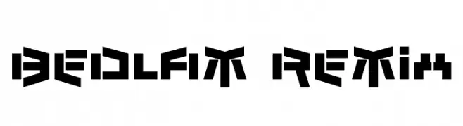
A bold, geometric font with a futuristic and digital aesthetic.
![Bedlam Remix تنزيل الخطوط]() تنزيل 164 التنزيلات@WebFont
تنزيل 164 التنزيلات@WebFont -
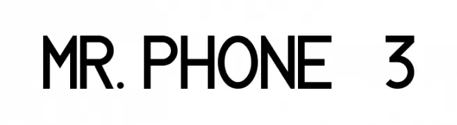
( Glyphobet Font Foundry - glyphobet.net/typography/ )
A modern, geometric sans-serif font with consistent stroke width.
![MR. PHONE 3 تنزيل الخطوط]() تنزيل 164 التنزيلات@WebFont
تنزيل 164 التنزيلات@WebFont -
( Fonts by a Des Gomez. Personal-use only. For commercial use please contact owner. )
A playful, handwritten font with a whimsical and artistic style.
![DesiWonderland تنزيل الخطوط]() تنزيل 164 التنزيلات@WebFont
تنزيل 164 التنزيلات@WebFont -
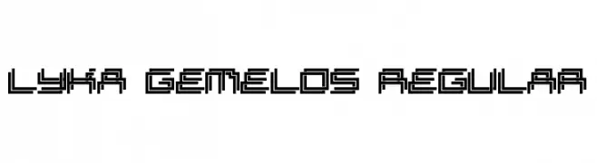
![Lyka Gemelos Regular تنزيل الخطوط]() تنزيل 164 التنزيلات@WebFont
تنزيل 164 التنزيلات@WebFont -
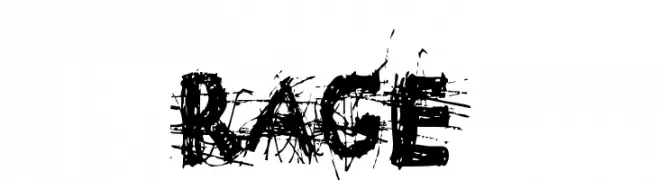
( Fonts by www.woodcutter.es - woodcutter Manero - Personal-use only. For commercial use please contact owner. )
A chaotic, distressed font with jagged edges and an aggressive style.
![rage تنزيل الخطوط]() تنزيل 164 التنزيلات@WebFont
تنزيل 164 التنزيلات@WebFont


ما هي أبرز الخطوط الآن؟
تحظى FREEDAY, Templo Ligero, Praetorian 3D Italic, Malibu Sunset Sans Free and Exostencil بشعبية لخطوطها النظيفة وتطبيقاتها الواسعة — من الهوية البصرية إلى الصفحات المقصودة والملصقات.
أي الخطوط تُستخدم كثيرًا في الشعارات؟
تُعد السان سيريف الهندسية (مثل Poppins وعائلات على نمط Gotham) خيارًا شائعًا لعلامات نظيفة قابلة للتوسع. ولإضفاء طابع ودي، تبقى السكريبت واليدوية خيارًا كلاسيكيًا. اجمع عنوانًا بارزًا مع خط نصي محايد لتحقيق التوازن والتميّز.
كم مرة يتم تحديث قائمة أعلى الخطوط؟
نحدّثها بانتظام استنادًا إلى التنزيلات والنشاط الفعلي. عُد إليها كثيرًا لاكتشاف النجوم الصاعدة مبكرًا.
💡 نصيحة: أضف هذه الصفحة إلى العلامات — تتغير الاتجاهات بسرعة وقد تُلهم خطوط اليوم الرائجة إعادة العلامة غدًا.