مرحبًا بك في قسم أعلى الخطوط — حيث تلتقي الشعبية بالجودة. هذه هي الخطوط الأكثر تنزيلًا واستخدامًا هذا العام من قبل مجتمعنا. إذا كنت بحاجة إلى اختيار موثوق للشعارات أو الويب أو وسائل التواصل، فابدأ من هنا.
يتميز كل خط رائج بتوازن جيد وقابلية قراءة وتعدد استخدامات. ستجد سان سيريف حديثة، وسكريبتات أنيقة، وسيريف كلاسيكية، وخطوط عرض minimal مختارة بعناية.
-
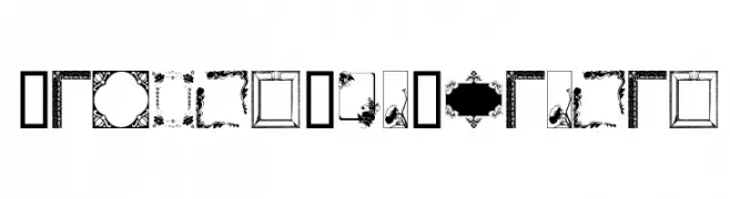
( Fonts by www.houseoflime.com )
A decorative collection of frame and border glyphs for creative design.
 تنزيل 165 التنزيلات@WebFont
 -
( Fonts by Iconian Fonts )
A bold, italicized font with a futuristic and geometric design.
![Cruiser Fortress Laser Italic تنزيل الخطوط]() تنزيل 165 التنزيلات@WebFont
تنزيل 165 التنزيلات@WebFont -
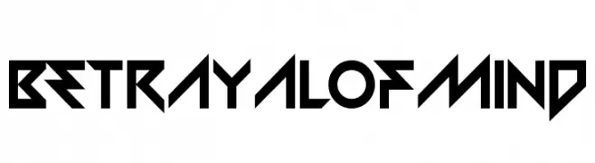
( Chequered Ink - chequered.ink/ )
A bold, angular font with a futuristic and aggressive style.
![BetrayalofMind تنزيل الخطوط]() تنزيل 165 التنزيلات@WebFont
تنزيل 165 التنزيلات@WebFont -
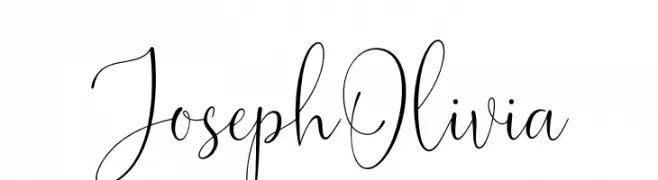
( Fonts by Hamzah Muhamad Ihsan - Typesthetic Studio - Personal-use only. For commercial use please contact owner. )
An elegant, flowing script font with high contrast and delicate swirls.
![Joseph Olivia تنزيل الخطوط]() تنزيل 165 التنزيلات@WebFont
تنزيل 165 التنزيلات@WebFont -
( Fonts by NanaNissa )
A bold, playful font with rounded edges and a hand-drawn feel.
![BENITO تنزيل الخطوط]() تنزيل 165 التنزيلات@WebFont
تنزيل 165 التنزيلات@WebFont -
-
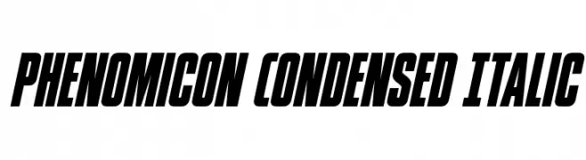
( Fonts by Iconian Fonts - Daniel Zadorozny - Personal-use only. For commercial use please contact owner. )
A bold, condensed, and italic font with high contrast and a modern, dynamic style.
![Phenomicon Condensed Italic تنزيل الخطوط]() تنزيل 165 التنزيلات@WebFont
تنزيل 165 التنزيلات@WebFont -
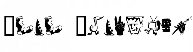
![Zono Dingbats تنزيل الخطوط]() تنزيل 165 التنزيلات@WebFont
تنزيل 165 التنزيلات@WebFont -
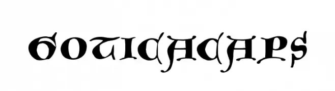
( Fonts by Manfred Klein. Free for private and charity use. Free for commercial with donation to organizations )
A bold, ornate blackletter font with medieval flair and intricate details.
![GoticaCaps تنزيل الخطوط]() تنزيل 165 التنزيلات@WebFont
تنزيل 165 التنزيلات@WebFont -
![Cancranacancarnaca Regular تنزيل الخطوط]() تنزيل 165 التنزيلات@WebFont
تنزيل 165 التنزيلات@WebFont -
( Fonts by Yves Michel - Personal-use only. For commercial use please contact owner. )
A cursive, handwritten-style font with elegant loops and swirls.
![Cursyves تنزيل الخطوط]() تنزيل 165 التنزيلات@WebFont
تنزيل 165 التنزيلات@WebFont


ما هي أبرز الخطوط الآن؟
تحظى FramesAndBorders, Cruiser Fortress Laser Italic, BetrayalofMind, Joseph Olivia and BENITO بشعبية لخطوطها النظيفة وتطبيقاتها الواسعة — من الهوية البصرية إلى الصفحات المقصودة والملصقات.
أي الخطوط تُستخدم كثيرًا في الشعارات؟
تُعد السان سيريف الهندسية (مثل Poppins وعائلات على نمط Gotham) خيارًا شائعًا لعلامات نظيفة قابلة للتوسع. ولإضفاء طابع ودي، تبقى السكريبت واليدوية خيارًا كلاسيكيًا. اجمع عنوانًا بارزًا مع خط نصي محايد لتحقيق التوازن والتميّز.
كم مرة يتم تحديث قائمة أعلى الخطوط؟
نحدّثها بانتظام استنادًا إلى التنزيلات والنشاط الفعلي. عُد إليها كثيرًا لاكتشاف النجوم الصاعدة مبكرًا.
💡 نصيحة: أضف هذه الصفحة إلى العلامات — تتغير الاتجاهات بسرعة وقد تُلهم خطوط اليوم الرائجة إعادة العلامة غدًا.