مرحبًا بك في قسم أعلى الخطوط — حيث تلتقي الشعبية بالجودة. هذه هي الخطوط الأكثر تنزيلًا واستخدامًا هذا العام من قبل مجتمعنا. إذا كنت بحاجة إلى اختيار موثوق للشعارات أو الويب أو وسائل التواصل، فابدأ من هنا.
يتميز كل خط رائج بتوازن جيد وقابلية قراءة وتعدد استخدامات. ستجد سان سيريف حديثة، وسكريبتات أنيقة، وسيريف كلاسيكية، وخطوط عرض minimal مختارة بعناية.
-
( Fonts by Modestype Studio )
A bold, playful font with a hand-drawn, quirky style.
 تنزيل 165 التنزيلات@WebFont
 -
( Fonts by Galdino Otten - Personal-use only. For commercial use please contact owner. )
A playful, handwritten font with a comic, balloon-like style.
![Comic Balloon New تنزيل الخطوط]() تنزيل 165 التنزيلات@WebFont
تنزيل 165 التنزيلات@WebFont -
( Fonts by Manfred Klein. Free for private and charity use. Free for commercial with donation to organizations )
A minimalist, geometric font with thin, linear strokes and a modern aesthetic.
![Linearus تنزيل الخطوط]() تنزيل 165 التنزيلات@WebFont
تنزيل 165 التنزيلات@WebFont -
( Shawn Griswold )
A modern, condensed serif font with elegant strokes and high readability.
![Gris Condensed Regular تنزيل الخطوط]() تنزيل 165 التنزيلات@WebFont
تنزيل 165 التنزيلات@WebFont -
( Fonts by exe.vis.ne.jp )
A bold, decorative font with dynamic curves and a slightly italicized style.
![Registration Number ANA I Serif تنزيل الخطوط]() تنزيل 165 التنزيلات@WebFont
تنزيل 165 التنزيلات@WebFont -
-
( Fonts by Daniel Zadorozny - www.iconian.com - Personal-use only. For commercial use please contact owner. )
A bold, italicized font with a modern, angular design.
![Urban Defender Italic تنزيل الخطوط]() تنزيل 165 التنزيلات@WebFont
تنزيل 165 التنزيلات@WebFont -
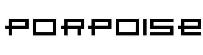
( Fonts by Marty Bee - www.martybee.com )
A bold, geometric font with a pixelated, digital aesthetic.
![Porpoise تنزيل الخطوط]() تنزيل 165 التنزيلات@WebFont
تنزيل 165 التنزيلات@WebFont -
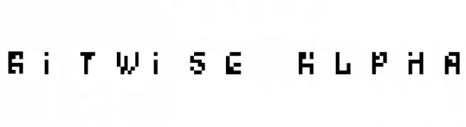
( Fonts by Scott Dieznyik - Kejak (formerly Cheops) )
A pixelated, retro-style font with a digital, blocky appearance.
![Bitwise Alpha تنزيل الخطوط]() تنزيل 165 التنزيلات@WebFont
تنزيل 165 التنزيلات@WebFont -
( Fonts by Chris Vile )
A bold, decorative font with gothic influences and high contrast strokes.
![Hallow Grave تنزيل الخطوط]() تنزيل 165 التنزيلات@WebFont
تنزيل 165 التنزيلات@WebFont -
![TypesettersTV تنزيل الخطوط]() تنزيل 165 التنزيلات@WebFont
تنزيل 165 التنزيلات@WebFont


ما هي أبرز الخطوط الآن؟
تحظى Cayman-Land, Comic Balloon New, Linearus, Gris Condensed Regular and Registration Number ANA I Serif بشعبية لخطوطها النظيفة وتطبيقاتها الواسعة — من الهوية البصرية إلى الصفحات المقصودة والملصقات.
أي الخطوط تُستخدم كثيرًا في الشعارات؟
تُعد السان سيريف الهندسية (مثل Poppins وعائلات على نمط Gotham) خيارًا شائعًا لعلامات نظيفة قابلة للتوسع. ولإضفاء طابع ودي، تبقى السكريبت واليدوية خيارًا كلاسيكيًا. اجمع عنوانًا بارزًا مع خط نصي محايد لتحقيق التوازن والتميّز.
كم مرة يتم تحديث قائمة أعلى الخطوط؟
نحدّثها بانتظام استنادًا إلى التنزيلات والنشاط الفعلي. عُد إليها كثيرًا لاكتشاف النجوم الصاعدة مبكرًا.
💡 نصيحة: أضف هذه الصفحة إلى العلامات — تتغير الاتجاهات بسرعة وقد تُلهم خطوط اليوم الرائجة إعادة العلامة غدًا.