مرحبًا بك في قسم أعلى الخطوط — حيث تلتقي الشعبية بالجودة. هذه هي الخطوط الأكثر تنزيلًا واستخدامًا هذا العام من قبل مجتمعنا. إذا كنت بحاجة إلى اختيار موثوق للشعارات أو الويب أو وسائل التواصل، فابدأ من هنا.
يتميز كل خط رائج بتوازن جيد وقابلية قراءة وتعدد استخدامات. ستجد سان سيريف حديثة، وسكريبتات أنيقة، وسيريف كلاسيكية، وخطوط عرض minimal مختارة بعناية.
-
 تنزيل 169 التنزيلات@WebFont
 -
![MangaAxt تنزيل الخطوط]() تنزيل 169 التنزيلات@WebFont
تنزيل 169 التنزيلات@WebFont -
( Fonts by www.philing.net )
A casual, handwritten font with a playful and informal style.
![JIMMY1 تنزيل الخطوط]() تنزيل 169 التنزيلات@WebFont
تنزيل 169 التنزيلات@WebFont -
( Fonts by HansCo )
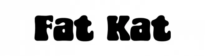
A bold, playful font with thick, rounded characters and a retro-modern style.
![Fat Kat تنزيل الخطوط]() تنزيل 169 التنزيلات@WebFont
تنزيل 169 التنزيلات@WebFont -
( Fonts by Bumbayo Font Fabrik - Personal-use only. For commercial use please contact owner. )
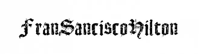
A distressed, blackletter-inspired font with a grunge aesthetic.
![FranSanciscoHilton تنزيل الخطوط]() تنزيل 169 التنزيلات@WebFont
تنزيل 169 التنزيلات@WebFont -
-
( Noto is a trademark of Google Inc. Noto fonts are open source. All Noto fonts are published under the SIL Open Font License, Version 1.1 )
A bold, modern typeface ideal for headlines and impactful designs.
![Noto Sans Bengali ExtraBold تنزيل الخطوط]() تنزيل 169 التنزيلات@WebFont
تنزيل 169 التنزيلات@WebFont -
( Fonts by Vladimir Nikolic - https://www.creativefabrica.com/product/educated-deers/ref/144265/ - Personal-use only. For commercial use please contact owner. )
A bold, geometric font with a modern, industrial style.
![Kalinka Regular تنزيل الخطوط]() تنزيل 169 التنزيلات@WebFont
تنزيل 169 التنزيلات@WebFont -
( Fonts by CannotIntoSpaceFonts - KineticPlasma Fonts - Personal-use only. For commercial use please contact owner. )
A bold, angular serif font with a modern twist.
![Charger Zwolnij Panike تنزيل الخطوط]() تنزيل 169 التنزيلات@WebFont
تنزيل 169 التنزيلات@WebFont -
( Fonts by Bangkit Tri Setiadi )
A bold, angular font with a geometric and modern design.
![Stone Ocean Regular تنزيل الخطوط]() تنزيل 169 التنزيلات@WebFont
تنزيل 169 التنزيلات@WebFont -
( Fonts by LyonsType - Daniel Lyons - Personal-use only. For commercial use please contact owner. )
A modern and elegant font with bold uppercase and smooth lowercase letters.
![LTMarathon-Regular تنزيل الخطوط]() تنزيل 169 التنزيلات@WebFont
تنزيل 169 التنزيلات@WebFont


ما هي أبرز الخطوط الآن؟
تحظى TRUCK Conky Choo Driver, MangaAxt, JIMMY1, Fat Kat and FranSanciscoHilton بشعبية لخطوطها النظيفة وتطبيقاتها الواسعة — من الهوية البصرية إلى الصفحات المقصودة والملصقات.
أي الخطوط تُستخدم كثيرًا في الشعارات؟
تُعد السان سيريف الهندسية (مثل Poppins وعائلات على نمط Gotham) خيارًا شائعًا لعلامات نظيفة قابلة للتوسع. ولإضفاء طابع ودي، تبقى السكريبت واليدوية خيارًا كلاسيكيًا. اجمع عنوانًا بارزًا مع خط نصي محايد لتحقيق التوازن والتميّز.
كم مرة يتم تحديث قائمة أعلى الخطوط؟
نحدّثها بانتظام استنادًا إلى التنزيلات والنشاط الفعلي. عُد إليها كثيرًا لاكتشاف النجوم الصاعدة مبكرًا.
💡 نصيحة: أضف هذه الصفحة إلى العلامات — تتغير الاتجاهات بسرعة وقد تُلهم خطوط اليوم الرائجة إعادة العلامة غدًا.