مرحبًا بك في قسم أعلى الخطوط — حيث تلتقي الشعبية بالجودة. هذه هي الخطوط الأكثر تنزيلًا واستخدامًا هذا العام من قبل مجتمعنا. إذا كنت بحاجة إلى اختيار موثوق للشعارات أو الويب أو وسائل التواصل، فابدأ من هنا.
يتميز كل خط رائج بتوازن جيد وقابلية قراءة وتعدد استخدامات. ستجد سان سيريف حديثة، وسكريبتات أنيقة، وسيريف كلاسيكية، وخطوط عرض minimal مختارة بعناية.
-
 تنزيل 173 التنزيلات@WebFont
 -
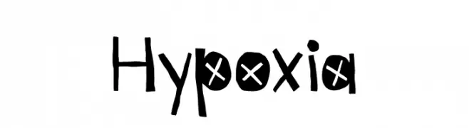
( Fonts by Kyle Hathcoat )
A playful, hand-drawn font with bold, irregular characters and whimsical details.
![Hypoxia تنزيل الخطوط]() تنزيل 173 التنزيلات@WebFont
تنزيل 173 التنزيلات@WebFont -
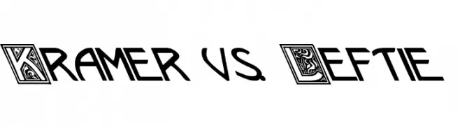
( Fonts by David Rakowski )
A bold, dynamic font with decorative and modern styles.
![Kramer vs. Leftie تنزيل الخطوط]() تنزيل 173 التنزيلات@WebFont
تنزيل 173 التنزيلات@WebFont -
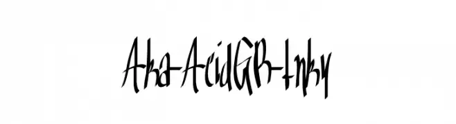
( Fonts by www.aka-acid.com )
A dynamic, hand-drawn font with sharp, angular strokes and a graffiti-like style.
![Aka-AcidGR-Inky تنزيل الخطوط]() تنزيل 173 التنزيلات@WebFont
تنزيل 173 التنزيلات@WebFont -
![Apollo9 Italic تنزيل الخطوط]() تنزيل 173 التنزيلات@WebFont
تنزيل 173 التنزيلات@WebFont -
-
( Fonts by Syaf Rizal - Khurasan - Personal-use only. For commercial use please contact owner. )
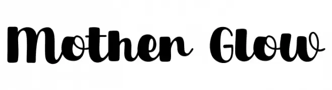
A bold, playful script font with a modern, energetic style.
![Mother Glow تنزيل الخطوط]() تنزيل 173 التنزيلات@WebFont
تنزيل 173 التنزيلات@WebFont -
( Syahputra - creativemarket.com/Bexxtype )
An elegant and sophisticated cursive font with decorative flourishes.
![Namilla تنزيل الخطوط]() تنزيل 173 التنزيلات@WebFont
تنزيل 173 التنزيلات@WebFont -
( Fonts by CannotIntoSpaceFonts - KineticPlasma Fonts - Personal-use only. For commercial use please contact owner. )
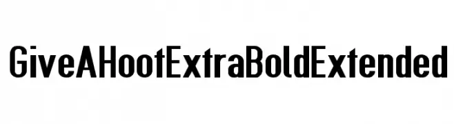
A bold, extended font with a modern and impactful design.
![Give A Hoot ExtraBold Extended تنزيل الخطوط]() تنزيل 173 التنزيلات@WebFont
تنزيل 173 التنزيلات@WebFont -
( Daniel Freeman - www.freedanstudios.com )
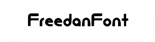
A modern, geometric font with rounded edges and consistent stroke widths.
![FreedanFont تنزيل الخطوط]() تنزيل 173 التنزيلات@WebFont
تنزيل 173 التنزيلات@WebFont -
( Fonts by Vladimir Nikolic - https://www.creativefabrica.com/product/educated-deers/ref/144265/ - Personal-use only. For commercial use please contact owner. )
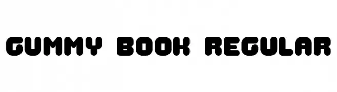
A playful, bold font with rounded edges and a cohesive design.
![Gummy Book Regular تنزيل الخطوط]() تنزيل 173 التنزيلات@WebFont
تنزيل 173 التنزيلات@WebFont


ما هي أبرز الخطوط الآن؟
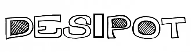
تحظى Des-Pot, Hypoxia, Kramer vs. Leftie, Aka-AcidGR-Inky and Apollo9 Italic بشعبية لخطوطها النظيفة وتطبيقاتها الواسعة — من الهوية البصرية إلى الصفحات المقصودة والملصقات.
أي الخطوط تُستخدم كثيرًا في الشعارات؟
تُعد السان سيريف الهندسية (مثل Poppins وعائلات على نمط Gotham) خيارًا شائعًا لعلامات نظيفة قابلة للتوسع. ولإضفاء طابع ودي، تبقى السكريبت واليدوية خيارًا كلاسيكيًا. اجمع عنوانًا بارزًا مع خط نصي محايد لتحقيق التوازن والتميّز.
كم مرة يتم تحديث قائمة أعلى الخطوط؟
نحدّثها بانتظام استنادًا إلى التنزيلات والنشاط الفعلي. عُد إليها كثيرًا لاكتشاف النجوم الصاعدة مبكرًا.
💡 نصيحة: أضف هذه الصفحة إلى العلامات — تتغير الاتجاهات بسرعة وقد تُلهم خطوط اليوم الرائجة إعادة العلامة غدًا.